9Research Designs: Experimental and Non-Experimental Approaches
9.1 Introduction
Research designs are fundamental to the scientific process, providing structured approaches to investigate hypotheses and answer research questions. This chapter explores two main categories of research designs: experimental and non-experimental, with a focus on the Neyman-Rubin potential outcome framework. We’ll delve into various design types, their characteristics, and provide practical examples using R for data analysis and visualization.
9.2 Experimental Designs
Experimental designs are characterized by the researcher’s control over the independent variable(s) and random assignment of subjects to different conditions. These designs are considered the gold standard for establishing causal relationships.
Randomized Controlled Trials (RCTs)
RCTs are the most rigorous form of experimental design. They involve:
Random assignment of subjects to treatment and control groups
Manipulation of the independent variable
Measurement of the dependent variable
Let’s visualize a simple RCT design:
library(ggplot2)library(dplyr)set.seed(123)# Create sample datan <-100data <-data.frame(id =1:n,group =factor(rep(c("Control", "Treatment"), each = n/2)),pre_test =rnorm(n, mean =50, sd =10),post_test =NA)# Simulate treatment effectdata$post_test <-ifelse(data$group =="Treatment", data$pre_test +rnorm(n/2, mean =10, sd =5), data$pre_test +rnorm(n/2, mean =0, sd =5))# Reshape data for plottingdata_long <- tidyr::pivot_longer(data, cols =c(pre_test, post_test),names_to ="time", values_to ="score")# Create plotggplot(data_long, aes(x = time, y = score, color = group, group =interaction(id, group))) +geom_line(alpha =0.3) +geom_point(alpha =0.5) +stat_summary(aes(group = group), fun = mean, geom ="line", size =1.5) +labs(title ="Pre-test and Post-test Scores in RCT",x ="Time", y ="Score", color ="Group") +theme_minimal() +scale_color_brewer(palette ="Set1")
Warning: Using `size` aesthetic for lines was deprecated in ggplot2 3.4.0.
ℹ Please use `linewidth` instead.
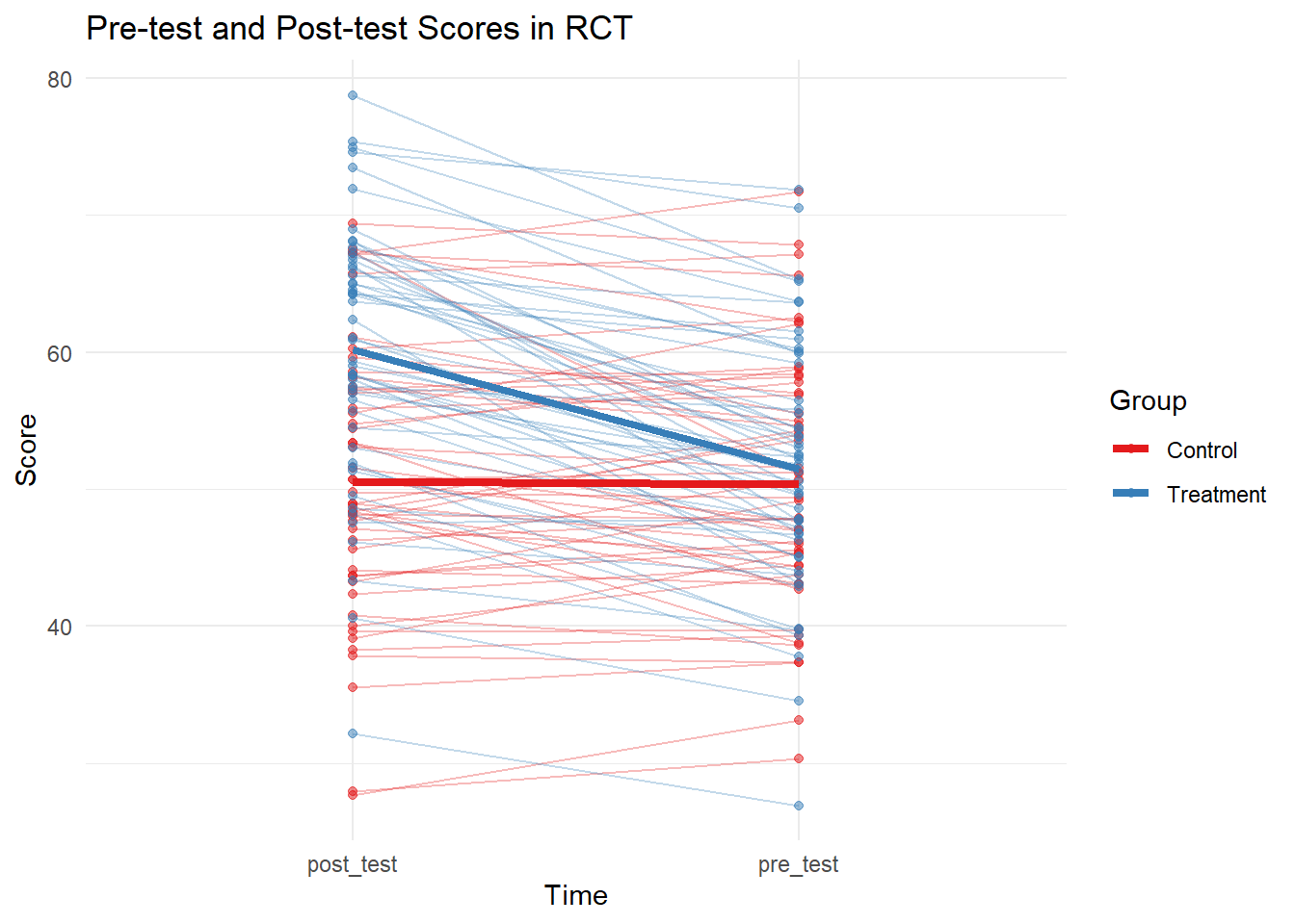
Randomized Controlled Trial Design
This plot shows individual trajectories and group means for pre-test and post-test scores in a hypothetical RCT. The treatment group shows a clear increase in scores compared to the control group.
9.3 A/B Testing: An Example and Comparison with RCTs
A/B testing is a widely used experimental method in digital marketing, user experience design, and product development. This chapter will present an example of A/B testing, explain its methodology, and discuss how it differs from Randomized Controlled Trials (RCTs).
Example: Website Landing Page Conversion Rate
Let’s consider an example where an e-commerce company wants to improve the conversion rate of their landing page. They decide to test two different layouts: the current layout (A) and a new layout (B).
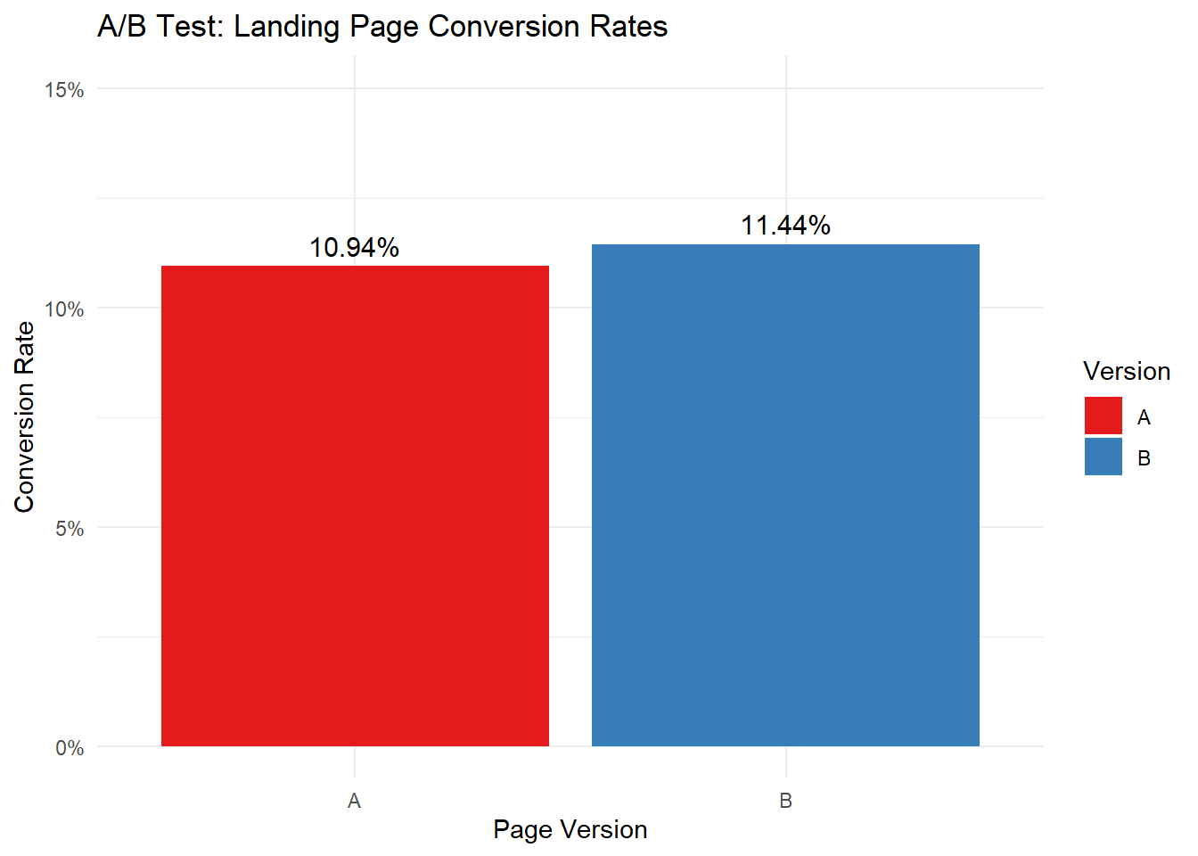
Figure 9.1: A/B Test Results: Landing Page Conversion Rates
In this example, we simulated data for 10,000 visitors randomly assigned to either version A or B of the landing page. The results show that version B has a slightly higher conversion rate (11.44%) compared to version A (10.94%).
A/B Testing Methodology
A/B testing typically follows these steps:
Identify the element to be tested (e.g., landing page layout).
Create two versions: the control (A) and the variant (B).
Randomly assign visitors to either version.
Collect data on the metric of interest (e.g., conversion rate).
Analyze the results using statistical methods.
Make a decision based on the results.
Differences between A/B Testing and RCTs
While A/B testing and Randomized Controlled Trials (RCTs) share some similarities, they have several key differences:
Scope and Context:
A/B Testing: Typically used in digital environments for quick, iterative improvements.
RCTs: Used in various fields, including medicine, psychology, and social sciences, often for more complex interventions.
Duration:
A/B Testing: Usually shorter, often running for days or weeks.
RCTs: Can last months or years, especially in medical research.
Sample Size:
A/B Testing: Can involve very large sample sizes due to ease of implementation in digital platforms.
RCTs: Sample sizes are often smaller due to practical and cost constraints.
Blinding:
A/B Testing: Participants are usually unaware they’re part of a test.
RCTs: May involve single, double, or triple blinding to reduce bias.
Ethical Considerations:
A/B Testing: Generally involves low-risk changes with minimal ethical concerns.
RCTs: Often require extensive ethical review, especially in medical contexts.
Outcome Measures:
A/B Testing: Typically focuses on a single, easily measurable outcome (e.g., click-through rate).
RCTs: Often measure multiple outcomes, including potential side effects or long-term impacts.
Generalizability:
A/B Testing: Results are often specific to the platform or context tested.
RCTs: Aim for broader generalizability, though this can vary.
Analysis Complexity:
A/B Testing: Often uses simpler statistical analyses.
RCTs: May involve more complex statistical methods to account for various factors.
A/B testing is a powerful tool for making data-driven decisions in digital environments. While it shares the fundamental principle of randomization with RCTs, it is typically simpler, faster, and more focused on specific, measurable outcomes in digital contexts. Understanding these differences helps researchers and practitioners choose the most appropriate method for their specific needs and constraints.
Example 1: Effect of Sleep Duration on Cognitive Performance
Research Question: Does increasing sleep duration improve cognitive performance in college students?
# Generating sample dataset.seed(456)n <-100pre_experimental <-rnorm(n, mean =70, sd =10)post_experimental <- pre_experimental +rnorm(n, mean =8, sd =5)pre_control <-rnorm(n, mean =70, sd =10)post_control <- pre_control +rnorm(n, mean =1, sd =5)data <-data.frame(Group =rep(c("Experimental", "Control"), each = n*2),Time =rep(rep(c("Pre", "Post"), each = n), 2),Score =c(pre_experimental, post_experimental, pre_control, post_control))# Creating the plotggplot(data, aes(x = Time, y = Score, color = Group, group = Group)) +geom_point(position =position_jitter(width =0.2), alpha =0.5) +stat_summary(fun = mean, geom ="point", size =3) +stat_summary(fun = mean, geom ="line") +theme_minimal() +ggtitle("Effect of Increased Sleep Duration on Cognitive Performance") +xlab("Time") +ylab("Cognitive Performance Score")
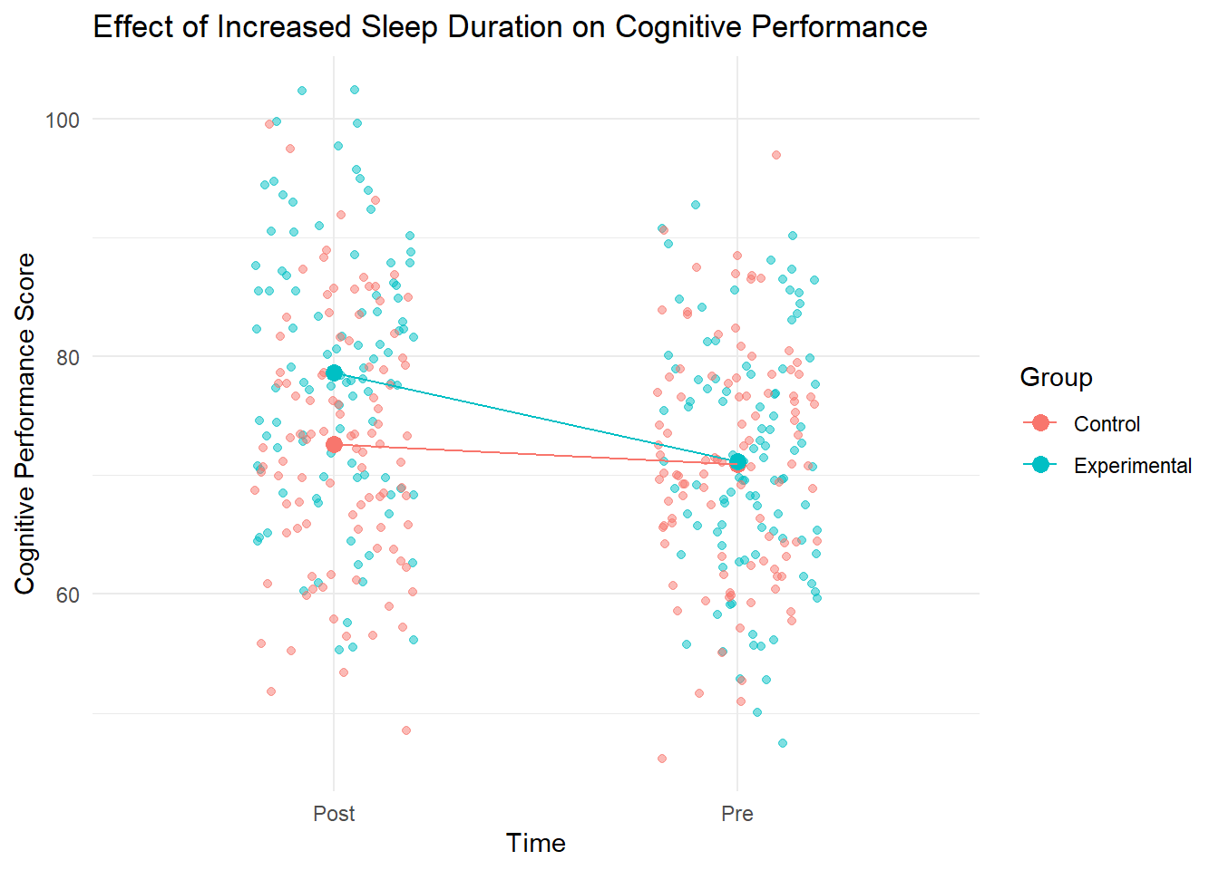
Figure 9.2: Effect of Sleep Duration on Cognitive Performance
Interpretation
This plot demonstrates the effect of increased sleep duration on cognitive performance. The experimental group, which increased their sleep duration, shows a more substantial improvement in cognitive performance compared to the control group. This suggests that increasing sleep duration may positively impact cognitive abilities in college students.
Example 2: Impact of Mindfulness Training on Stress Levels
Research Question: Can a short-term mindfulness training program reduce stress levels in healthcare workers?
# Generating sample dataset.seed(789)n <-120pre_experimental <-rnorm(n, mean =60, sd =15)post_experimental <- pre_experimental +rnorm(n, mean =-12, sd =8)pre_control <-rnorm(n, mean =60, sd =15)post_control <- pre_control +rnorm(n, mean =-2, sd =6)data <-data.frame(Group =rep(c("Mindfulness", "Control"), each = n*2),Time =rep(rep(c("Pre", "Post"), each = n), 2),StressScore =c(pre_experimental, post_experimental, pre_control, post_control))# Creating the plotggplot(data, aes(x = Time, y = StressScore, color = Group, group = Group)) +geom_point(position =position_jitter(width =0.2), alpha =0.5) +stat_summary(fun = mean, geom ="point", size =3) +stat_summary(fun = mean, geom ="line") +theme_minimal() +ggtitle("Impact of Mindfulness Training on Stress Levels") +xlab("Time") +ylab("Stress Score")
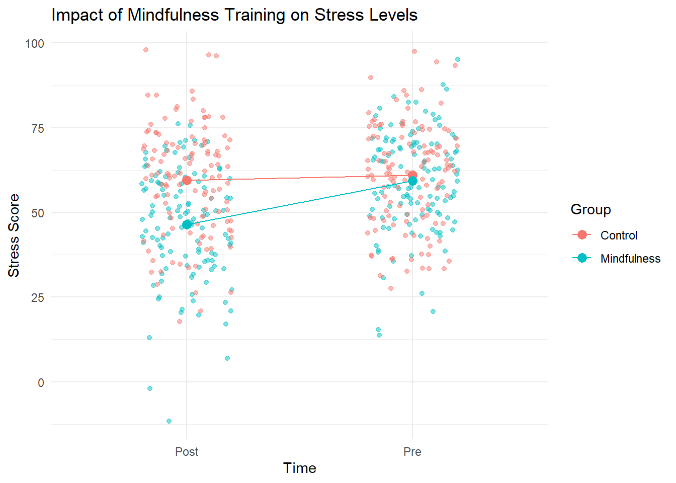
Figure 9.3: Impact of Mindfulness Training on Stress Levels
Interpretation
This visualization illustrates the impact of a mindfulness training program on stress levels in healthcare workers. The mindfulness group shows a more significant decrease in stress scores compared to the control group. This suggests that the mindfulness training program may be effective in reducing stress levels among healthcare workers.
When interpreting such results, it’s important to consider:
The magnitude of the change in each group
The difference in change between the experimental and control groups
The variability within each group
Any potential confounding factors not accounted for in the experimental design
These examples provide a template for visualizing and interpreting similar experimental designs across different research contexts.
Factorial Designs
Factorial designs allow researchers to study the effects of multiple independent variables simultaneously. They are efficient and can reveal interaction effects between variables.
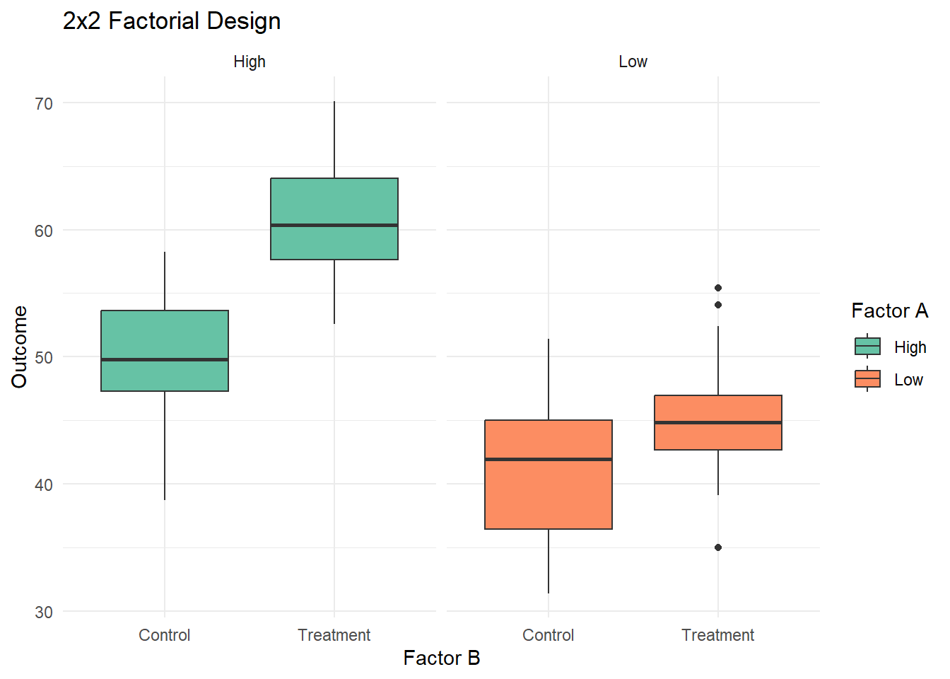
Example of a 2x2 factorial design:
# Create sample data for 2x2 factorial designset.seed(456)n_per_group <-25factorial_data <-data.frame(factor_a =rep(rep(c("Low", "High"), each = n_per_group), 2),factor_b =rep(c("Control", "Treatment"), each = n_per_group *2),outcome =NA)# Generate outcomesfactorial_data$outcome <-ifelse(factorial_data$factor_a =="Low"& factorial_data$factor_b =="Control",rnorm(n_per_group, 40, 5),ifelse(factorial_data$factor_a =="Low"& factorial_data$factor_b =="Treatment",rnorm(n_per_group, 45, 5),ifelse(factorial_data$factor_a =="High"& factorial_data$factor_b =="Control",rnorm(n_per_group, 50, 5),rnorm(n_per_group, 60, 5))))# Create plotggplot(factorial_data, aes(x = factor_b, y = outcome, fill = factor_a)) +geom_boxplot() +facet_wrap(~factor_a, scales ="free_x") +labs(title ="2x2 Factorial Design",x ="Factor B", y ="Outcome", fill ="Factor A") +theme_minimal() +scale_fill_brewer(palette ="Set2")
2x2 Factorial Design
This plot illustrates a 2x2 factorial design, showing the effects of two factors (A and B) on the outcome variable. We can observe main effects for both factors and a potential interaction effect.
9.4 Non-Experimental Designs
Non-experimental designs are used when randomization or manipulation of variables is not possible or ethical. They include observational/descriptive studies and quasi-experimental designs.
Observational Studies
Observational studies involve collecting data without manipulating variables. They are useful for exploring relationships and generating hypotheses.
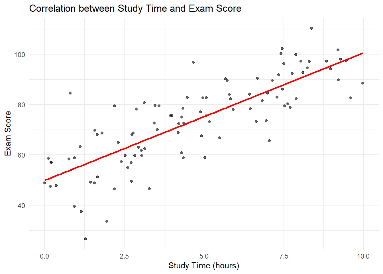
Example: Correlation study
set.seed(789)n <-100study_time <-runif(n, 0, 10)exam_score <-50+5* study_time +rnorm(n, 0, 10)correlation_data <-data.frame(study_time, exam_score)ggplot(correlation_data, aes(x = study_time, y = exam_score)) +geom_point(alpha =0.6) +geom_smooth(method ="lm", se =FALSE, color ="red") +labs(title ="Correlation between Study Time and Exam Score",x ="Study Time (hours)", y ="Exam Score") +theme_minimal()
`geom_smooth()` using formula = 'y ~ x'
Correlation between Study Time and Exam Score
This scatter plot shows the relationship between study time and exam scores, illustrating a positive correlation typical in observational studies.
Quasi-Experimental Designs
Quasi-experimental designs lack random assignment but attempt to establish causal relationships. Common types include:
Difference-in-Differences (DiD)
Regression Discontinuity Design (RDD)
Difference-in-Differences (DiD)
DiD is used to estimate treatment effects by comparing the average change over time in the outcome variable for the treatment group to the average change over time for the control group.
Let’s simulate a DiD analysis using the plm package:
library(plm)
Attaching package: 'plm'
The following objects are masked from 'package:dplyr':

    between, lag, lead
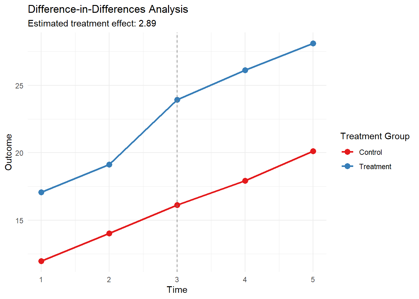
library(ggplot2)# Set seed for reproducibilityset.seed(101)# Generate synthetic panel datan <-1000time_periods <-5intervention_time <-3panel_data <-data.frame(id =rep(1:n, each = time_periods),time =rep(1:time_periods, times = n),treatment =rep(sample(c(0, 1), n, replace =TRUE), each = time_periods))# Generate outcomespanel_data$outcome <-with(panel_data,10+2* time +5* treatment +3* (time >= intervention_time & treatment ==1) +rnorm(n * time_periods, 0, 2))# Create post-treatment indicatorpanel_data$post <-as.integer(panel_data$time >= intervention_time)# Estimate DiD modeldid_model <-plm(outcome ~ treatment * post, data = panel_data, index =c("id", "time"), model ="within")# Summarize resultssummary_did <-summary(did_model)# Calculate group means for each time periodgroup_means <-aggregate(outcome ~ time + treatment, data = panel_data, FUN = mean)# Visualize DiDggplot(group_means, aes(x = time, y = outcome, color =factor(treatment), group = treatment)) +geom_line(size =1) +geom_point(size =3) +geom_vline(xintercept = intervention_time, linetype ="dashed", color ="gray50") +labs(title ="Difference-in-Differences Analysis",subtitle =paste("Estimated treatment effect:", round(coef(did_model)["treatment:post"], 3)),x ="Time", y ="Outcome", color ="Treatment Group") +theme_minimal() +scale_color_brewer(palette ="Set1", labels =c("Control", "Treatment")) +scale_x_continuous(breaks =1:time_periods)
Difference-in-Differences Analysis
# Print model summaryprint(summary_did)
Oneway (individual) effect Within Model

Call:
plm(formula = outcome ~ treatment * post, data = panel_data,
    model = "within", index = c("id", "time"))

Balanced Panel: n = 1000, T = 5, N = 5000

Residuals:
     Min.   1st Qu.    Median   3rd Qu.      Max.
-7.509908 -1.625814  0.001753  1.610009  8.047479

Coefficients:
               Estimate Std. Error t-value  Pr(>|t|)
post            5.05692    0.10315  49.026 < 2.2e-16 ***
treatment:post  2.89003    0.14935  19.351 < 2.2e-16 ***
---
Signif. codes:  0 '***' 0.001 '**' 0.01 '*' 0.05 '.' 0.1 ' ' 1

Total Sum of Squares:    78894
Residual Sum of Squares: 26696
R-Squared:      0.66163
Adj. R-Squared: 0.57691
F-statistic: 3908.68 on 2 and 3998 DF, p-value: < 2.22e-16
The plot shows the average outcomes for treatment and control groups over time. The vertical dashed line indicates the intervention point. The DiD estimate is the difference between the two groups’ changes from pre- to post-intervention periods.
DiD Model:
The model outcome ~ treatment * post estimates:
The average treatment effect on the treated (ATT) after the intervention
The coefficient on treatment:post represents this effect
Interpretation of Results: Looking at the model summary:
The coefficient for treatment:post is the DiD estimator. It represents the average treatment effect on the treated after the intervention.
If this coefficient is statistically significant, it suggests that the treatment had a causal effect on the outcome.
The magnitude of this coefficient tells us the size of the treatment effect.
Visualization: The plot shows:
Separate trend lines for the treatment and control groups
A vertical dashed line indicating the intervention time
The parallel trends assumption can be visually assessed by looking at the pre-intervention period
The divergence of the lines after the intervention represents the treatment effect
Assumptions and Limitations:
It’s important to note some key assumptions of DiD:
Parallel trends: In the absence of treatment, the difference between the treatment and control groups would remain constant over time.
No spillover effects: The treatment does not affect the control group.
No compositional changes: The composition of treatment and control groups remains stable over time.
Regression Discontinuity Design (RDD)
RDD is used when treatment assignment is determined by a cutoff value on a continuous variable. It compares observations just above and below the cutoff to estimate the treatment effect.
Let’s implement an RDD analysis using the rdrobust package:
Sharp RD estimates using local polynomial regression.

Number of Obs.                 1000
BW type                       mserd
Kernel                   Triangular
VCE method                       NN

Number of Obs.                  499          501
Eff. Number of Obs.             182          175
Order est. (p)                    1            1
Order bias  (q)                   2            2
BW est. (h)                   0.362        0.362
BW bias (b)                   0.575        0.575
rho (h/b)                     0.630        0.630
Unique Obs.                     499          501

=============================================================================
        Method     Coef. Std. Err.         z     P>|z|      [ 95% C.I. ]
=============================================================================
  Conventional     4.092     0.231    17.723     0.000     [3.640 , 4.545]
        Robust         -         -    15.013     0.000     [3.600 , 4.680]
=============================================================================
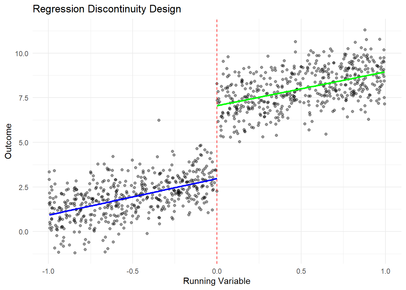
# Visualize RDDggplot(rdd_data, aes(x = x, y = y)) +geom_point(alpha =0.4) +geom_vline(xintercept =0, linetype ="dashed", color ="red") +geom_smooth(data =subset(rdd_data, x <0), method ="lm", se =FALSE, color ="blue") +geom_smooth(data =subset(rdd_data, x >=0), method ="lm", se =FALSE, color ="green") +labs(title ="Regression Discontinuity Design",x ="Running Variable", y ="Outcome") +theme_minimal()
`geom_smooth()` using formula = 'y ~ x'
`geom_smooth()` using formula = 'y ~ x'
Regression Discontinuity Design Analysis
The plot shows the discontinuity at the cutoff point (x = 0), with separate regression lines fitted on either side. The treatment effect is estimated by the gap between these lines at the cutoff.
9.5 The Neyman-Rubin Potential Outcome Framework
The Neyman-Rubin potential outcome framework provides a formal approach to causal inference. It introduces the concept of potential outcomes: for each unit, we consider the outcome under treatment and the outcome under control, even though we can only observe one in reality.
Key concepts:
Potential Outcomes: Y_i(1) and Y_i(0) for treatment and control, respectively.
Observed Outcome: Y_i = Y_i(1)T_i + Y_i(0)(1-T_i), where T_i is the treatment indicator.
Where n_1 and n_0 are the numbers of treated and control units, respectively.
# Using the RCT data from earlierate_estimate <-mean(data$post_test[data$group =="Treatment"]) -mean(data$post_test[data$group =="Control"])
Warning in mean.default(data$post_test[data$group == "Treatment"]): argument is
not numeric or logical: returning NA
Warning in mean.default(data$post_test[data$group == "Control"]): argument is
not numeric or logical: returning NA
cat("Estimated Average Treatment Effect:", round(ate_estimate, 2))
Estimated Average Treatment Effect: NA
This estimate represents the causal effect of the treatment under the assumptions of the potential outcome framework.
9.6 Conclusion
This chapter has explored various research designs, from experimental approaches like RCTs and factorial designs to non-experimental methods such as observational studies and quasi-experimental designs. We’ve demonstrated how to implement and visualize these designs using R, and introduced the Neyman-Rubin potential outcome framework for causal inference.
Understanding these designs and their appropriate use is crucial for conducting rigorous research and drawing valid causal conclusions. Each design has its strengths and limitations, and the choice of design should be guided by the research question, ethical considerations, and practical constraints.
9.7 References
Imbens, G. W., & Rubin, D. B. (2015). Causal Inference for Statistics, Social, and Biomedical Sciences: An Introduction. Cambridge University Press.
Angrist, J. D., & Pischke, J. S. (2008). Mostly Harmless Econometrics: An Empiricist’s Companion. Princeton University Press.
Shadish, W. R., Cook, T. D., & Campbell, D. T. (2002). Experimental and Quasi-Experimental Designs for Generalized Causal Inference. Houghton Mifflin.
Cunningham, S. (2021). Causal Inference: The Mixtape. Yale University Press.