5Fundamentals of Univariate Descriptive Statistics
Descriptive statistics are fundamental tools in social science research, providing a concise summary of data characteristics. They serve several crucial functions:
Summarizing large datasets into manageable information
Identifying patterns and trends in data
Detecting potential anomalies or outliers
Providing a foundation for further statistical analysis
5.1 Introduction to Sigma Notation (Σ)
What is Sigma summation notation? Sigma (Σ) is a mathematical operator that instructs us to sum (add) a sequence of terms - it functions as a directive to perform addition of all elements within a specified range.
Purpose: Provides a concise way to write sums of many similar terms using a single symbol, avoiding lengthy addition expressions.
Basic Formula
The general form of sigma notation is: \sum_{i=a}^{b} f(i)
Summation index:i
Lower bound:a
Upper bound:b
Function:f(i)
Examples of Sigma Notation Applications
Simple Example: Sum of Natural Numbers
Suppose you want to add the first five positive integers: \sum_{i=1}^{5} i = 1 + 2 + 3 + 4 + 5 = 15
The above notation adds the first five positive integers.
Sum of Squares
Suppose you want to sum the squares of the first four positive integers: \sum_{i=1}^{4} i^2 = 1^2 + 2^2 + 3^2 + 4^2 = 1 + 4 + 9 + 16 = 30
This is the sum of squares of the first four positive integers.
Sum of a Constant Value
Summing a constant value c for n terms: \sum_{i=1}^{n} c = c + c + c + ... + c \text{ (n times)} = n \cdot c
Example: Sum of five fives: \sum_{i=1}^{5} 5 = 5 + 5 + 5 + 5 + 5 = 5 \cdot 5 = 25
Simple Examples in Statistical Context
\sum_{i=1}^{n} x_i - Summation index:i (typically denotes a specific observation in a dataset) - Lower bound: 1 (we usually start from the first observation) - Upper bound:n (total number of observations in our dataset) - Expression:x_i (value of the ith observation)
Summing Observation Values
We have a dataset: 5, 8, 12, 15, 20
Sum of all values: \sum_{i=1}^{5} x_i = x_1 + x_2 + x_3 + x_4 + x_5 = 5 + 8 + 12 + 15 + 20 = 60
This sum is a key element when calculating the arithmetic mean.
Sum of Deviations from the Mean
For the same dataset (5, 8, 12, 15, 20), the mean is \bar{x} = 60/5 = 12
Sum of deviations from the mean: \sum_{i=1}^{5} (x_i - \bar{x}) = (5-12) + (8-12) + (12-12) + (15-12) + (20-12)= -7 + (-4) + 0 + 3 + 8 = 0
Important observation: The sum of deviations from the mean always equals 0, which is a fundamental property of the arithmetic mean.
Summary
Sigma Notation (Σ) allows for concise expression of key statistical formulas
The most important applications include calculating:
Arithmetic mean
Variance and standard deviation
Various sums of squares used in regression analysis
Summation (Σ) and Product (Π) Operators
Sigma (Σ) Operator
\sum is a summation operator that instructs us to add terms:
\sum_{i=1}^{n} x_i = x_1 + x_2 + ... + x_n
where: - i is the index variable - The lower value under Σ (here i=1) is the starting point - The upper value (here n) is the ending point
Pi (Π) Operator
\prod is a product operator that instructs us to multiply terms:
Data distribution informs what values a variable takes and how often.
Understanding data distributions is crucial for data analysis and visualization. In this document, we’ll explore various types of distributions and how to visualize them using ggplot2 in R.
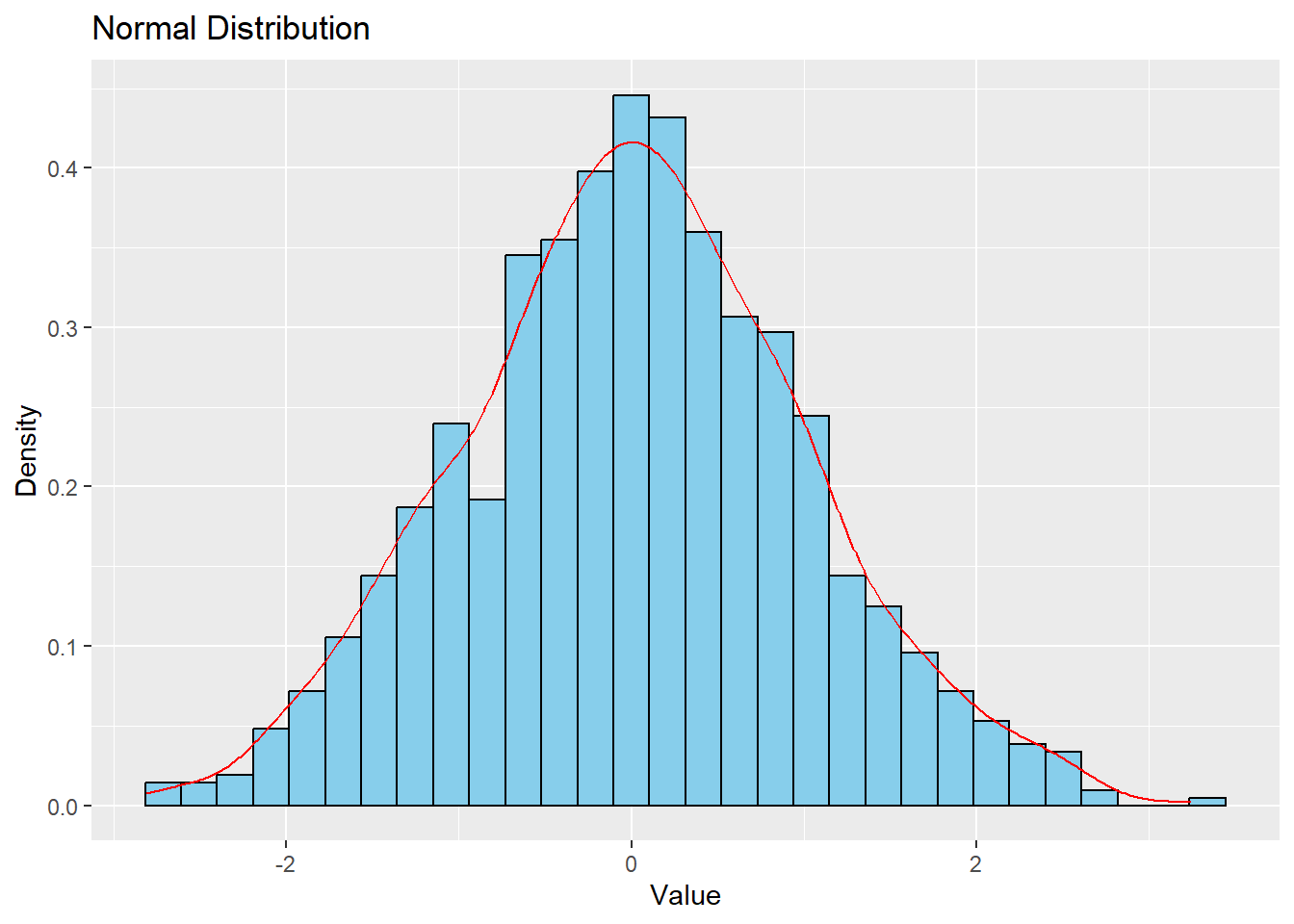
Normal Distribution
The normal distribution, also known as the Gaussian distribution, is symmetric and bell-shaped.
# Generate normal distribution datanormal_data <-data.frame(x =rnorm(1000))# Plotggplot(normal_data, aes(x)) +geom_histogram(aes(y = ..density..), bins =30, fill ="skyblue", color ="black") +geom_density(color ="red") +labs(title ="Normal Distribution", x ="Value", y ="Density")
Warning: The dot-dot notation (`..density..`) was deprecated in ggplot2 3.4.0.
ℹ Please use `after_stat(density)` instead.
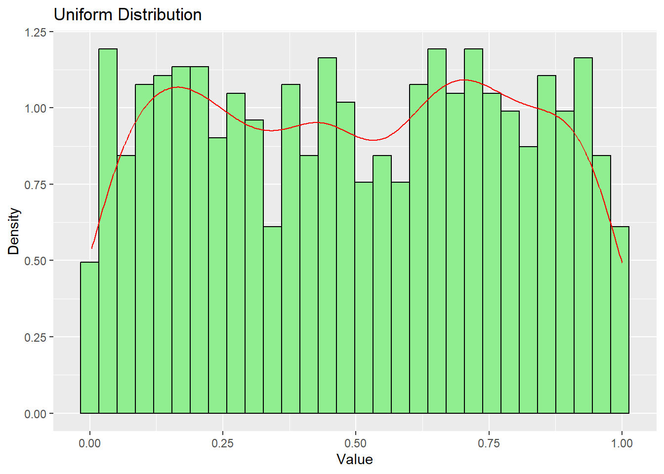
Uniform Distribution
In a uniform distribution, all values have an equal probability of occurrence.
# Generate uniform distribution datauniform_data <-data.frame(x =runif(1000))# Plotggplot(uniform_data, aes(x)) +geom_histogram(aes(y = ..density..), bins =30, fill ="lightgreen", color ="black") +geom_density(color ="red") +labs(title ="Uniform Distribution", x ="Value", y ="Density")
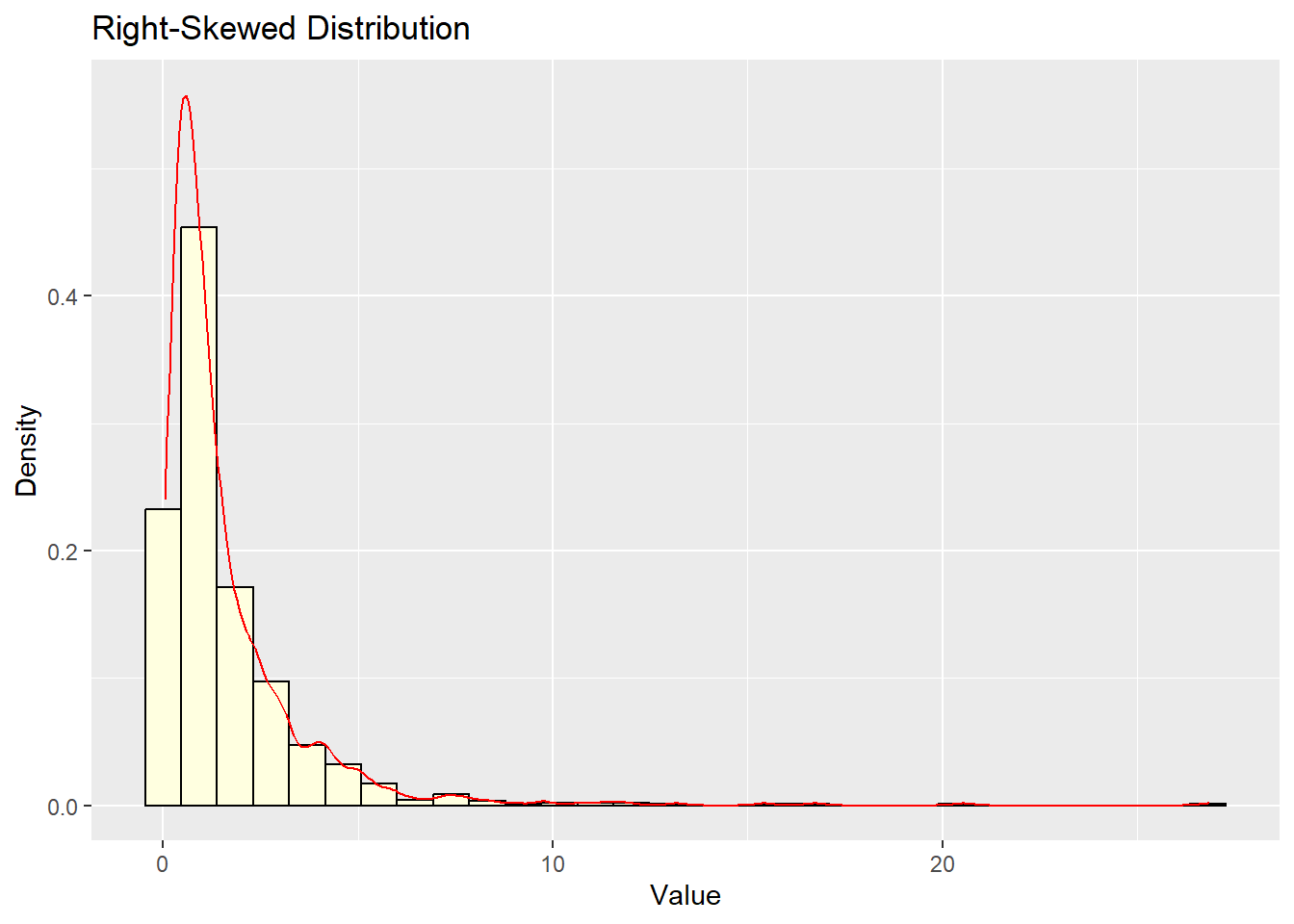
Skewed Distributions
Skewed distributions are asymmetric, with one tail longer than the other.
# Generate right-skewed dataright_skewed <-data.frame(x =rlnorm(1000))# Plotggplot(right_skewed, aes(x)) +geom_histogram(aes(y = ..density..), bins =30, fill ="lightyellow", color ="black") +geom_density(color ="red") +labs(title ="Right-Skewed Distribution", x ="Value", y ="Density")
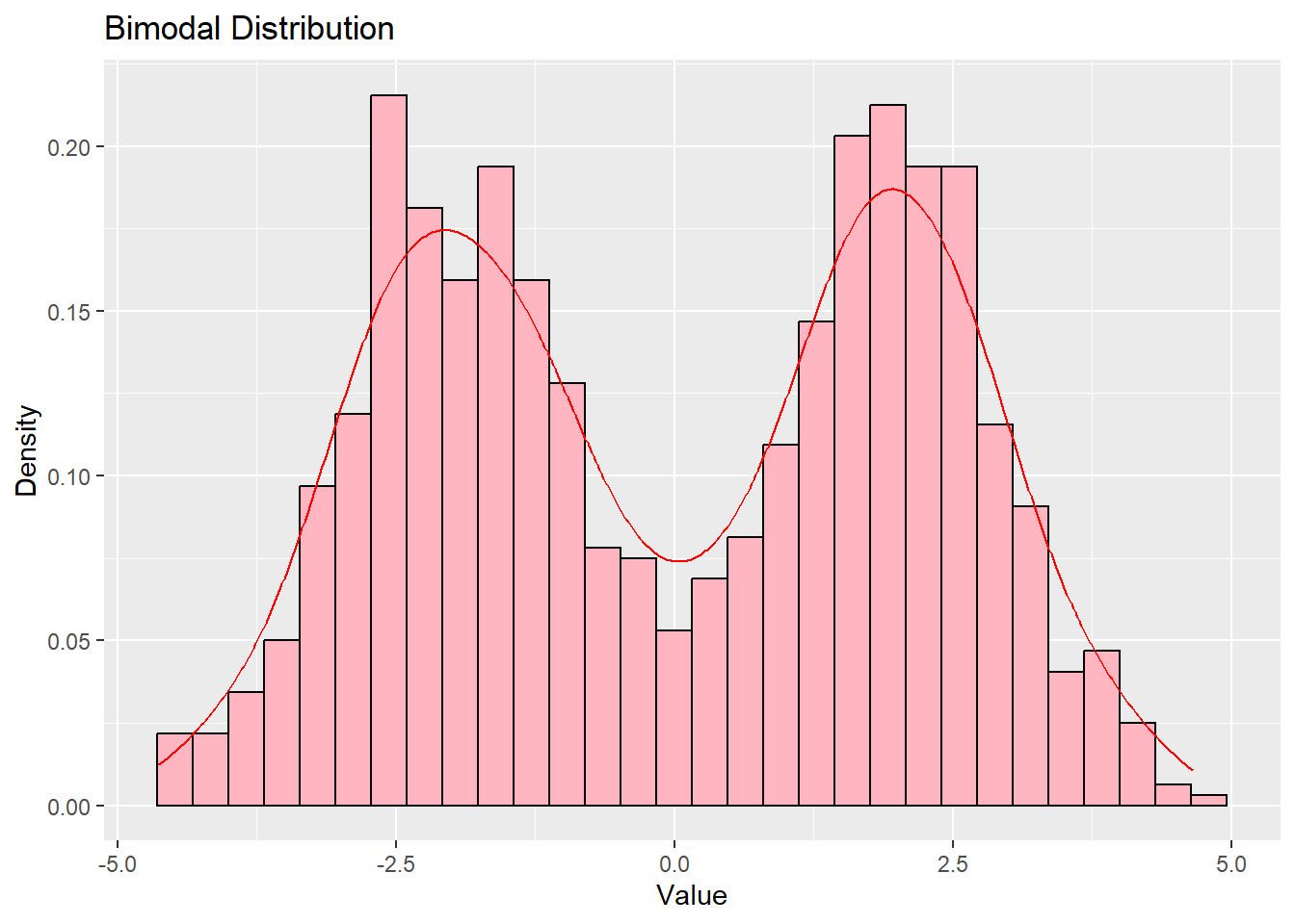
Bimodal Distribution
A bimodal distribution has two peaks, indicating two distinct subgroups in the data.
# Generate bimodal databimodal_data <-data.frame(x =c(rnorm(500, mean =-2), rnorm(500, mean =2)))# Plotggplot(bimodal_data, aes(x)) +geom_histogram(aes(y = ..density..), bins =30, fill ="lightpink", color ="black") +geom_density(color ="red") +labs(title ="Bimodal Distribution", x ="Value", y ="Density")
Distribution
Key Properties
Examples
Symmetric (Normal)
Symmetric, bell-shaped, most values close to the mean
Adult height in population, IQ test scores, measurement errors, standardized exam results
Uniform
Equal probability across the entire range
Last digit of phone numbers, random day of the week selection, position of pointer after spinning a wheel of fortune
Bimodal
Two distinct peaks, suggests presence of subgroups
Age structure in university towns (students and permanent residents), opinions on strongly polarizing topics, traffic intensity hours (morning and afternoon peak)
Right-skewed (Positively skewed)
Extended “tail” on the right side, most values less than the mean
Queue waiting time, commute time to work, age at first marriage
Heavy-tailed skewed (Log-normal)
Strong right asymmetry, values cannot be negative, long “fat tail”
Personal income, housing prices, household size
Extreme-tailed skewed (Power law)
Extreme asymmetry, “rich get richer” effect, no characteristic scale
Wealth of the richest individuals, city populations, number of followers on social media, number of citations of scientific publications
5.3 Visualizing Real-World Data Distributions
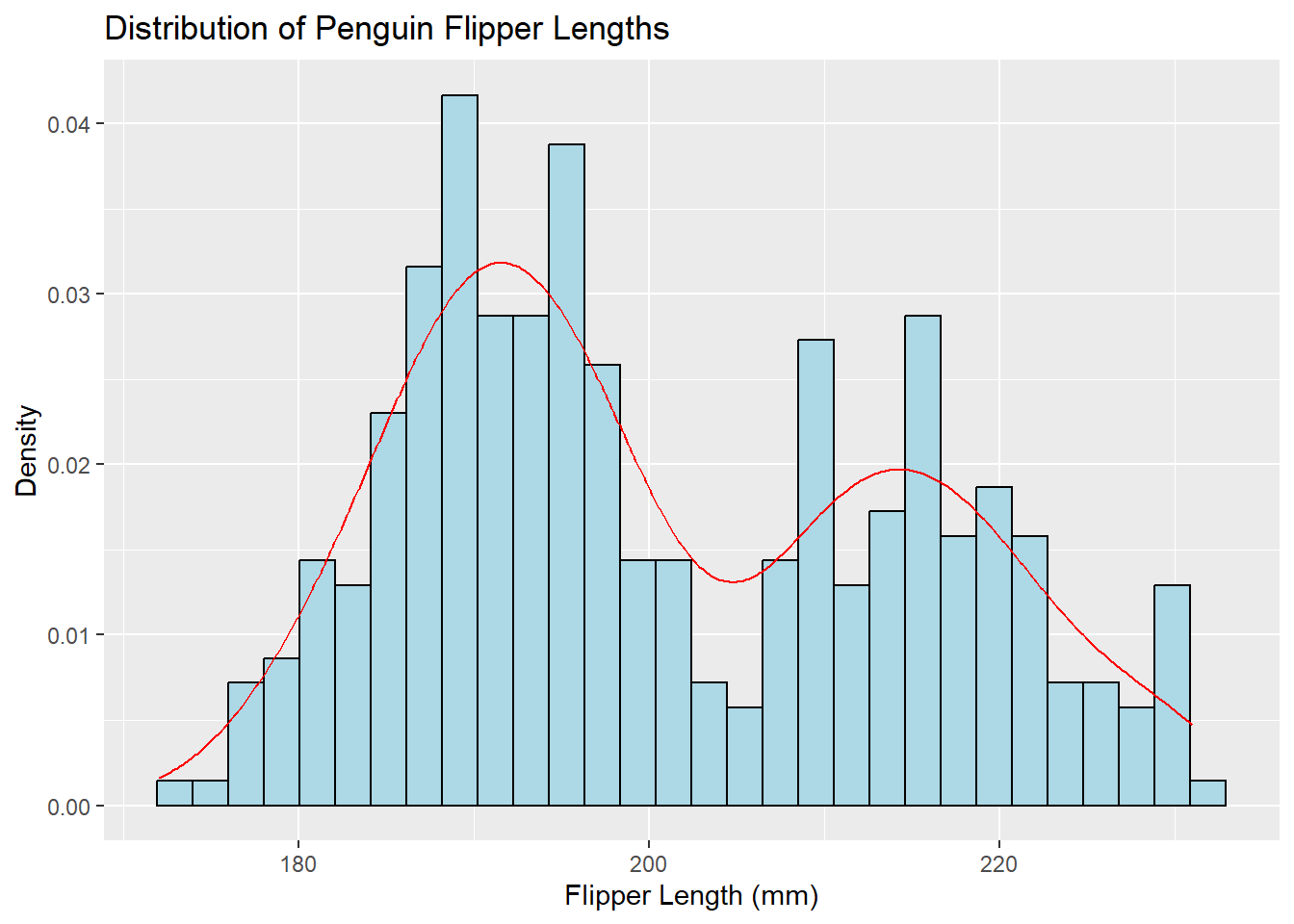
Let’s use the palmerpenguins dataset to explore data distributions.
Histogram and Density Plot
Understanding Histograms and Density
⭐ A histogram is a special graph for numerical data where:
Data is grouped into ranges (called “bins”)
Bars touch each other (unlike bar charts!) because the data is continuous
Each bar’s height shows how many values fall into that range
Think of density as showing how common or concentrated certain values are in your data:
A higher point on a density curve (or taller bar in a histogram) means those values appear more frequently in your data
A lower point means those values are less common
Just like a crowded area has more people per space (higher density), a taller part of the graph shows values that appear more often in your dataset!
ggplot(penguins, aes(x = flipper_length_mm)) +geom_histogram(aes(y = ..density..), bins =30, fill ="lightblue", color ="black") +geom_density(color ="red") +labs(title ="Distribution of Penguin Flipper Lengths", x ="Flipper Length (mm)", y ="Density")
Warning: Removed 2 rows containing non-finite outside the scale range
(`stat_bin()`).
Warning: Removed 2 rows containing non-finite outside the scale range
(`stat_density()`).
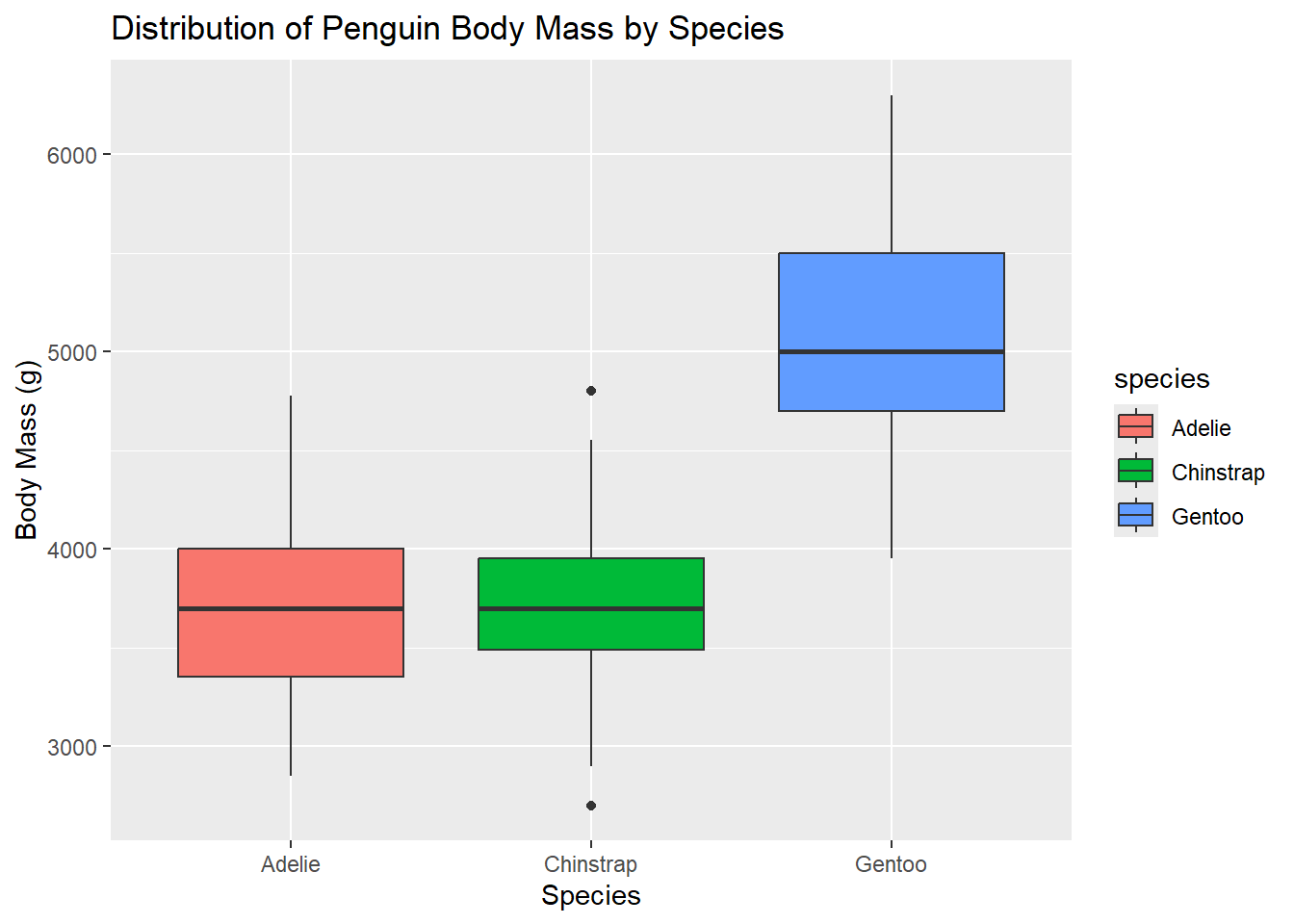
Box Plot
Box plots are useful for comparing distributions across categories.
ggplot(penguins, aes(x = species, y = body_mass_g, fill = species)) +geom_boxplot() +labs(title ="Distribution of Penguin Body Mass by Species", x ="Species", y ="Body Mass (g)")
Warning: Removed 2 rows containing non-finite outside the scale range
(`stat_boxplot()`).
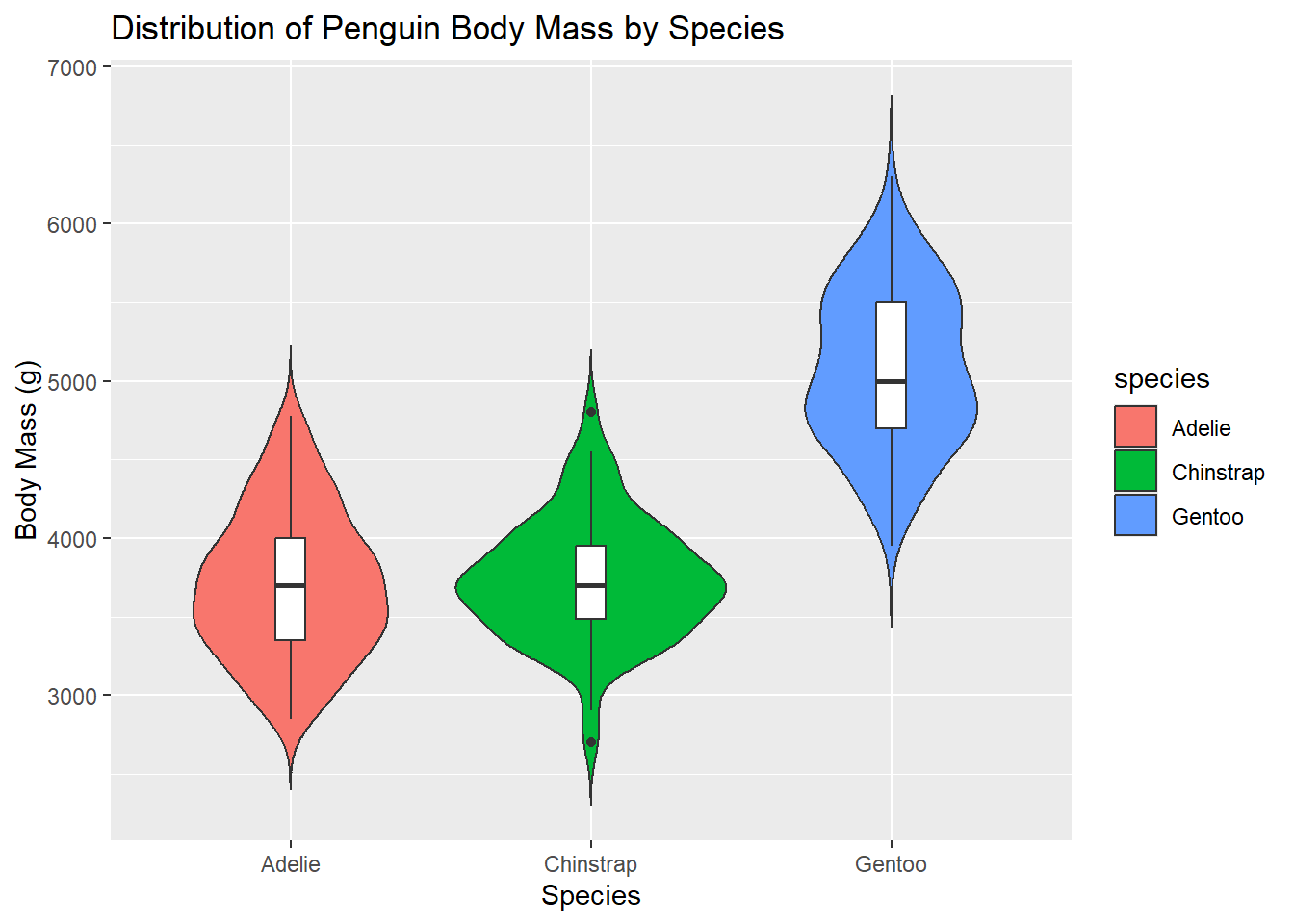
Violin Plot
Violin plots combine box plot and density plot features.
ggplot(penguins, aes(x = species, y = body_mass_g, fill = species)) +geom_violin(trim =FALSE) +geom_boxplot(width =0.1, fill ="white") +labs(title ="Distribution of Penguin Body Mass by Species", x ="Species", y ="Body Mass (g)")
Warning: Removed 2 rows containing non-finite outside the scale range
(`stat_ydensity()`).
Warning: Removed 2 rows containing non-finite outside the scale range
(`stat_boxplot()`).
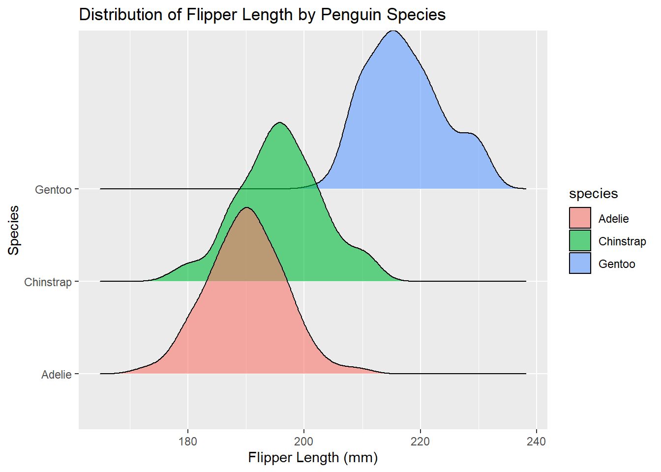
Ridgeline Plot
Ridgeline plots are useful for comparing multiple distributions.
library(ggridges)ggplot(penguins, aes(x = flipper_length_mm, y = species, fill = species)) +geom_density_ridges(alpha =0.6) +labs(title ="Distribution of Flipper Length by Penguin Species",x ="Flipper Length (mm)",y ="Species")
Picking joint bandwidth of 2.38
Warning: Removed 2 rows containing non-finite outside the scale range
(`stat_density_ridges()`).
Conclusion
Understanding and visualizing data distributions is crucial in data analysis. ggplot2 provides a flexible and powerful toolkit for creating various types of distribution plots. By exploring different visualization techniques, we can gain insights into the underlying patterns and characteristics of our data.
5.4 Understanding Outliers
Before diving into specific measures, it’s crucial to understand the concept of outliers, as they can significantly impact many descriptive statistics.
Outliers are data points that differ significantly from other observations in the dataset. They can occur due to:
Measurement or recording errors
Genuine extreme values in the population
Outliers can have a substantial effect on many statistical measures, especially those based on means or sums of squared deviations. Therefore, it’s essential to:
Identify outliers through both statistical methods and domain knowledge
Investigate the cause of outliers
Make informed decisions about whether to include or exclude them in analyses
Throughout this guide, we’ll discuss how different descriptive measures are affected by outliers.
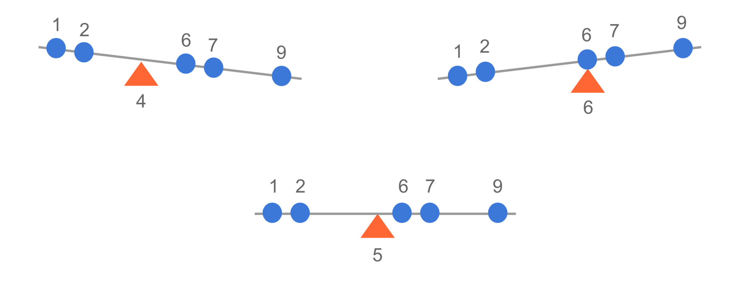
The mean (\mu) acts as the perfect balance point of this seesaw. For our data:
\mu = \frac{1 + 2 + 6 + 7 + 9}{5} = 5
What happens at different support points? 🤔
Support point at 6 (too high):
Left side: Values (1, 2) are below
Right side: Values (7, 9) are above
\sum distances from left = (6-1) + (6-2) = 9
\sum distances from right = (7-6) + (9-6) = 4
The seesaw tilts left! ⬅️ because 9 > 4
Support point at 4 (too low):
Left side: Values (1, 2) are below
Right side: Values (6, 7, 9) are above
\sum distances from left = (4-1) + (4-2) = 5
\sum distances from right = (6-4) + (7-4) + (9-4) = 10
The seesaw tilts right! ➡️ because 5 < 10
Support point at mean (5) (perfect balance):
\sum distances below = \sum distances above
((5-1) + (5-2)) = ((6-5) + (7-5) + (9-5))
7 = 7 ✨ Perfect balance!
This shows why the mean is the unique balance point, where:
\sum_{i=1}^n (x_i - \mu) = 0
The seesaw will always tilt unless the support point is placed exactly at the mean! 🎪
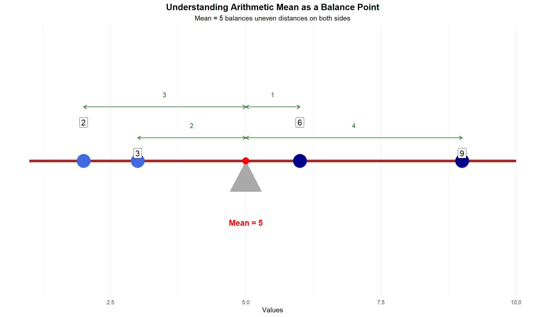
Mean as a Balance Point
This visualization shows how the arithmetic mean (5) acts as a balance point between clustered points on the left and dispersed points on the right:
Left side of the mean: - Points with values 2 and 3 - Close together (difference of 1 unit) - Distances from mean: 3 and 2 units - Sum of “pull” = 5 units
Right side of the mean: - Points with values 6 and 9 - More spread out (difference of 3 units) - Distances from mean: 1 and 4 units - Sum of “pull” = 5 units
Key observations:
The mean (5) is a balance point, even though:
Points on the left are clustered (2,3)
Points on the right are dispersed (6,9)
Green arrows show distances from the mean
Balance is maintained because:
Sum of distances balances out: (5-2) + (5-3) = (6-5) + (9-5)
Total sum of distances = 5 units on each side
Manual Calculation Example:
Let’s calculate the mean for the dataset: 2, 4, 4, 5, 5, 7, 9
As we can see, the outlier (100) drastically affects the mean.
Median
The median is the “middle value” that divides ordered data into two equal-sized halves.
More precisely:
If n is odd: The median is the middle observation (the one at position (n+1)/2)
If n is even: The median is the average of the two middle observations (at positions n/2 and n/2 + 1)
Manual Calculation Example:
Using the same dataset: 2, 4, 4, 5, 5, 7, 9
Step
Description
Result
1
Order the data
2, 4, 4, 5, 5, 7, 9
2
Find the middle value
5
For even number of values, take the average of the two middle values.
R calculation:
data <-c(2, 4, 4, 5, 5, 7, 9)median(data)
[1] 5
median(data_with_outlier)
[1] 5
Pros:
Not affected by extreme outliers
Better for skewed distributions
Cons:
Doesn’t use all data points
Less useful for further statistical calculations
Warning
To find the position of the median in a dataset:
First sort the data in ascending order
If n is odd:
Median position = \frac{n + 1}{2}
If n is even:
First median position = \frac{n}{2}
Second median position = \frac{n}{2} + 1
Median = \frac{\text{value at }\frac{n}{2} + \text{value at }(\frac{n}{2}+1)}{2}
For example:
Odd n=7: position = \frac{7+1}{2} = 4th value
Even n=8: positions = \frac{8}{2} = 4th and 4+1 = 5th value
Mode
The mode is the most frequently occurring value.
Manual Calculation Example:
Using the dataset: 2, 4, 4, 5, 5, 7, 9
Value
Frequency
2
1
4
2
5
2
7
1
9
1
The mode is 4 and 5 (bimodal).
R calculation:
library(modeest)mfv(data) # Most frequent value
[1] 4 5
Pros:
Only measure of central tendency for nominal data
Can identify multiple peaks in the data
Cons:
Not always uniquely defined
Not useful for continuous data
Weighted (arithmetic) Mean (*)
The weighted mean is used when some data points are more important than others. There are two types of weighted means: with not normalized weights and with normalized weights.
Weighted Mean with Not Normalized Weights
This is the standard form of the weighted mean, where weights can be any positive numbers representing the importance of each data point.
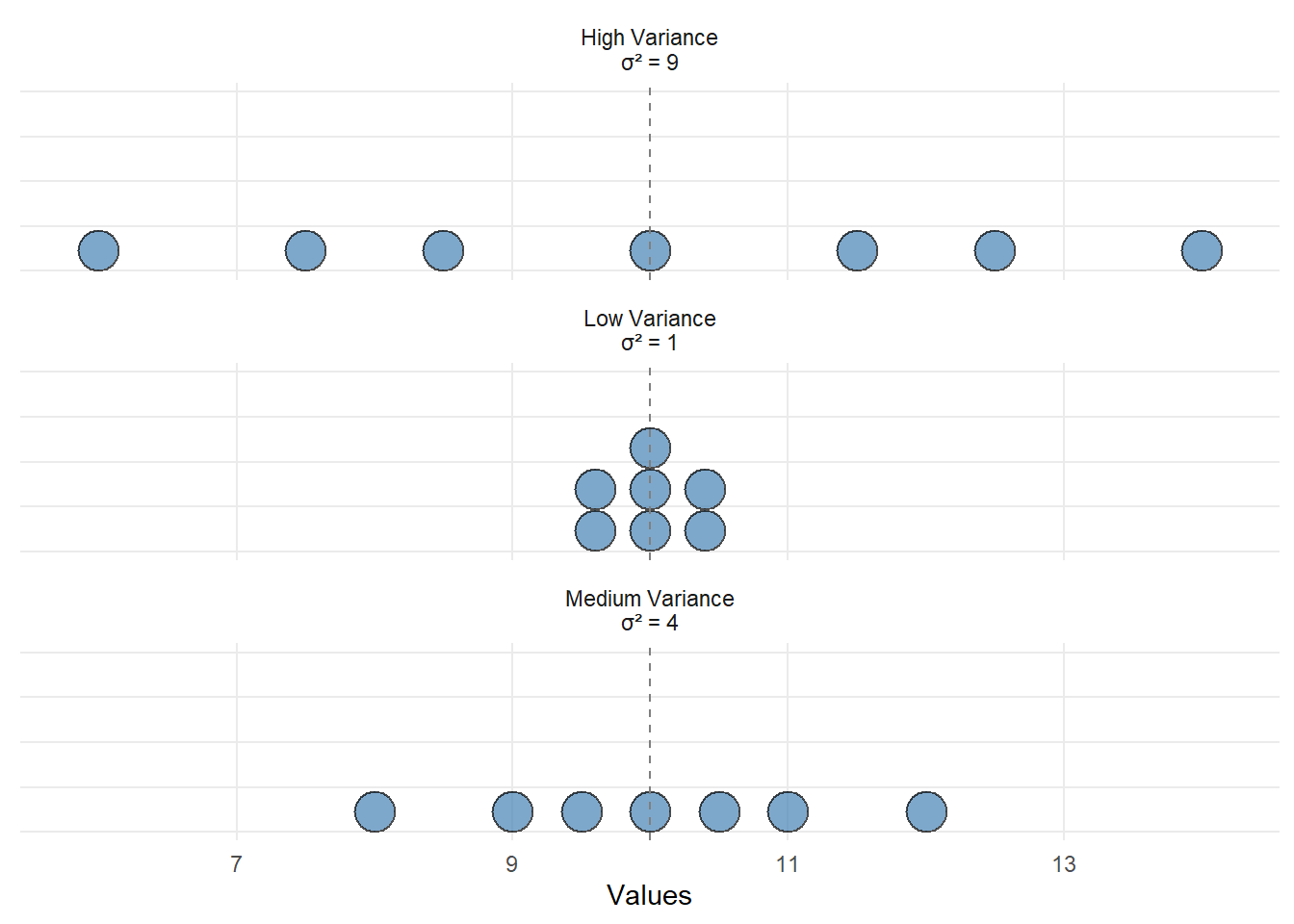
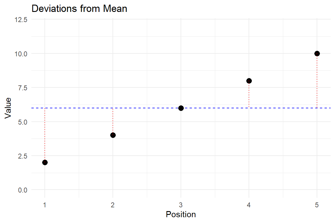
Deviations show distance from mean (red dotted lines)
Squaring makes all deviations positive (blue bars)
Larger deviations contribute more to variance
Manual Calculation Example:
Using the dataset: 2, 4, 4, 5, 5, 7, 9
Step
Description
Calculation
1
Calculate the mean
\bar{x} = 5.14
2
Subtract the mean from each value and square the result
(2 - 5.14)^2 = 9.86
(4 - 5.14)^2 = 1.30
(4 - 5.14)^2 = 1.30
(5 - 5.14)^2 = 0.02
(5 - 5.14)^2 = 0.02
(7 - 5.14)^2 = 3.46
(9 - 5.14)^2 = 14.90
3
Sum the squared differences
30.86
4
Divide by (n-1), i.e. by the number of observations - 1
30.86 / 6 = 5.14
R calculation:
var(data)
[1] 5.142857
Pros:
Uses all data points
Foundation for many statistical tests
Cons:
Units are squared, making interpretation less intuitive
Sensitive to outliers
Bessel’s Correction: Why We Divide by (n-1) And Not by n
The Key Insight:
When we calculate deviations from the mean, they must sum to zero. This is a mathematical fact: \sum(x_i - \bar{x}) = 0
Think of it Like This:
If you have 5 numbers and their mean:
Once you calculate 4 deviations from the mean
The 5th deviation MUST be whatever makes the sum zero
You don’t really have 5 independent deviations
You only have 4 truly “free” deviations
Simple Example:
Numbers: 2, 4, 6, 8, 10
Mean = 6
Deviations: -4, -2, 0, +2, +4
Notice they sum to zero
If you know any 4 deviations, the 5th is predetermined!
This is Why:
When calculating variance: s^2 = \frac{\sum(x_i - \bar{x})^2}{n-1}
We divide by (n-1) not n
Because only (n-1) deviations are truly independent
The last one is determined by the others
Degrees of Freedom:
n = number of observations
1 = constraint (deviations must sum to zero)
n-1 = degrees of freedom = number of truly independent deviations
When to Use It:
When calculating sample variance
When calculating sample standard deviation
When NOT to Use It:
Population calculations (when you have all data)
Remember:
It’s not just a statistical trick
Deviations from the mean must sum to zero
This constraint costs us one degree of freedom
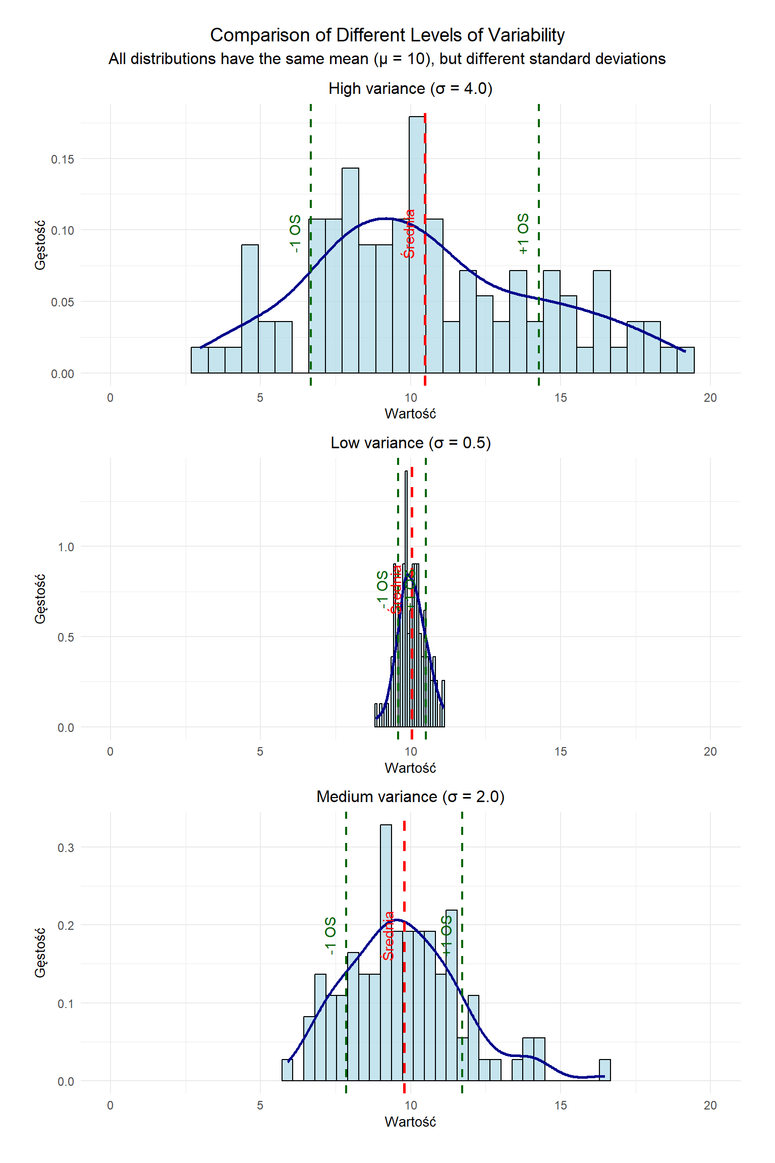
Standard Deviation
The standard deviation is the square root of the variance and measures the average dispersion of the data about their arithmetic mean. In contrast to the variance, it has the advantage of being expressed in the same units as the original measurements, making its interpretation more intuitive.
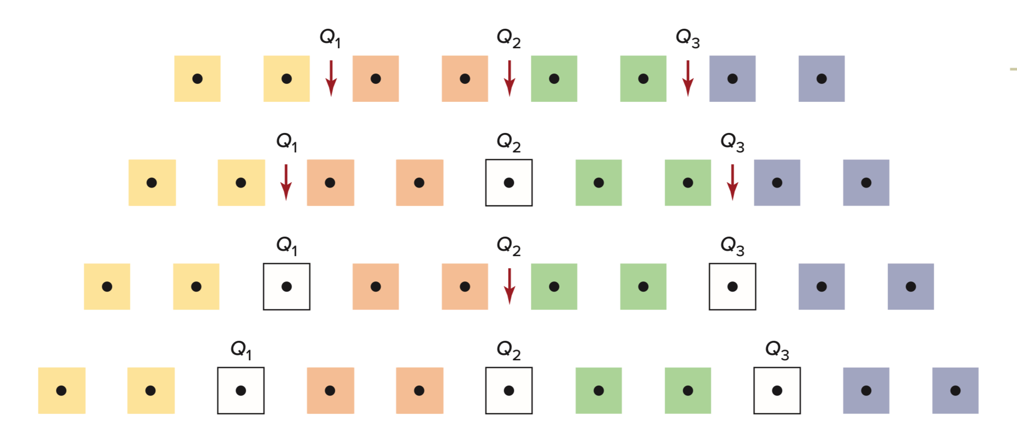
Percentiles: A More Precise Measure of Relative Standing (*)
What Are Percentiles?
Percentiles give us a more detailed view by dividing data into 100 equal parts.
Key Points:
The 25th percentile equals Q1
The 50th percentile equals Q2 (median)
The 75th percentile equals Q3
Calculating Percentiles
The Formula: P_k = \frac{k(n+1)}{100}
Where:
P_k is the position for the kth percentile
k is the percentile we want (1-100)
n is the number of observations
Example 3: Finding the 60th Percentile Let’s use student homework scores: 72, 75, 78, 80, 82, 85, 88, 90, 92, 95
Step 1: Calculate position
n = 10 scores
For 60th percentile: P_{60} = \frac{60(10+1)}{100} = 6.6
Step 2: Find surrounding values
Position 6: score of 85
Position 7: score of 88
Step 3: Interpolate (important: percentiles use linear interpolation)
We need to go 0.6 of the way between 85 and 88 P_{60} = 85 + 0.6(88-85)P_{60} = 85 + 0.6(3)P_{60} = 85 + 1.8 = 86.8
What this means: 60% of students scored 86.8 or below.
Percentile Ranks (PR) (*)
What is a Percentile Rank?
Percentiles and percentile ranks are related but opposite concepts:
Key Difference: - Percentile → “What score is at the 75th percentile?” (position → value) - Percentile Rank → “What percentile rank does a score of 75 have?” (value → position)
Percentile rank tells us what percentage of values fall below a specific score. Think of it as answering: “What percentage of the class did I score higher than?”
The Formula
PR = \frac{\text{number of values below} + 0.5 \times \text{number of equal values}}{\text{total number of values}} \times 100
Example 4: Finding a Percentile Rank
Consider these exam scores (sorted):
Position
1
2
3
4
5
6
7
8
9
10
Score
65
70
70
75
75
75
80
85
85
90
Let’s find the PR for a score of 75 (highlighted).
Interpretation: A score of 75 is higher than 45% of the class scores.
Sanity check: This makes sense! There are 3 scores clearly below 75, and you’re in the middle of the 3 people who scored 75, so you’re at roughly position 4.5 out of 10 = 45%. ✓
Understanding the 0.5 Factor
Q: Why do we multiply equal values by 0.5?
A: The 0.5 factor means we count half of the tied values as being below us.
Here’s the intuition: If you scored 75 along with two other people, should you count yourself as: - Above all of them? (That wouldn’t be fair to them) - Below all of them? (That wouldn’t be fair to you) - Somewhere in the middle? ✓ (This is the fairest approach)
Using our example: - 3 people scored below 75: we count all 3 of them - 3 people scored exactly 75 (including you): we count half of them = 0.5 × 3 = 1.5 - Total below or tied: 3 + 1.5 = 4.5 out of 10 = 45%
By using 0.5, we’re essentially saying: “Of the people who tied with me, I can assume I did better than half of them.” This treats everyone with the same score equally and avoids giving any one person an unfair advantage.
Practice Problem
Using the same dataset above, find the percentile rank for a score of 85.
Answer: A score of 85 has a percentile rank of 80%.
Note on Software Implementation
Different software packages may use slightly different methods for calculating percentile ranks: - R: Use ecdf() function or manually calculate - Python (pandas): Use rank(pct=True) method
These may produce slightly different results depending on how they handle ties and boundary cases.
Understanding and Interpreting Box Plots
Box plots (also known as box-and-whisker plots) are powerful visualization tools for understanding data distributions. In this section, we’ll explore how to construct and interpret box plots using height measurements from two groups.
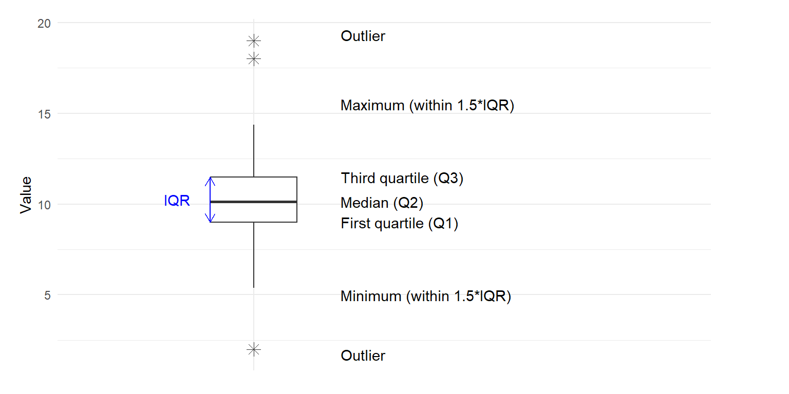
Construction of the Tukey Box Plot
The box plot was introduced by John Tukey as part of his exploratory data analysis toolkit. It provides a standardized way of displaying the distribution of data based on a five-number summary.
The Five-Number Summary
A box plot represents five key statistical values:
Minimum: The smallest value in the dataset (excluding outliers)
First Quartile (Q1): The 25th percentile, below which 25% of observations fall
Median (Q2): The 50th percentile, which divides the dataset into two equal halves
Third Quartile (Q3): The 75th percentile, below which 75% of observations fall
Maximum: The largest value in the dataset (excluding outliers)
Box Plot Components
Figure 5.2: Boxplot diagram showing its key components.
The components of a box plot include:
The Box:
Represents the interquartile range (IQR), containing the middle 50% of the data
Lower edge represents Q1
Upper edge represents Q3
Line inside the box represents the median (Q2)
The Whiskers:
Extend from the box to show the range of non-outlier data
In a Tukey box plot, whiskers extend up to 1.5 × IQR from the box edges:
Lower whisker: extends to the minimum value ≥ (Q1 - 1.5 × IQR)
Upper whisker: extends to the maximum value ≤ (Q3 + 1.5 × IQR)
Outliers:
Points that fall beyond the whiskers
Individually plotted as dots or symbols
Values that are < (Q1 - 1.5 × IQR) or > (Q3 + 1.5 × IQR)
Key Features to Observe
When interpreting box plots, look for these characteristics:
Central Tendency: Location of the median line within the box
Dispersion: Width of the box (IQR) and length of the whiskers
Skewness:
Symmetrical data: median is approximately in the middle of the box, whiskers are roughly equal in length
Right (positive) skew: median is closer to the bottom of the box, upper whisker is longer
Left (negative) skew: median is closer to the top of the box, lower whisker is longer
Outliers: Presence of individual points beyond the whiskers
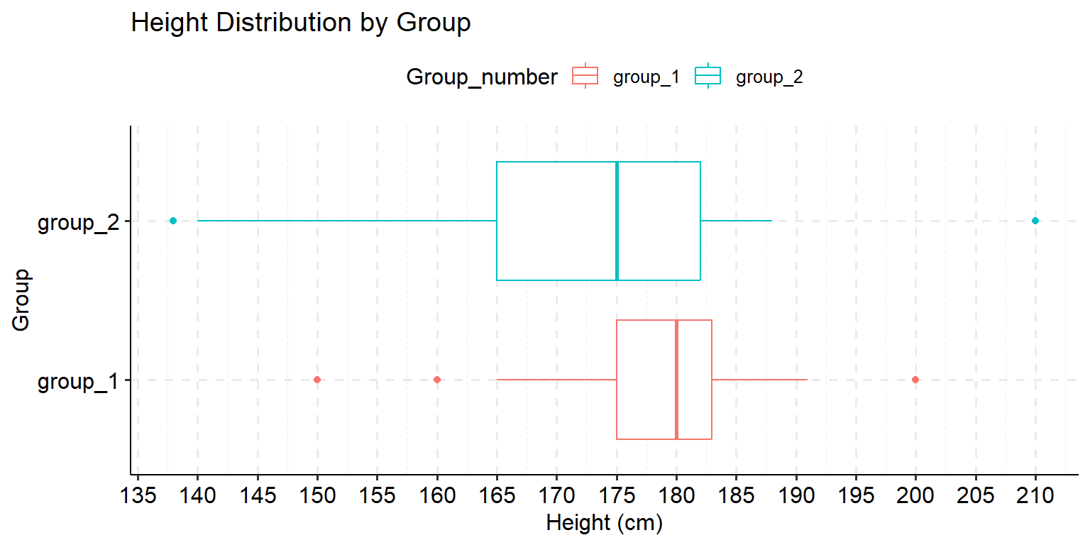
Case Study: Comparing Heights Between Groups
Let’s apply our understanding of box plots to a real dataset. We have height measurements (in centimeters) from two groups of 25 students each.
# Create the datasetdata_height <-data.frame(group_1 =c(150, 160, 165, 168, 172, 173, 175, 176, 177, 178, 179, 180, 180, 181, 181, 182, 182, 183, 183, 184, 186, 188, 190, 191, 200),group_2 =c(138, 140, 148, 152, 164, 164, 165, 165, 166, 166, 170, 175, 175, 175, 182, 182, 182, 182, 182, 182, 183, 183, 183, 188, 210))# Transform dataset from wide to long formatdata_height_l <-gather(data = data_height, key ="Group_number", value ="height", group_1:group_2)# Display the first few rowshead(data_height_l)
Warning: The `size` argument of `element_line()` is deprecated as of ggplot2 3.4.0.
ℹ Please use the `linewidth` argument instead.
ℹ The deprecated feature was likely used in the ggpubr package.
  Please report the issue at <https://github.com/kassambara/ggpubr/issues>.
Warning: The `size` argument of `element_rect()` is deprecated as of ggplot2 3.4.0.
ℹ Please use the `linewidth` argument instead.
ℹ The deprecated feature was likely used in the ggpubr package.
  Please report the issue at <https://github.com/kassambara/ggpubr/issues>.
Figure 5.3: Box plots comparing height distributions between groups.
To complement our box plots, let’s also look at the density distributions:
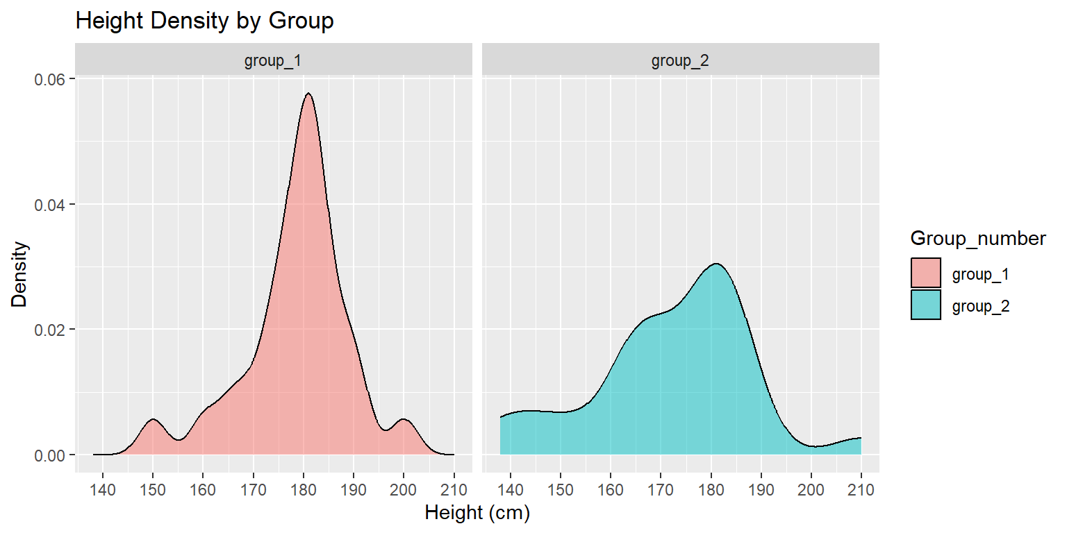
# Create density plotsggplot(data = data_height_l) +geom_density(aes(x = height, fill = Group_number), alpha =0.5) +facet_grid(~ Group_number) +scale_x_continuous(breaks =seq(130, 210, 10)) +labs(title ="Height Density by Group",x ="Height (cm)",y ="Density")
Figure 5.4: Density plots showing the height distributions for each group.
Box Plot Interpretation Exercise
Based on the box plots and density plots above, determine whether each of the following statements is True or False. For each statement, provide a brief explanation based on evidence from the visualizations.
Exercise Questions
Students from group 2 (G2) in the studied sample are, on average, taller than those from group 1 (G1).
Group 1 (G1) height measurements are more dispersed/spread out than group 2 (G2).
The lowest person is in group 2 (G2).
Both data sets are negatively (left) skewed.
Half of the students in group 2 (G2) measure at least 175 cm.
Hints for Interpretation
When answering these questions, consider:
The position of the median line within each box
The relative sizes of the boxes (IQR)
The positions of the minimum and maximum values
The symmetry of the distributions (balanced or skewed)
The lengths of the whiskers
For each statement, determine whether it is True or False and provide your explanation:
Answer Template
Students from G2 are, on average, taller than G1: [True/False]
Explanation:
G1 height is more dispersed/spread out: [True/False]
Explanation:
The lowest person is in G2: [True/False]
Explanation:
Both data sets are negatively (left) skewed: [True/False]
Explanation:
Half of G2 measure at least 175 cm: [True/False]
Explanation:
Let’s review the answers to our box plot interpretation questions:
Solutions
Students from G2 are, on average, taller than G1: False
Explanation: The median height (middle line in the boxplot) for G1 is higher than G2.
G1 height is more dispersed/spread out: False
Explanation: G2 shows greater dispersion. This is visible in the boxplot where G2 has a larger interquartile range (IQR) of 17.5 cm compared to G1’s 9.5 cm. G2 also has a wider range from minimum to maximum values.
The lowest person is in G2: True
Explanation: The minimum value in G2 is 138 cm, which is lower than the minimum value in G1 (150 cm).
Both data sets are negatively (left) skewed: True
Explanation: In both groups, the median line is positioned toward the upper part of the box, and the lower whisker is longer than the upper whisker. This indicates that there’s a longer tail on the left side of the distribution, which means negative skewness.
Half of G2 measure at least 175 cm: True
Explanation: The median (middle line in the boxplot) for G2 is 175 cm, which means that 50% of the values are greater than or equal to 175 cm.
R Code Reference
Here’s the complete R code used in this section:
# Load required packageslibrary(tidyr)library(ggplot2)library(ggpubr)# Set display optionsoptions(scipen =999, digits =3)# Create the datasetdata_height <-data.frame(group_1 =c(150, 160, 165, 168, 172, 173, 175, 176, 177, 178, 179, 180, 180, 181, 181, 182, 182, 183, 183, 184, 186, 188, 190, 191, 200),group_2 =c(138, 140, 148, 152, 164, 164, 165, 165, 166, 166, 170, 175, 175, 175, 182, 182, 182, 182, 182, 182, 183, 183, 183, 188, 210))# Transform dataset from wide to long formatdata_height_l <-gather(data = data_height, key ="Group_number", value ="height", group_1:group_2)# Display the first few rowshead(data_height_l)# Calculate summary statistics for each groupgroup1_stats <-summary(data_height$group_1)group2_stats <-summary(data_height$group_2)# Calculate IQRgroup1_iqr <-IQR(data_height$group_1)group2_iqr <-IQR(data_height$group_2)# Create horizontal boxplotsggplot(data = data_height_l) +geom_boxplot(aes(x = Group_number, y = height, colour = Group_number), notch =FALSE) +coord_flip() +scale_y_continuous(breaks =seq(130, 210, 5)) +theme_pubr() +grids(linetype ="dashed") +labs(title ="Height Distribution by Group",x ="Group",y ="Height (cm)")# Create density plotsggplot(data = data_height_l) +geom_density(aes(x = height, fill = Group_number), alpha =0.5) +facet_grid(~ Group_number) +scale_x_continuous(breaks =seq(130, 210, 10)) +labs(title ="Height Density by Group",x ="Height (cm)",y ="Density")
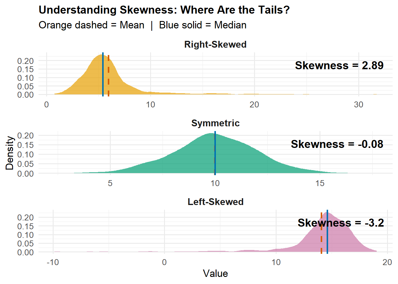
5.9 Shape Measures (*)
Skewness
What it measures: The asymmetry of your data distribution. Think of it as answering “which tail is longer?”
Formula:
SK = \frac{n}{(n-1)(n-2)} \sum_{i=1}^n \left(\frac{x_i - \bar{x}}{s}\right)^3
Quick interpretation:
SK > 0: Right tail is longer (most data on the left, few high outliers)
SK < 0: Left tail is longer (most data on the right, few low outliers)
SK ≈ 0: Roughly symmetric
Clear Visualization of Skewness
library(moments)
Attaching package: 'moments'
The following object is masked from 'package:modeest':

    skewness
library(ggplot2)library(tidyverse)set.seed(123)# Generate clear examples with more data for smooth distributionsright_skewed <-c(rnorm(800, 5, 1.5), rexp(200, 0.2) +5)left_skewed <-20-c(rnorm(800, 5, 1.5), rexp(200, 0.2) +5)symmetric <-rnorm(1000, 10, 2)# Combine into data framedf_skew <-tibble(value =c(right_skewed, left_skewed, symmetric),type =factor(rep(c("Right-Skewed", "Left-Skewed", "Symmetric"),each =1000),levels =c("Right-Skewed", "Symmetric", "Left-Skewed")))# Calculate statistics for each typestats_skew <- df_skew %>%group_by(type) %>%summarise(mean =mean(value),median =median(value),sk =round(skewness(value), 2) )# Create density plot with clear annotationsggplot(df_skew, aes(x = value, fill = type)) +geom_density(alpha =0.7, color =NA) +geom_vline(data = stats_skew, aes(xintercept = mean),color ="#D55E00", linewidth =1, linetype ="dashed") +geom_vline(data = stats_skew, aes(xintercept = median),color ="#0072B2", linewidth =1, linetype ="solid") +geom_text(data = stats_skew,aes(x =Inf, y =Inf, label =paste0("Skewness = ", sk)),hjust =1.1, vjust =2, size =5, fontface ="bold") +facet_wrap(~type, scales ="free", ncol =1) +scale_fill_manual(values =c("#E69F00", "#009E73", "#CC79A7")) +labs(title ="Understanding Skewness: Where Are the Tails?",subtitle ="Orange dashed = Mean | Blue solid = Median",x ="Value",y ="Density" ) +theme_minimal(base_size =13) +theme(legend.position ="none",strip.text =element_text(face ="bold", size =12),plot.title =element_text(face ="bold", size =14) )
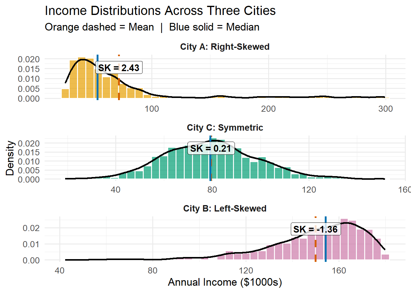
Applied Example: Income Distribution
set.seed(456)# Realistic income scenarios (in thousands)# Right-skewed: Most earn moderate, few earn very highincome_city_a <-c(rgamma(900, shape =2, scale =15) +25, runif(100, 150, 300))# Left-skewed: Most earn high, few earn low (wealthy area)income_city_b <-180-c(rgamma(900, shape =2, scale =15), runif(100, 0, 50))# Symmetric: More balanced income distributionincome_city_c <-rnorm(1000, 80, 20)df_income <-tibble(income =c(income_city_a, income_city_b, income_city_c),city =factor(rep(c("City A: Right-Skewed", "City B: Left-Skewed", "City C: Symmetric"),each =1000),levels =c("City A: Right-Skewed", "City C: Symmetric","City B: Left-Skewed")))# Calculate statsstats_income <- df_income %>%group_by(city) %>%summarise(mean =mean(income),median =median(income),sk =round(skewness(income), 2) )ggplot(df_income, aes(x = income)) +geom_histogram(aes(y =after_stat(density), fill = city),bins =40, alpha =0.7, color ="white") +geom_density(linewidth =1, color ="black") +geom_vline(data = stats_income, aes(xintercept = mean),color ="#D55E00", linewidth =1.2, linetype ="dashed") +geom_vline(data = stats_income, aes(xintercept = median),color ="#0072B2", linewidth =1.2) +geom_label(data = stats_income,aes(x = mean, y =Inf, label =paste("SK =", sk)),vjust =1.5, hjust =0.5, size =4, fontface ="bold",fill ="white", alpha =0.8) +facet_wrap(~city, scales ="free", ncol =1) +scale_fill_manual(values =c("#E69F00", "#009E73", "#CC79A7")) +labs(title ="Income Distributions Across Three Cities",subtitle ="Orange dashed = Mean | Blue solid = Median",x ="Annual Income ($1000s)",y ="Density" ) +theme_minimal(base_size =13) +theme(legend.position ="none",strip.text =element_text(face ="bold", size =11) )
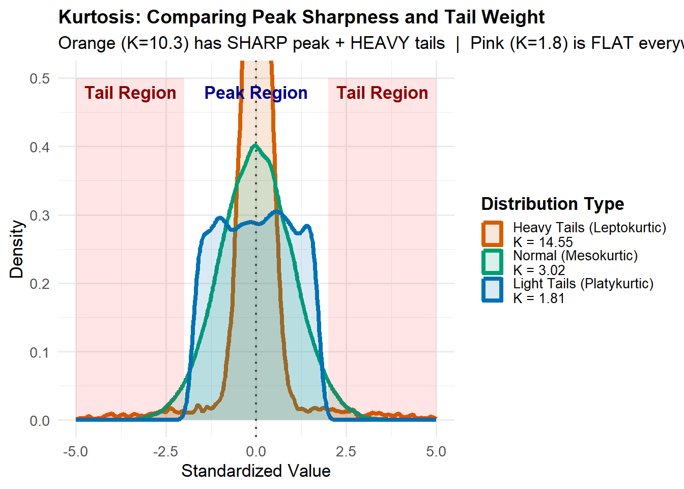
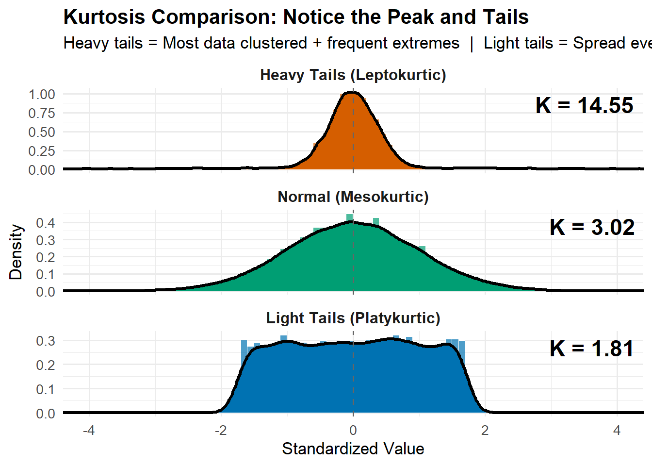
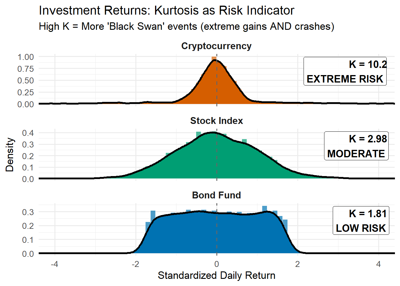
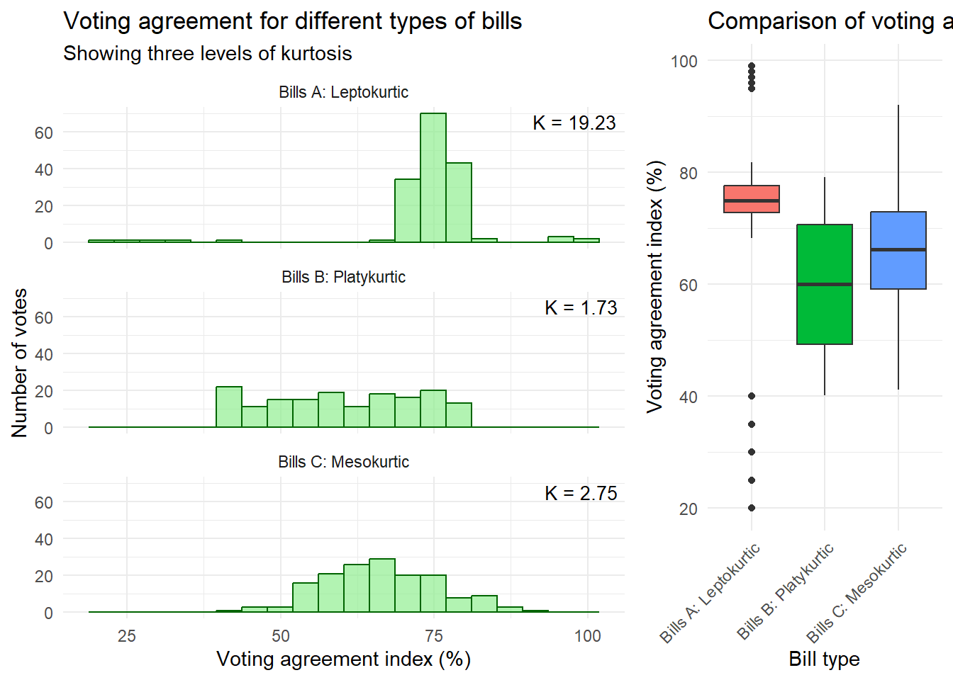
Kurtosis
What it measures: The “tailedness” of your distribution. Think of it as answering “how extreme are the extremes?”
Formula:
K = \frac{n(n+1)}{(n-1)(n-2)(n-3)} \sum_{i=1}^n \left(\frac{x_i - \bar{x}}{s}\right)^4 - \frac{3(n-1)^2}{(n-2)(n-3)}
Quick interpretation:
K > 3 (Leptokurtic): Heavy tails, sharp peak (more extreme values)
Low kurtosis (K < 2): Data stays predictable, within tight bounds
Normal kurtosis (K ≈ 3): Typical bell curve behavior
Visual cues:
Skewness: Look at tail length - mean vs median separation
Kurtosis: Look at peak sharpness AND tail thickness simultaneously
Practical meaning:
High kurtosis ≠ just “fat tails” - it’s a sharp peak WITH heavy tails
It means: “mostly clustered, but watch out for surprises”
5.10 Exercise 1. Center and dispersion of data
Data
We have salary data (in thousands of euros) from two small European companies:
Index
Company X
Company Y
1
2
3
2
2
3
3
2
4
4
3
4
5
3
4
6
3
4
7
3
4
8
3
4
9
3
5
10
4
5
11
4
5
12
4
5
13
4
5
14
4
5
15
5
6
16
5
6
17
5
6
18
5
7
19
20
7
20
35
8
This table presents the data for both Company X and Company Y side by side, with an index column for easy reference.
Measures of Central Tendency
Mean
The mean is the average of all values in a dataset.
Formula: \bar{x} = \frac{\sum_{i=1}^{n} x_i}{n}
Można też zapisać ten wzór w postaci:
\bar{x} = \frac{\sum_{i=1}^{k} x_i f_i}{n}
gdzie f_i to częstość bezwzględna (liczba wystąpień, waga bezwzględna) i-tej wartości, a k to liczba różnych wartości cechy (liczba wartości wyróżnionych).
Z użyciem częstości względnych:
\bar{x} = \sum_{i=1}^{k} x_i p_i
gdzie p_i to częstość względna (frakcja, waga znormalizowana) i-tej wartości, a k to liczba różnych wartości cechy (liczba wartości wyróżnionych).
Manual Calculation for Company X
Value (x_i)
Frequency (f_i)
x_i \cdot f_i
2
3
6
3
6
18
4
5
20
5
4
20
20
1
20
35
1
35
Total
n = 20
Sum = 119
\bar{x} = \frac{119}{20} = 5.95
Manual Calculation for Company Y
Value (x_i)
Frequency (f_i)
x_i \cdot f_i
3
2
6
4
6
24
5
6
30
6
3
18
7
2
14
8
1
8
Total
n = 20
Sum = 100
\bar{y} = \frac{100}{20} = 5
R Verification
X <-c(2,2,2,3,3,3,3,3,3,4,4,4,4,4,5,5,5,5,20,35)Y <-c(3,3,4,4,4,4,4,4,5,5,5,5,5,5,6,6,6,7,7,8)mean(X)
[1] 5.95
mean(Y)
[1] 5
Median
The median is the middle value when the data is ordered.
Poprawka Bessela jest stosowana przy obliczaniu wariancji z próby, aby uzyskać nieobciążony estymator wariancji populacji. W standardowym wzorze na wariancję z próby dzielimy przez (n-1) zamiast przez n.
Modyfikacje wzoru dla danych pogrupowanych (szereg częstości):
Q1 (25th percentile): median of first 10 numbers = 4
Q2 (50th percentile, median): 5
Q3 (75th percentile): median of last 10 numbers = 6
R Verification
quantile(X)
  0%  25%  50%  75% 100%
   2    3    4    5   35
quantile(Y)
  0%  25%  50%  75% 100%
   3    4    5    6    8
IQR
IQR_x = 5 - 3 = 2
IQR_y = 6 - 4 = 2
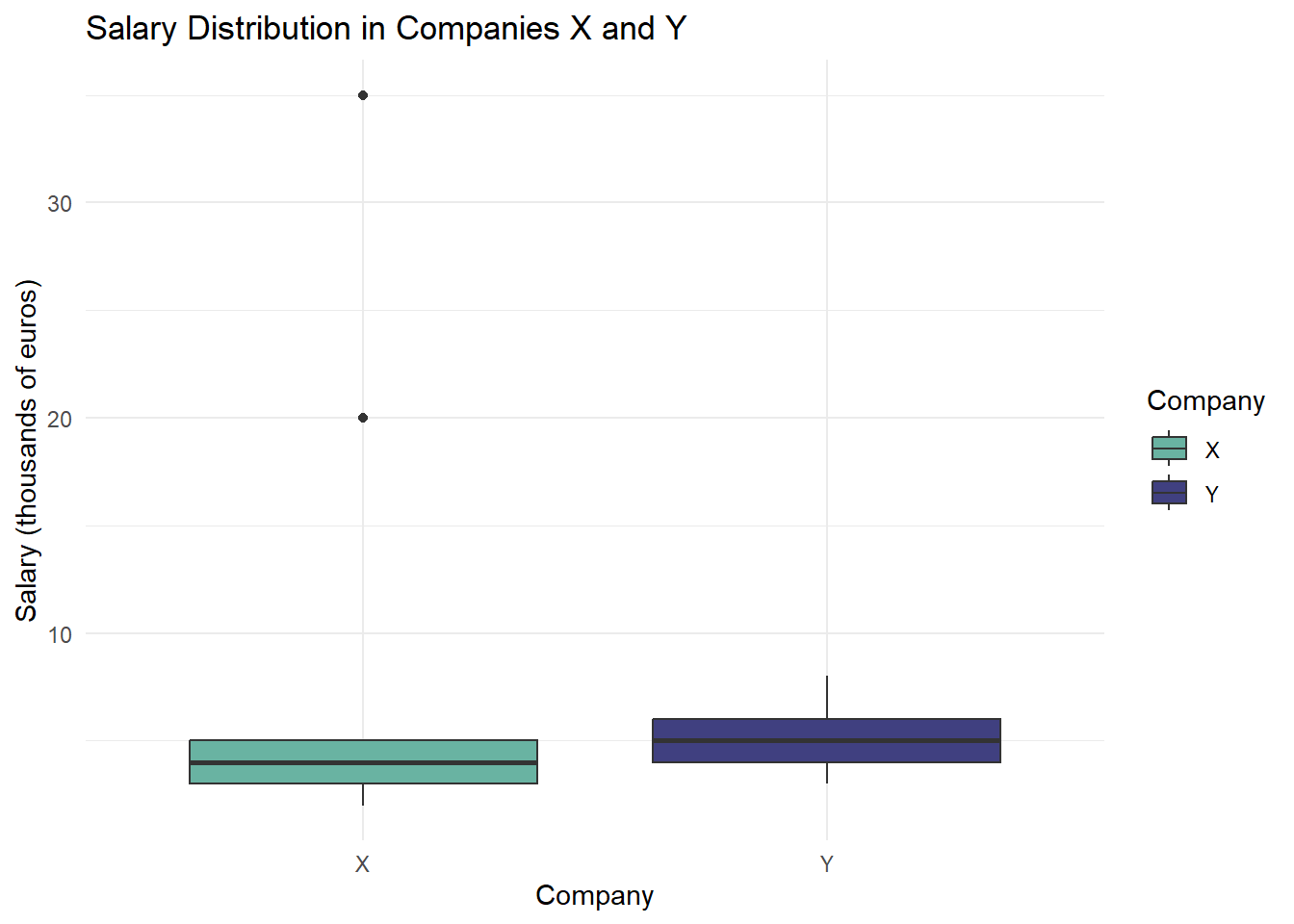
Tukey Box Plot
A Tukey box plot visually represents the distribution of data based on quartiles. We’ll use ggplot2 to create the plot.
library(ggplot2)library(tidyr)# Prepare the datadata <-data.frame(Company =rep(c("X", "Y"), each =20),Salary =c(X, Y))# Create the box plotggplot(data, aes(x = Company, y = Salary, fill = Company)) +geom_boxplot() +labs(title ="Salary Distribution in Companies X and Y",x ="Company",y ="Salary (thousands of euros)") +theme_minimal() +scale_fill_manual(values =c("X"="#69b3a2", "Y"="#404080"))
# Create the box plotggplot(data, aes(x = Company, y = Salary, fill = Company)) +geom_boxplot(outliers = F) +labs(title ="Salary Distribution in Companies X and Y",x ="Company",y ="Salary (thousands of euros)") +theme_minimal() +scale_fill_manual(values =c("X"="#69b3a2", "Y"="#404080"))
Interpreting the Box Plot
The box represents the interquartile range (IQR) from Q1 to Q3.
The line inside the box is the median (Q2).
Whiskers extend to the smallest and largest values within 1.5 * IQR.
Points beyond the whiskers are considered outliers.
Comparison of Results
Measure
Company X
Company Y
Mean
5.95
5.00
Median
4
5
Mode
3
4 and 5
Variance
61.21
1.79
Standard Deviation
7.82
1.34
Q1
3
4
Q3
5
6
Key Observations:
Central Tendency: Company X has a higher mean but lower median than Company Y, indicating a right-skewed distribution for Company X.
Dispersion: Company X shows much higher variance and standard deviation, suggesting greater salary disparities.
Distribution Shape: Company Y’s salaries are more tightly clustered, while Company X has extreme values (potential outliers) that significantly affect its mean and variance.
Quartiles: Company Y’s interquartile range (Q3 - Q1) is slightly larger, but its overall range is much smaller than Company X’s.
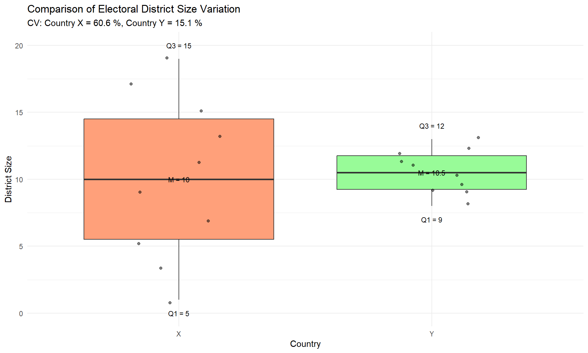
5.11 Exercise 2. Comparing Electoral District Size Variation Between Countries
Data
We have electoral district size data from two countries:
x <-c(1, 3, 5, 7, 9, 11, 13, 15, 17, 19) # Country high variancey <-c(8, 9, 9, 10, 10, 11, 11, 12, 12, 13) # Country low variancekable(data.frame("Country X (High var.)"= x,"Country Y (Low var.)"= y))
Country.X..High.var..
Country.Y..Low.var..
1
8
3
9
5
9
7
10
9
10
11
11
13
11
15
12
17
12
19
13
Measures of Central Tendency
Arithmetic Mean
Formula: \bar{x} = \frac{\sum_{i=1}^{n} x_i}{n}
Calculations for Country X
Element
Value
1
1
2
3
3
5
4
7
5
9
6
11
7
13
8
15
9
17
10
19
Sum
100
\bar{x} = \frac{100}{10} = 10
mean_x <-mean(x)c("Manual"=10, "R"= mean_x)
Manual      R
    10     10
Calculations for Country Y
Element
Value
1
8
2
9
3
9
4
10
5
10
6
11
7
11
8
12
9
12
10
13
Sum
105
\bar{y} = \frac{105}{10} = 10.5
mean_y <-mean(y)c("Manual"=10.5, "R"= mean_y)
Manual      R
  10.5   10.5
Median
The median is the middle value in an ordered dataset.
Calculations for Country X
Ordered data: 1, 3, 5, 7, 9, 11, 13, 15, 17, 19
For n = 10 (even number of observations): Middle positions: 5 and 6 Middle values: 9 and 11
Median = \frac{9 + 11}{2} = 10
median_x <-median(x)c("Manual"=10, "R"= median_x)
Manual      R
    10     10
Calculations for Country Y
Ordered data: 8, 9, 9, 10, 10, 11, 11, 12, 12, 13
For n = 10 (even number of observations): Middle positions: 5 and 6 Middle values: 10 and 11
df_long <-data.frame(country =rep(c("X", "Y"), each =10),size =c(x, y))# Basic plotp <-ggplot(df_long, aes(x = country, y = size, fill = country)) +geom_boxplot(outlier.shape =NA) +# Disable default outlier pointsgeom_jitter(width =0.2, alpha =0.5) +# Add points with transparencyscale_fill_manual(values =c("X"="#FFA07A", "Y"="#98FB98")) +labs(title ="Comparison of Electoral District Size Variation",subtitle =paste("CV: Country X =", round(cv_x, 1), "%, Country Y =", round(cv_y, 1), "%"),x ="Country",y ="District Size" ) +theme_minimal() +theme(legend.position ="none")# Add quartile annotationsp +annotate("text", x =c(1, 1, 1, 2, 2, 2), y =c(max(x)+1, mean(x), min(x)-1, max(y)+1, mean(y), min(y)-1),label =c(paste("Q3 =", quantile(x, 0.75, type=1)),paste("M =", median(x)),paste("Q1 =", quantile(x, 0.25, type=1)),paste("Q3 =", quantile(y, 0.75, type=1)),paste("M =", median(y)),paste("Q1 =", quantile(y, 0.25, type=1)) ),size =3)
Methodological Notes
Quartile Calculations:
The median-excluding method used may give different results than R’s default functions
Differences in calculation methods don’t affect overall conclusions
Always important to specify the method used in reports
Visualization:
Box plot effectively shows differences in distributions
Additional points show actual values
Annotations facilitate interpretation
Application Notes
Using the Analysis:
All calculations can be reproduced using the provided R code
Code chunks are self-contained and documented
Data format requirements are clearly specified
Customization:
Analysis can be adapted for different district size datasets
Visualization parameters can be adjusted for different presentation needs
Statistical methods can be modified based on specific requirements
Conclusion
Summary Statistics Comparison
Measure
Country X
Country Y
Relative Difference
Mean
10.0
10.5
Similar
Median
10.0
10.5
Similar
Mode
None
Multiple (9,10,11,12)
-
Range
18
5
3.6× larger in X
Variance
36.67
2.5
14.7× larger in X
IQR
10
3
3.3× larger in X
CV
60.6%
15.0%
4.0× larger in X
Distribution Characteristics
Country X:
Uniform distribution pattern
No dominant district size (no mode)
Wide range: 1 to 19 seats
High variability (CV = 60.6%) - Even spread of values across range
Country Y:
Clustered distribution pattern
Multiple common sizes (four modes)
Narrow range: 8 to 13 seats
Low variability (CV = 15.0%) - Values concentrated around mean
Box Plot Interpretation
The box plot visualization reveals:
Structure Elements:
Box: Shows interquartile range (IQR)
Lower edge: First quartile (Q1)
Upper edge: Third quartile (Q3)
Internal line: Median (Q2)
Whiskers: Extend to ±1.5 IQR - Points: Individual district sizes
Key Visual Findings:
Box Size:
Country X: Large box indicates wide spread of middle 50%
Country Y: Small box shows tight clustering of middle values
Whisker Length:
Country X: Long whiskers indicate broad overall distribution
Country Y: Short whiskers show limited total spread
Point Distribution:
Country X: Points widely dispersed
Country Y: Points densely clustered
Key Observations
Central Tendency:
Similar average district sizes
Different distribution patterns
Distinct approaches to standardization
Variability Measures:
All metrics show Country X with 3-15 times more variation
Consistent pattern across different statistical measures
Systematic difference in district design
System Design:
Country X: Flexible, varied approach
Country Y: Standardized, uniform approach
Different philosophical approaches to representation
Representative Implications:
Country X: Variable voter-to-representative ratios
Country Y: More consistent representation levels
Different approaches to democratic representation
This analysis demonstrates fundamental differences in electoral system design between the two countries, with Country X adopting a more varied approach and Country Y maintaining greater uniformity in district sizes.
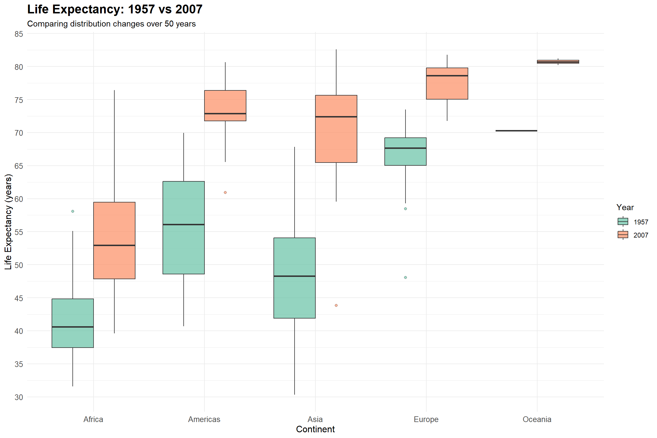
5.12 Exercise 3. Understanding Boxplots Through Life Expectancy Data
`summarise()` has grouped output by 'continent'. You can override using the
`.groups` argument.
knitr::kable(summary_stats, digits =1,caption ="Summary Statistics by Continent and Year")
Summary Statistics by Continent and Year
continent
year
median
q1
q3
iqr
n_outliers
Africa
1957
40.6
37.4
44.8
7.4
1
Africa
2007
52.9
47.8
59.4
11.6
0
Americas
1957
56.1
48.6
62.6
14.0
0
Americas
2007
72.9
71.8
76.4
4.6
1
Asia
1957
48.3
41.9
54.1
12.2
0
Asia
2007
72.4
65.5
75.6
10.2
1
Europe
1957
67.7
65.0
69.2
4.2
2
Europe
2007
78.6
75.0
79.8
4.8
0
Oceania
1957
70.3
70.3
70.3
0.0
0
Oceania
2007
80.7
80.5
81.0
0.5
0
5.16 Key Learning Points
Distribution Center:
Median shows the typical life expectancy
Changes in median reflect overall improvements
Spread and Variation:
IQR (box height) indicates data dispersion
Wider boxes suggest more inequality in life expectancy
Outliers and Extremes:
Outliers often represent countries with unique circumstances
Time Comparison:
Shows both absolute improvements and changes in variation
Highlights persistent regional disparities
Reveals different rates of progress across continents
5.17 Appendix: Summary Tables for Data Types and Applicable Statistical Measures
Table 1: Pros and Cons of Various Statistical Measures
Measures of Center
Measure
Pros
Cons
Applicable to
Mean
- Uses all data points - Allows for further statistical calculations - Ideal for normally distributed data
- Sensitive to outliers - Not ideal for skewed distributions - Not meaningful for nominal data
Interval, Ratio, some Discrete, Continuous
Median
- Not affected by outliers - Good for skewed distributions - Can be used with ordinal data
- Ignores the actual values of most data points - Less useful for further statistical analyses
Ordinal, Interval, Ratio, Discrete, Continuous
Mode
- Can be used with any data type - Good for finding most common category
- May not be unique (multimodal) - Not useful for many types of analyses - Ignores magnitude of differences between values
All types
Measures of Variability
Measure
Pros
Cons
Applicable to
Range
- Simple to calculate and understand - Gives quick idea of data spread
- Very sensitive to outliers - Ignores all data between extremes - Not useful for further statistical analyses
Ordinal, Interval, Ratio, Discrete, Continuous
Interquartile Range (IQR)
- Not affected by outliers - Good for skewed distributions
- Ignores 50% of the data - Less intuitive than range
Ordinal, Interval, Ratio, Discrete, Continuous
Variance
- Uses all data points - Basis for many statistical procedures
- Sensitive to outliers - Units are squared (less intuitive)
Interval, Ratio, some Discrete, Continuous
Standard Deviation
- Uses all data points - Same units as original data - Widely used and understood
- Sensitive to outliers - Assumes roughly normal distribution for interpretation
Interval, Ratio, some Discrete, Continuous
Coefficient of Variation
- Allows comparison between datasets with different units or means
- Can be misleading when means are close to zero - Not meaningful for data with negative values
Ratio, some Interval
Measures of Correlation/Association
Measure
Pros
Cons
Applicable to
Pearson’s r
- Measures linear relationship - Widely used and understood
- Assumes normal distribution - Sensitive to outliers - Only captures linear relationships
Interval, Ratio, Continuous
Spearman’s rho
- Can be used with ordinal data - Captures monotonic relationships - Less sensitive to outliers
- Loses information by converting to ranks - May miss some types of relationships
Ordinal, Interval, Ratio
Kendall’s tau
- Can be used with ordinal data - More robust than Spearman’s for small samples - Has nice interpretation (probability of concordance)
- Loses information by only considering order - Computationally more intensive
Ordinal, Interval, Ratio
Chi-square
- Can be used with nominal data - Tests independence of categorical variables
- Requires large sample sizes - Sensitive to sample size - Doesn’t measure strength of association
Nominal, Ordinal
Cramér’s V
- Can be used with nominal data - Provides measure of strength of association - Normalized to [0,1] range
- Interpretation can be subjective - May overestimate association in small samples
Nominal, Ordinal
Statistical Measures Applicability / Zastosowanie miar statystycznych
Measure (EN)
Miara (PL)
Nominal
Ordinal
Interval
Ratio
Central Tendency / Tendencja centralna:
Mode
Dominanta
✓
✓
✓
✓
Median
Mediana
-
✓
✓
✓
Arithmetic Mean
Średnia arytmetyczna
-
-
✓*
✓
Geometric Mean
Średnia geometryczna
-
-
-
✓
Harmonic Mean
Średnia harmoniczna
-
-
-
✓
Dispersion / Rozproszenie:
Range
Rozstęp
-
✓
✓
✓
Interquartile Range
Rozstęp międzykwartylowy
-
✓
✓
✓
Mean Absolute Deviation
Średnie odchylenie bezwzględne
-
-
✓
✓
Variance
Wariancja
-
-
✓*
✓
Standard Deviation
Odchylenie standardowe
-
-
✓*
✓
Coefficient of Variation
Współczynnik zmienności
-
-
-
✓
Association / Współzależność:
Chi-square
Chi-kwadrat
✓
✓
✓
✓
Spearman Correlation
Korelacja Spearmana
-
✓
✓
✓
Kendall’s Tau
Tau Kendalla
-
✓
✓
✓
Pearson Correlation
Korelacja Pearsona
-
-
✓*
✓
Covariance
Kowariancja
-
-
✓*
✓
* Theoretically problematic but commonly used in practice / Teoretycznie problematyczne, ale powszechnie stosowane w praktyce
Notes / Uwagi:
Measurement Scales / Skale pomiarowe:
Nominal: Categories without order / Kategorie bez uporządkowania
Ordinal: Ordered categories / Kategorie uporządkowane
Interval: Equal intervals, arbitrary zero / Równe interwały, umowne zero
Ratio: Equal intervals, absolute zero / Równe interwały, absolutne zero
Practical Considerations / Aspekty praktyczne:
Some measures marked with ✓* are commonly used for interval data despite theoretical issues / Niektóre miary oznaczone ✓* są powszechnie stosowane dla danych przedziałowych pomimo problemów teoretycznych
Choice of measure should consider both theoretical appropriateness and practical utility / Wybór miary powinien uwzględniać zarówno poprawność teoretyczną jak i użyteczność praktyczną
More restrictive scales (ratio) allow all measures from less restrictive scales / Bardziej restrykcyjne skale (ilorazowe) pozwalają na wszystkie miary z mniej restrykcyjnych skal