Statistics is the science of learning from data under uncertainty.
Statistics is a way to learn about the world from data. It teaches how to collect data wisely, spot patterns, estimate population parameters, and make predictions—stating how wrong we might be.
Note
Statistics is the science of collecting, organizing, analyzing, interpreting, and presenting data. It encompasses both the methods for working with data and the theoretical foundations that justify these methods.
But statistics is more than just numbers and formulas—it’s a way of thinking about uncertainty and variation in the world around us.
What is Data?
Data: Information collected during research – this includes survey responses, experimental results, economic indicators, social media content, or any other measurable observations.
A data distribution describes how values spread across possible outcomes (what values and how often a variable takes). Distributions tell us what values are common, what values are rare, and what patterns exist in our data.
Demography is the scientific study of human populations, focusing on their size, structure, distribution, and changes over time. It’s essentially the statistical analysis of people - who they are, where they live, how many there are, and how these characteristics evolve.
Statistics and demography are interconnected disciplines that provide powerful tools for understanding populations, their characteristics, and the patterns that emerge from data.
Rounding and Scientific Notation
Main Rule: Unless otherwise specified, round the decimal parts of decimal numbers to at least 2 significant figures. In statistics, we often work with long decimal parts and very small numbers — don’t round excessively in intermediate steps, round at the end of calculations.
Rounding in Statistical Context
The decimal part consists of digits after the decimal point. In statistics, it’s particularly important to maintain appropriate precision:
Descriptive statistics:
Mean: \bar{x} = 15.847693... \rightarrow 15.85
Standard deviation: s = 2.7488... \rightarrow 2.75
Correlation coefficient: r = 0.78432... \rightarrow 0.78
Very small numbers (p-values, probabilities):
p = 0.000347... \rightarrow 0.00035 or 3.5 \times 10^{-4}
When in doubt: Better to keep an extra digit than to round too aggressively
What is Statistics For in Social and Political Science?
Statistics is essential in social and political science for several key purposes:
Understanding Social Phenomena: Measuring inequality, poverty, unemployment, political participation; describing demographic patterns and social trends; quantifying attitudes, beliefs, and behaviors in populations.
Testing Theories: Political scientists theorize about democracy, voting behavior, conflict, and institutions. Sociologists develop theories about social mobility, inequality, and group dynamics. Statistics allows us to test whether these theories match reality.
Causal Inference: Social scientists want to answer “why” questions—Does education increase income? Do democracies go to war less often? Does social media affect political polarization? Statistics helps separate causation from mere correlation.
Policy Evaluation: Assessing whether interventions work—Does a job training program reduce unemployment? Did election reform increase voter turnout? Are anti-poverty programs effective? Statistics provides tools to evaluate what works and what doesn’t.
Public Opinion Research: Election polls and forecasting; measuring public support for policies; understanding how opinions vary across demographic groups; tracking attitude changes over time.
Making Generalizations: We can’t survey everyone, so we sample and use statistics to make inferences about entire populations. A poll of 1,000 people can tell us about a nation of millions (with known uncertainty).
Dealing with Complexity: Human societies are messy—many factors influence outcomes simultaneously. Statistics helps us control for confounding variables, isolate specific effects, and make sense of multivariate relationships.
The Uniqueness of Social Sciences: Unlike natural sciences, social sciences study human behavior, which is highly variable and context-dependent. Statistics provides the tools to find patterns and draw conclusions despite this inherent uncertainty.
When working with data, statisticians use two different approaches: exploration and confirmation/verification (inferential statistics). First, we examine the data to understand its characteristics and identify patterns. Then, we use formal methods to test specific hypotheses and draw conclusions.
EDA vs. Inferential Statistics
Statistics can be viewed as two complementary phases:
Exploratory Data Analysis (EDA): combines descriptive statistics and visualization methods to explore data, uncover patterns, check assumptions, and generate hypotheses.
Inferential Statistics: uses probability models to test hypotheses and draw conclusions that generalize beyond the observed data.
Percent vs Percentage Points (pp)
When news reports say “unemployment decreased by 2,” do they mean 2 percentage points (pp) or 2 percent?
These are not the same:
2 pp (absolute change): e.g., 10% → 8% (−2 pp).
2% (relative change): multiply the old rate by 0.98; e.g., 10% → 9.8% (−0.2 pp).
Always ask:
What is the baseline (earlier rate)?
Is the change absolute (pp) or relative (%)?
Could this be sampling error / random variation?
How was unemployment measured (survey vs. administrative), when, and who’s included?
Rule of thumb
Use percentage points (pp) when comparing rates directly (unemployment, turnout).
Use percent (%) for relative changes (proportional to the starting value).
Tiny lookup table
Starting rate
“Down 2%” (relative)
“Down 2 pp” (absolute)
6%
6% × 0.98 = 5.88% (−0.12 pp)
4%
8%
8% × 0.98 = 7.84% (−0.16 pp)
6%
10%
10% × 0.98 = 9.8% (−0.2 pp)
8%
Uwaga (PL): 2% ≠ 2 punkty procentowe (pp).
1.2 Exploratory Data Analysis (EDA)
What is EDA? Exploratory Data Analysis is the initial step where we examine data systematically to understand its structure and characteristics. This phase does not involve formal hypothesis testing—it focuses on discovering what the data contains.
Why do we do EDA?
Find interesting patterns you didn’t expect
Spot mistakes or unusual values in your data
Get ideas about what questions to ask
Understand what your data looks like before doing formal tests (many statistical methods have specific requirements about the data to work properly. EDA helps check whether our data meets these requirements - e.g. 1) some tests require data to have a normal distribution (bell-shaped), 2) we need to verify that the relationship between variables is actually linear, or 3) check homogeneity of variance and find outliers)
The EDA Approach
When conducting EDA, we begin without predetermined hypotheses. Instead, we examine data from multiple perspectives to discover patterns and generate questions for further investigation.
Simple Tools for Exploring Data
1. Summary Numbers (Descriptive Statistics)
These are basic calculations that describe your data:
Finding the “Typical” Value:
Arithmetic Mean (Average): Add up all values and divide by how many you have. Example: If 5 students scored 70, 80, 85, 90, and 100 on a test, the average is 85.
Median (Middle): The value in the middle when you line up all numbers from smallest to largest. In our test example, the median is also 85.
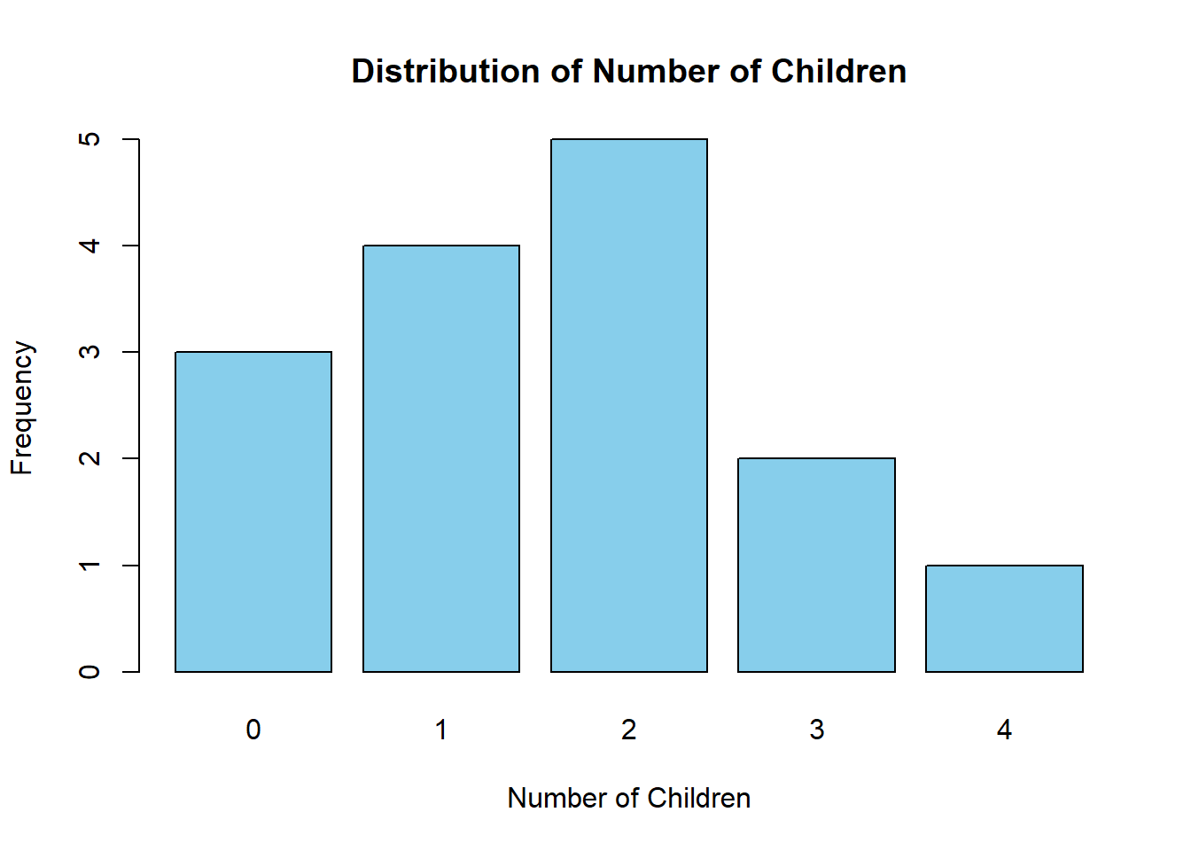
Mode (Most Common): The value that appears most often. If ten families have 1, 2, 2, 2, 2, 3, 3, 3, 4, and 5 children, the mode is 2 children.
Understanding Spread:
Range: Just subtract the smallest number from the biggest. If students’ ages go from 18 to 24, the range is 6 years.
Standard Deviation: Shows how spread out your data is from the average. A small standard deviation means most values are close to the average; a large one means they’re more spread out.
2. Visual Exploration
Graphical methods help reveal patterns that numerical summaries alone might not show:
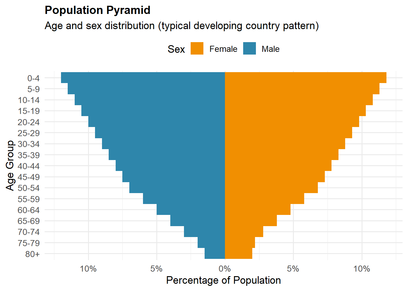
Population Pyramids: Show how many people are in each age group, split by males and females. Helps you see if a population is young or old.
Box Plots: Show the middle of your data and help spot unusual values
Scatter Plots: Display relationships between two variables (such as hours studied versus test scores)
Time (Series) Graphs: Show how something changes over time (like temperature throughout the year)
Histograms: A histogram is a graphical representation of data that shows the frequency distribution of a dataset. It consists of adjacent bars (with no gaps between them) where each bar represents a range of values (called a bin or class interval), and the height of the bar shows how many data points (what proportion of data points) fall within that range. Histograms are used to visualize the shape, spread, and central tendency of numerical data.
Do two variables move together? (When one goes up, does the other go up too?)
Can you draw a line (regression line) that roughly fits your data points?
Do you see any clear patterns or trends?
Using the Same Techniques for Different Purposes
Many statistical techniques serve both exploratory and confirmatory functions:
Exploring: We calculate correlations or fit regression lines to understand what relationships exist in the data. The focus is on discovering patterns.
Confirming: We apply statistical tests to determine whether observed patterns are statistically significant or could have occurred by chance. The focus is on formal hypothesis testing.
The same technique can serve different purposes depending on the research phase.
4. Good Questions to Ask While Exploring:
What does the shape of my data look like?
Are there any weird or unusual values?
Do I see any patterns?
Is any data missing?
Do different groups show different patterns?
1.3 Inferential Statistics
After exploring, you might want to make formal conclusions. Inferential statistics helps you do this.
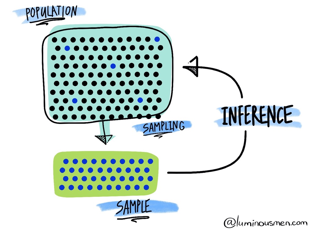
The Basic Idea: You have data from some people (a sample), but you want to know about everyone (the population). Inferential statistics helps you make educated guesses about the bigger group based on your smaller group.
Note
A random sample requires that each member has a known, non-zero chance of being selected, not necessarily an equal chance.
When every member has an equal chance of selection, that’s specifically called a simple random sample - which is the most basic type.
A Soup-Tasting Analogy
Consider a chef preparing soup for 100 people who needs to assess its flavor without consuming the entire batch:
Population: The entire pot of soup (100 servings) Sample: A single spoonful for tasting Population Parameter: The true average saltiness of the complete pot (unknown) Sample Statistic: The saltiness level detected in the spoonful (observable, a point estimate) Statistical Inference: Using the spoonful’s characteristics to draw conclusions about the entire pot
Key points
1. Random sampling is essential. The cook should stir thoroughly or sample from random locations. Skimming only the surface can miss seasonings that settled to the bottom, introducing systematic bias.
2. Sample size drives precision. A larger ladle — or more spoonfuls (larger n) — reduces random error and gives a more stable estimate of the “average taste,” though cost and time limit how much you can increase n.
3. Uncertainty is unavoidable. Even with proper sampling, a single spoonful may not perfectly represent the whole pot; there is always random variability.
4. Systematic bias undermines inference. If someone secretly adds salt only where you sample, conclusions about the whole pot will be distorted — a classic case of sampling bias.
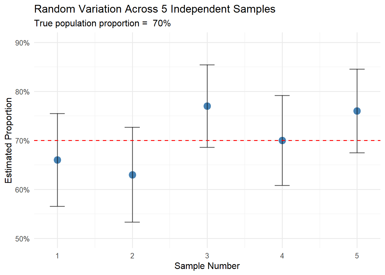
5. One sample is limited. A single taste can tell you the average saltiness, but not how much it varies across the pot. To assess variability, you need multiple independent samples.
Note: Increasing n improves precision (less noise) but does not remove bias; eliminating bias requires fixing the sampling design.
This analogy captures the essence of statistical reasoning: using carefully selected samples to learn about larger populations while explicitly acknowledging and quantifying the inherent uncertainty in this process.
Statistical Thinking
Key concepts (at a glance)
Pipeline:Research question → Estimand (population quantity) → Parameter (true, unknown value) → Estimator (sample rule/statistic; random) → Estimate (the single number from your data)
What we want to know:
Estimand — the population quantity we aim to learn (the formal target), not the sentence itself. Example: “Population mean age at first birth in Poland in 2023.”
Parameter(\theta) — the true but unknown value of that estimand in the population (fixed, not random). Example: The true mean \mu (e.g., \mu=29.4 years).
How we estimate (3 steps):
Sample statistic — any function of the sample (a rule), e.g. \displaystyle \bar{X}=\frac{1}{n}\sum_{i=1}^n X_i
Estimator — that statistic chosen to estimate a specific parameter (depends on a random sample, so it’s random). Example: Use \bar{X} as an estimator of \mu.
Estimate(\hat\theta) — the numerical result after applying the estimator to your observed data (x_1,\dots,x_n). Example:\hat\mu=\bar{x}=29.1 years.
Analogy:
Statistic = tool → Estimator = tool chosen for a goal → Estimate = the finished output (your concrete result)
Common estimators
Target parameter (goal)
Estimator (statistic)
Formula
Note
Population mean \mu
Sample mean
\bar X=\frac{1}{n}\sum_{i=1}^n X_i
Unbiased estimator. The estimator \bar X is a random variable; a specific calculated value (e.g., \bar x = 5.2) is called an estimate.
Population proportion p
Sample proportion
\hat p=\frac{K}{n} where K=\sum_{i=1}^n Y_i for Y_i\in\{0,1\}
Equivalent to \bar Y when encoding outcomes as 0/1. Here K counts the number of successes in n trials.
Population variance \sigma^2
Sample variance
s^2=\frac{1}{n-1}\sum_{i=1}^n (X_i-\bar X)^2
The n-1 divisor (Bessel’s correction) makes this unbiased for \sigma^2. Using n would give a biased estimator.
Every estimator is a statistic, but not every statistic is an estimator — until you tie it to a target (an estimand), it’s “just” a statistic.
How do we assess if an estimator (“method”) is good?
Bias — does our method give true results “on average”?
Imagine we want to know the average height of adult Poles (true value: 172 cm). We draw 100 different samples of 500 people each and calculate the mean for each one.
Unbiased estimator: Those 100 means will differ (169 cm, 173 cm, 171 cm…), but their average will be close to 172 cm. Sometimes we overestimate, sometimes underestimate, but there’s no systematic error.
Biased estimator: If we accidentally always excluded people over 180 cm, all our 100 means would be too low (e.g., oscillating around 168 cm). That’s systematic bias.
Variance — how much do results differ between samples?
We have two methods for estimating the same parameter. Both give good results “on average,” but:
Method A: from 10 samples we get: 171, 172, 173, 171, 172, 173, 172, 171, 173, 172 cm
Method B: from 10 samples we get: 165, 179, 168, 176, 171, 174, 169, 175, 167, 176 cm
Method A has lower variance — results are more concentrated, predictable. In practice, you prefer Method A because you can be more confident in a single result.
Key principle: Larger sample = lower variance. With a sample of 100 people, the mean will “jump around” more than with a sample of 1,000 people.
Mean Squared Error (MSE) — what matters more: unbiasedness or stability?
Sometimes we face a dilemma:
Estimator A: Unbiased (average 172 cm), but very unstable (results from 160 to 184 cm)
Estimator B: Slightly biased (average 171 cm instead of 172 cm), but very stable (results from 169 to 173 cm)
MSE says: Estimator B is better — a small systematic underestimation of 1 cm is less problematic than the huge spread of results in Estimator A.
Efficiency — which unbiased estimator to choose?
You have data on incomes of 500 people. You want to know the “typical” income. Two options:
Arithmetic mean: typically gives results in the range 4,800–5,200 PLN
Median: gives results in the range 4,500–5,500 PLN
If both methods are unbiased, choose the one with smaller spread (the mean is more efficient for normally distributed data).
Example of Statistical Thinking
Your university is considering keeping the library open 24/7. The administration needs to know: What proportion of students support this change?
Note
Ideal world: Ask all 20,000 students → Get the exact answer (\theta parameter) Real world: Survey 100 students → Get an estimate (\hat{\theta}) with uncertainty
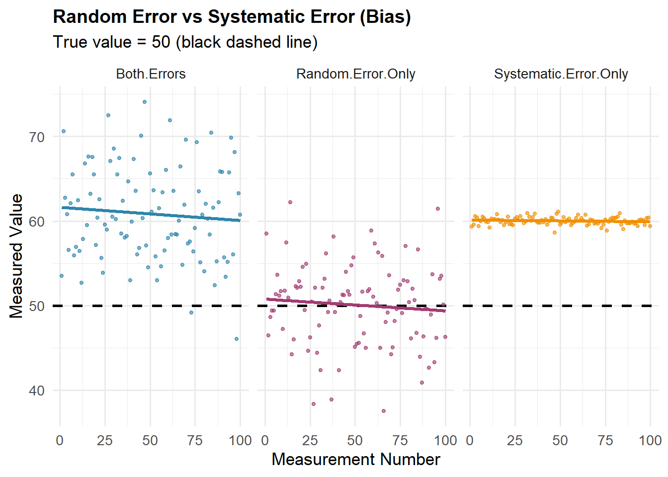
Bias vs. Random Error
Statistical (prediction) error can be decomposed into two main components: bias (systematic error) and random error (unpredictable variation).
Bias is like a miscalibrated scale that consistently reads 2 kg too high—every measurement is wrong in the same direction. It’s systematic error.
Random error is the unpredictable variation in your observations, like:
A dart player aiming at the bullseye—each throw lands in a slightly different spot due to hand tremor, air currents, tiny muscle variations
Measuring someone’s height multiple times and getting 174.8 cm, 175.0 cm, 175.3 cm—small fluctuations from posture changes, breathing, how you read the scale, and natural body variations
A weather model that’s sometimes 2°C too high, sometimes 1°C too low, sometimes spot on
Opinion polls showing 52%, 49%, 51% support across different surveys—each random sample gives slightly different results, but they cluster around the true value
Random error is measured by variance—the average squared deviation of observations from their mean. It quantifies how much your data points (predictions) scatter.
Random error is like asking 5 friends to estimate how many jellybeans are in a jar—they’ll all give different answers just due to chance, but those differences scatter randomly around the truth rather than all being wrong in the same direction.
Polling example: Bias is like polling only at the gym at 6am—you’ll always get more health-conscious, early-rising, employed people and always miss night-shift workers, people with young kids, etc. The poll is broken in a predictable way. Or: only counting responses from people who actually answer unknown phone calls—you’ll systematically miss everyone (especially younger people) who screens their calls.
Key difference: Averaging more observations reduces random error but never fixes bias. You can’t average your way out of a miscalibrated scale—or a biased sampling method!
Two Approaches to the Same Data
Imagine you survey 100 random students and find that 60 support the 24/7 library hours.
❌ Without Statistical Thinking
“60 out of 100 students said yes.”
Conclusion: “Exactly 60% of all students support it.”
Decision: “Since it’s over 50%, we have clear majority support.”
Problem: Ignores that a different sample might give 55% or 65%
✅ With Statistical Thinking
“60 out of 100 students said yes.”
Conclusion: “We estimate 60% support, with a margin of error of ±10 pp.”
Decision: “True support is likely between 50% and 70%—we need more data to be certain of majority support.”
Advantage: Acknowledges uncertainty and informs better decisions
How sample size affects precision:
Sample Size
Observed Result
Margin of Error
(95%) Range of Plausible Values
Interpretation
n = 100
60%
±10 pp
50% to 70%
Uncertain about majority
n = 400
60%
±5 pp
55% to 65%
Likely majority support
n = 1,000
60%
±3 pp
57% to 63%
Clear majority support
n = 1,600
60%
±2.5 pp
57.5% to 62.5%
Strong majority support
n = 10,000
60%
±1 pp
59% to 61%
Very precise estimate
The Diminishing Returns Principle: Notice that quadrupling the sample size from 100 to 400 cuts the margin of error in half, but increasing from 1,600 to 10,000 (a 6.25× increase) only reduces it by 1.5 percentage points. To halve your margin of error, you must quadruple your sample size.
This is why most polls stop around 1,000–1,500 respondents—the gains in precision beyond that point rarely justify the additional cost and effort.
Sample Size and Uncertainty (Random Error)
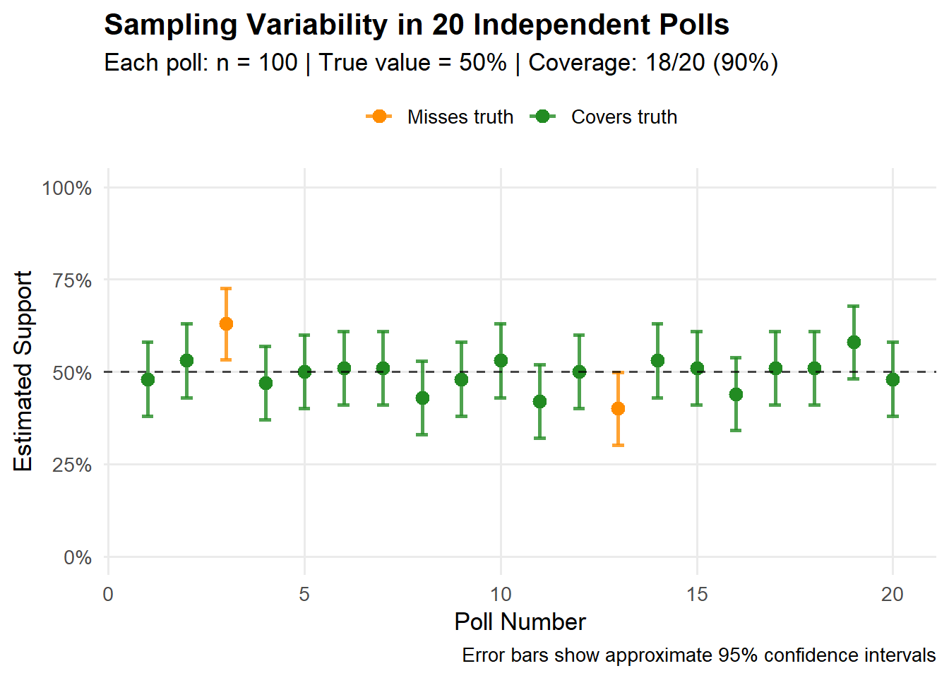
Suppose we take a random sample of n=1000 voters and observe \hat p = 0.55 (e.g., 55% support for a candidate in upcoming elections—550 out of 1,000 respondents). Then:
Our best single-number estimate (point estimate) of the population proportion is \hat p = 0.55.
A typical “range of plausible values” (at the 95\% confidence level) around \hat p can be approximated by \hat p \pm \text{Margin of Error}, i.e.,
\hat p \;\pm\; 2\sqrt{\frac{\hat p(1-\hat p)}{n}}
\;=\;
0.55 \;\pm\; 2\sqrt{\frac{0.55\cdot 0.45}{1000}}
\approx
0.55 \pm 0.031,
giving roughly (interval estimate) 52\% to 58\% (approximately \pm 3.1 percentage points).
Note: The factor of 2 is a convenient rounding of 1.96, the critical value from the standard normal distribution for 95% confidence.
The width of this interval shrinks predictably with sample size:
\text{Margin of Error} \;\propto\; \frac{1}{\sqrt{n}}.
For example, increasing n from 1,000 to 4,000 cuts the margin of error approximately in half (from \pm 3.1\% to \pm 1.6\%).
Note
Fundamental Principle: Statistics does not eliminate uncertainty—it helps us measure, manage, and communicate it effectively.
Historical Example: the 1936 Literary Digest Poll
In 1936, Literary Digest ran one of the largest opinion polls ever — about 2.4 million mailed responses — yet it completely misjudged the U.S. presidential election.
Candidate
Prediction
Actual result
Error
Landon
57%
36.5%
≈20 pp
Roosevelt
43%
60.8%
≈18 pp
What went wrong?
Even with millions of responses, the poll was badly biased — not random, but systematic.
Systematic vs. Random Error
Imagine a bathroom scale that adds +2.3 kg to everyone’s weight:
Random error (no bias): Each time you step on, your balance shifts a little. Readings jump around your true weight — say 68.0–68.5 kg. Averaging them gives the right result (≈68 kg). More readings reduce the scatter.
Systematic error (bias): The scale’s zero point is wrong. Every reading shows +2.3 kg too much. Weigh yourself once: 70.3 kg. Weigh yourself 1,000 times: still ~70.3 kg — precisely wrong.
That was Literary Digest’s problem: a miscalibrated “instrument” for measuring public opinion. Millions of biased responses only produced false confidence.
Where did the bias come from?
Two biases both worked in favor of Alf Landon:
Coverage (selection) bias — who could be contacted
The poll used telephone books, car registration lists, and magazine subscribers.
During the Great Depression, these lists mostly included wealthier Americans, who leaned Republican.
Result: systematic underrepresentation of poorer, pro-Roosevelt voters.
Nonresponse bias — who chose to reply
Only about one in four people (≈24%) who were contacted returned their ballot.
Those who responded were more politically active and more likely to oppose Roosevelt.
Together, these created a huge systematic bias that no large sample could fix.
Why sample size couldn’t save the poll
Taking 2.4 million responses from a biased list is like weighing an entire country on a faulty scale.
The maximum possible (worst case scenario) margin of error (for the 95\% confidence level) for a given sample size (if it had been a true random sample) would have been: \text{MoE}_{95\%} \approx 1.96\sqrt{\frac{0.25}{2{,}400{,}000}} \approx \pm 0.06 \text{ percentage points} — tiny.
That formula only captures random error, not bias.
The real error was about ±18–20 percentage points — hundreds of times larger.
Lesson:Precision without representativeness is useless. A huge biased sample can be worse than a small, carefully chosen one.
Modern Polling: Smaller but Smarter
The Literary Digest disaster transformed polling practice:
Probability sampling: every voter has a known, non-zero chance of selection.
Weighting: adjust for groups that reply too often or too rarely.
Total survey error mindset: consider coverage, nonresponse, measurement, and processing errors — not just sampling error.
Bottom line:How you sample matters far more than how many you sample.
1.4 Understanding Randomness
A random experiment is any process whose result cannot be predicted with certainty, such as tossing a coin or rolling a die.
An outcome is a single possible result of that experiment—for example, getting “heads” or rolling a “5”.
Sample space is the set of all possible outcomes of a random experiment. It is typically denoted by the symbol S or Ω (omega).
An event is a set of one or more outcomes that we’re interested in; it could be a simple event (like rolling exactly a 3) or a compound event (like rolling an even number, which includes the outcomes 2, 4, and 6).
Probability is a way of measuring how likely something is to happen. It’s a number between 0 and 1 (or 0% and 100%) that represents the chance of an event occurring.
A probability distribution is a mathematical function/rule that describes the likelihood of different possible outcomes in a random experiment.
If something has a probability of 0, it’s impossible - it will never happen. If something has a probability of 1, it’s certain - it will definitely happen. Most things fall somewhere in between.
For example, when you flip a fair coin, there’s a 0.5 (or 50%) probability it will land on heads, because there are two equally likely outcomes and heads is one of them.
Probability helps us make sense of uncertainty and randomness in the world.
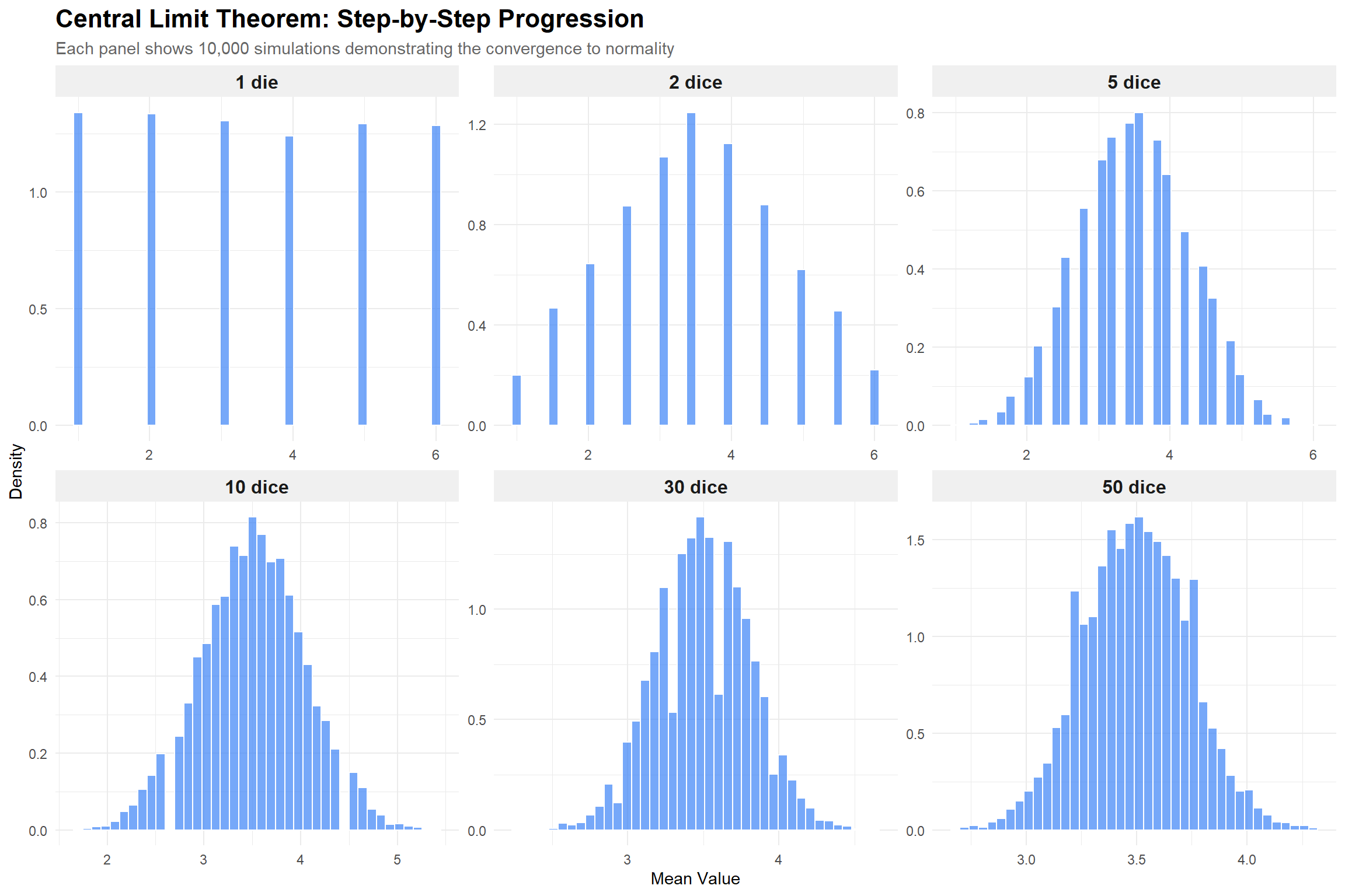
In statistics, randomness is an orderly way to describe uncertainty. While each individual outcome is unpredictable, stable patterns (more formally, empirical distributions of outcomes converge to probability distributions) emerge over many repetitions.
Example: Flip a fair coin:
Single flip: Completely unpredictable—you can’t know if it’ll be heads or tails
100 flips: You’ll get close to 50% heads (maybe 48 or 53)
10,000 flips: Almost certainly very close to 50% heads (perhaps 49.8%)
The same applies to dice: you can’t predict your next roll, but roll 600 times and each number (1-6) will appear close to 100 times. This predictable long-run behavior from unpredictable individual events is the essence of statistical randomness.
Types of Randomness
Epistemic vs. Ontological Randomness:
Epistemic randomness (due to incomplete knowledge): We treat an outcome as random because not all determinants are observed or conditions are not controlled. The system itself is deterministic—it follows fixed rules—but we lack the information needed to predict the outcome.
Coin toss: The trajectory of the coin is governed entirely by classical mechanics. If we knew the exact initial position, force, angular momentum, air resistance, and surface properties, we could theoretically predict whether it lands on heads or tails. The “randomness” exists only because we cannot measure these conditions with sufficient precision.
Poll responses: An individual’s answer to a survey question is determined by their beliefs, experiences, and context, but we don’t have access to this complete psychological state, so we model it as random.
Measurement error: Limited instrument precision means the “true” value exists, but we observe it with uncertainty.
Ontological randomness (intrinsic indeterminacy): Even complete knowledge of all conditions does not remove outcome uncertainty. The randomness is fundamental to the nature of reality itself, not just a gap in our knowledge.
Radioactive decay: The exact moment when a particular atom will decay is fundamentally unpredictable, even in principle. Quantum mechanics tells us only the probability distribution, not the precise timing.
Quantum measurements: The outcome of measuring a quantum particle’s position or spin is inherently probabilistic, not determined by hidden variables we simply haven’t discovered yet.
The Coin Toss Paradox
While we treat coin tosses as producing 50-50 random outcomes, research by mathematician Persi Diaconis has shown that with a mechanical coin-flipping machine that precisely controls initial conditions, you can reliably bias the outcome toward a chosen side. This confirms that coin tosses are epistemically, not ontologically, random—the apparent randomness comes from our inability to control and measure conditions, not from any fundamental indeterminacy in physics.
Related Concepts
Randomness vs. Haphazardness: Statistical randomness has mathematical structure and follows probability laws—it’s orderly uncertainty. Haphazardness suggests complete disorder without underlying patterns or rules.
Deterministic Chaos: The middle ground between perfect predictability and randomness. Chaos refers to deterministic systems (following fixed, known rules) that exhibit extreme sensitivity to initial conditions, making long-term prediction impossible in practice.
Think of chaos like a pinball machine, with the butterfly effect:
You know all the rules perfectly—the physics of collisions, friction, gravity
The system is completely deterministic: release the ball from exactly the same spot with exactly the same force, and you’ll get exactly the same result every time
But: A difference of 0.01 millimeters in starting position leads to the ball hitting different bumpers, which compounds with each collision until the final outcome is completely different
This is the butterfly effect: tiny perturbations in initial conditions grow exponentially over time
Classic examples of deterministic chaos:
Weather systems: Edward Lorenz discovered that atmospheric models are so sensitive that a butterfly flapping its wings in Brazil could theoretically alter whether a tornado forms in Texas weeks later. This is why weather forecasts are reliable for days but not months.
Planetary orbits: While stable on human timescales, the solar system’s dynamics are chaotic over millions of years. We cannot predict the exact position of planets in the distant future, even though we know the gravitational laws perfectly.
Double pendulum: Release it from a slightly different angle, and after a few swings, the motion becomes completely different.
Chaos vs. Epistemic Randomness—A Critical Distinction:
Both involve unpredictability due to limited knowledge, but they differ in a crucial way:
Aspect
Epistemic Randomness
Deterministic Chaos
Rules known?
Often yes
Yes, completely
Current state known?
No (or imprecisely)
No (or imprecisely)
What causes unpredictability?
Missing information about the current state
Exponential amplification of tiny measurement errors
Can perfect info help?
Yes—learning the state eliminates uncertainty
Only in the short term—errors accumulate again
Example to clarify:
Epistemic randomness (card face-down): The card is already the 7 of hearts. It’s not changing or evolving. You just don’t know which card it is yet. Flip it over, and the uncertainty vanishes completely and permanently.
Chaos (weather in 3 weeks): Even if you measure current atmospheric conditions to extraordinary precision, tiny errors (measurement at 6 decimal places instead of 20) compound over time. You might predict well for 5 days, but by week 3, your forecast is useless—not because you don’t know the physics, but because the system amplifies microscopic uncertainties.
Key Insight
Chaos is deterministic yet unpredictable. Epistemic randomness is deterministic yet unknown. Ontological randomness is fundamentally indeterministic. Statistical practice treats all three as “random,” but understanding the source of unpredictability helps us know when more information could help (epistemic), when it helps temporarily but not long-term (chaos), and when it cannot help at all (ontological).
Entropy: A measure of disorder or uncertainty in a system. High entropy means high unpredictability or many possible microstates; low entropy means high order and low uncertainty. In information theory and statistics, entropy quantifies the amount of uncertainty in a probability distribution—more spread out distributions have higher entropy.
1.5 Populations and Samples
Understanding the distinction between populations and samples is crucial for proper statistical analysis.
Population
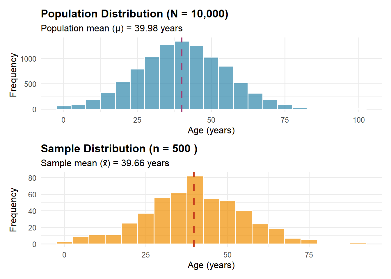
A population is the complete set of individuals, objects, or measurements about which we wish to draw conclusions. The key word here is “complete”—a population includes every single member of the group we’re studying.
Examples of Populations in Demography:
All residents of India as of January 1, 2024: This includes every person living in India on that specific date—approximately 1.4 billion people.
All births in Sweden during 2023: Every baby born within Swedish borders during that calendar year—roughly 100,000 births.
All households in Tokyo: Every residential unit where people live, cook, and sleep separately from others—about 7 million households.
All deaths from COVID-19 worldwide in 2020: Every death where COVID-19 was listed as a cause—several million deaths.
Populations can be:
Finite: Having a countable number of members (all current U.S. citizens, all Polish municipalities in 2024)
Infinite: Theoretical or uncountably large (all possible future births, all possible coin tosses or dice flips)
Fixed: Defined at a specific point in time (all residents on census day)
Dynamic: Changing over time (the population of a city that experiences births, deaths, and migration daily)
Sample
A sample is a subset of the population that is actually observed or measured. We study samples because examining entire populations is often impossible, impractical, or unnecessary.
Why We Use Samples:
Practical Impossibility: Imagine testing every person in China for a disease. By the time you finished testing 1.4 billion people, the disease situation would have changed completely, and some people tested early would need retesting.
Cost Considerations: The 2020 U.S. Census cost approximately $16 billion. Conducting such complete enumerations frequently would be prohibitively expensive. A well-designed sample survey can provide accurate estimates at a fraction of the cost.
Time Constraints: Policy makers often need information quickly. A sample survey of 10,000 people can be completed in weeks, while a census takes years to plan, execute, and process.
Destructive Measurement: Some measurements destroy what’s being measured. Testing the lifespan of light bulbs or the breaking point of materials requires using samples.
Greater Accuracy: Surprisingly, samples can sometimes be more accurate than complete enumerations. With a sample, you can afford better training for interviewers, more careful data collection, and more thorough quality checks.
Example of Sample vs. Population:
Let’s say we want to know the average household size in New York City:
Population: All 3.2 million households in NYC
Census approach: Attempt to contact every household (expensive, time-consuming, some will be missed)
Sample approach: Randomly select 5,000 households, carefully measure their sizes, and use this to estimate the average for all households
Result: The sample might find an average of 2.43 people per household with a margin of error of ±0.05, meaning we’re confident the true population average is between 2.38 and 2.48
Overview of Sampling Methods
Sampling involves selecting a subset of the population to estimate its characteristics. The sampling frame (list from which we sample) should ideally contain each member exactly once. Frame problems: undercoverage, overcoverage, duplication, and clustering.
Probability Sampling (Statistical Inference Possible)
Simple Random Sampling (SRS): Every possible sample of size n has equal probability of selection (sampling without replacement). Gold standard of probability methods.
Formal definition: Each of the \binom{N}{n} possible samples has probability \frac{1}{\binom{N}{n}}.
Inclusion probability for a unit:
Question: In how many samples does a specific person (e.g., student John) appear?
If John is already in the sample (that’s fixed), we need to select n-1 more people from the remaining N-1 people (everyone except John).
Number of samples containing John: \binom{N-1}{n-1}
Probability:
P(\text{John in sample}) = \frac{\text{samples with John}}{\text{all samples}} = \frac{\binom{N-1}{n-1}}{\binom{N}{n}} = \frac{n}{N}
Numerical example: N=5 people {A,B,C,D,E}, we sample n=3. All samples: \binom{5}{3}=10. Samples with person A: {ABC, ABD, ABE, ACD, ACE, ADE} = \binom{4}{2}=6 samples. Probability: 6/10 = 3/5 = n/N ✓
Systematic Sampling: Selection of every k-th element, where k = N/n. Simple to implement, but beware of hidden periodicity in the frame (e.g., list ordered by patterns).
Systematic Sampling: Selection of every k-th element, where k = N/n (sampling interval).
How it works: Randomly select a starting point r from \{1, 2, ..., k\}, then select: r, r+k, r+2k, r+3k, ...
Example: N=1000, n=100, so k=10. If r=7, we select: 7, 17, 27, 37, …, 997.
Advantages: Very simple, ensures even coverage of the population.
Periodicity problem: If the list has a pattern repeating every k elements, the sample can be severely biased.
Example (bad): Apartment list: 101, 102, 103, 104 (corner), 201, 202, 203, 204 (corner), … If k=4, we might sample only corner apartments!
Example (bad): Daily production data with 7-day cycle. If k=7, we might sample only Mondays.
Example (good): Alphabetical list of surnames - usually no periodicity.
Cluster Sampling: Selection of entire groups (clusters) instead of individual units. Cost-effective for geographically dispersed populations (e.g., sampling schools instead of students), but typically less precise than SRS (design effect: DEFF = Variance(cluster)/Variance(SRS)). Can be single- or multi-stage.
Convenience Sampling: Selection based on ease of access (e.g., passersby in city center). Useful in pilot/exploratory studies, but likely serious selection bias.
Purposive/Judgmental Sampling: Deliberate selection of typical, extreme, or information-rich cases. Valuable in qualitative research and studying rare populations.
Quota Sampling: Matching population proportions (e.g., 50% women), but without random selection. Quick and inexpensive, but hidden selection bias and no ability to calculate sampling error.
Snowball Sampling: Participants recruit others from their networks. Essential for hard-to-reach populations (drug users, undocumented immigrants), but biased toward well-connected individuals.
Fundamental Principle: Probability sampling enables valid statistical inference and calculation of sampling error; non-probability methods may be necessary for practical or ethical reasons, but limit the ability to generalize results to the entire population.
1.6 Superpopulation and Data Generating Process (DGP) (*)
Superpopulation
A superpopulation is a theoretical infinite population from which your finite population is considered to be one random sample.
Think of it in three levels:
Superpopulation: An infinite collection of possible values (theoretical)
Finite population: The actual population you could theoretically census (e.g., all 50 US states, all 10,000 firms in an industry)
Sample: The subset you actually observe (e.g., 30 states, 500 firms)
Why do we need this concept?
Consider the 50 US states. You might measure unemployment rate for all 50 states—a complete census, no sampling needed. But you still want to:
Test if unemployment is related to education levels
Predict next year’s unemployment rates
Determine if differences between states are “statistically significant”
Without the superpopulation concept, you’re stuck—you have all the data, so what’s left to infer? The answer: treat this year’s 50 values as one draw from an infinite superpopulation of possible values that could occur under similar conditions.
Mathematical representation:
Finite population value: Y_i (state i’s unemployment rate)
Your model is simpler than reality. You’re missing variables (sleep, stress, breakfast), so your estimates might be biased. The u_i term captures everything you missed.
Key insight: We never know the true DGP. Our statistical models are always approximations, trying to capture the most important parts of the unknown, complex truth.
Two Approaches to Statistical Inference
When analyzing data, especially from surveys or samples, we can take two philosophical approaches:
1. Design-Based Inference
Philosophy: The population values are fixed numbers. Randomness comes ONLY from which units we happened to sample.
Focus: How we selected the sample (simple random, stratified, cluster sampling, etc.)
Example: The mean income of California counties is a fixed number. We sample 10 counties. Our uncertainty comes from which 10 we randomly selected.
No models needed: We don’t assume anything about the population values’ distribution
2. Model-Based Inference
Philosophy: The population values themselves are realizations from some probability model (superpopulation)
Focus: The statistical model generating the population values
Example: Each California county’s income is drawn from: Y_i = \mu + \epsilon_i where \epsilon_i \sim N(0, \sigma^2)
Models required: We make assumptions about how the data were generated
Which is better?
Large populations, good random samples: Design-based works well
Small populations (like 50 states): Model-based often necessary
Complete enumeration: Only model-based allows inference
Modern practice: Often combines both approaches
Practical Example: Analyzing State Education Spending
Suppose you collect education spending per pupil for all 50 US states.
Without superpopulation thinking:
You have all 50 values—that’s it
The mean is the mean, no uncertainty
You can’t test hypotheses or make predictions
With superpopulation thinking:
This year’s 50 values are one realization from a superpopulation
Test if spending relates to state income (\beta \neq 0?)
Predict next year’s values
Calculate confidence intervals
The key insight: Even with complete data, the superpopulation framework enables statistical inference by treating observed values as one possible outcome from an underlying stochastic process.
Summary
Superpopulation: Treats your finite population as one draw from an infinite possibility space—essential when your finite population is small or completely observed
DGP: The true (unknown) process creating your data—your models try to approximate it
1.7 Understanding Data, Data Distributions, and Data Typologies
What is Data?
Data is a collection of facts, observations, or measurements that we gather to answer questions or understand phenomena. In statistics and data analysis, data represents information in a structured format that can be analyzed.
Data Points
A data point is a single observation or measurement in a dataset. For example, if we measure the height of 5 students, each individual height measurement is a data point.
Variables
A variable is a characteristic or attribute that can take different values across observations. Variables can be:
Categorical (e.g., color, gender, country)
Numerical (e.g., age, temperature, income)
Data Distribution
Data distribution describes what values a variable takes and how often each value occurs in the dataset. Understanding distribution helps us see patterns, central tendencies, and variability in our data.
Frequency Distribution Tables
A frequency distribution table organizes data by showing each unique value (or range of values) and the number of times it appears:
Value
Frequency
Relative Frequency
A
15
0.30 (30%)
B
25
0.50 (50%)
C
10
0.20 (20%)
Total
50
1.00 (100%)
This table allows us to quickly see which values are most common and understand the overall distribution pattern.
Understanding Different Types of Data Structures (Data Sets) and Their Formats
Cross-sectional Data
Observations for variables (columns in a database) collected at a single point in time across multiple entities/individuals:
Individual
Age
Income
Education
1
25
50000
Bachelor’s
2
35
75000
Master’s
3
45
90000
PhD
Time Series Data
Observations of a single entity tracked over multiple time points:
Year
GDP (in billions)
Unemployment Rate
2018
20,580
3.9%
2019
21,433
3.7%
2020
20,933
8.1%
Panel Data (Longitudinal Data)
Observations of multiple entities tracked over time:
Country
Year
GDP per capita
Life Expectancy
USA
2018
62,794
78.7
USA
2019
65,118
78.8
Canada
2018
46,194
81.9
Canada
2019
46,194
82.0
Time-series Cross-sectional (TSCS) Data
A special case of panel data where:
Number of time points > Number of entities
Similar structure to panel data but with emphasis on temporal depth
Common in political science and economics research
Data Formats
Wide Format
Each row represents an entity; columns represent variables/time points:
Country
GDP_2018
GDP_2019
LE_2018
LE_2019
USA
62,794
65,118
78.7
78.8
Canada
46,194
46,194
81.9
82.0
Long Format
Each row represents a unique entity-time-variable combination:
Country
Year
Variable
Value
USA
2018
GDP per capita
62,794
USA
2019
GDP per capita
65,118
USA
2018
Life Expectancy
78.7
USA
2019
Life Expectancy
78.8
Canada
2018
GDP per capita
46,194
Canada
2019
GDP per capita
46,194
Canada
2018
Life Expectancy
81.9
Canada
2019
Life Expectancy
82.0
Note: Long format is generally preferred for:
Data manipulation in R and Python
Statistical analysis
Data visualization
Understanding data types and distributions is fundamental to choosing appropriate analyses and interpreting results correctly.
Types of Data
Data consists of collected observations or measurements. The type of data determines what mathematical operations (e.g. multiplication) are meaningful and what statistical methods apply.
Quantitative Data
Continuous Data can take any value within a range:
Examples:
Age: Can be 25.5 years, 25.51 years, 25.514 years (precision limited only by measurement)
Body Mass Index: 23.7 kg/m²
Fertility Rate: 1.73 children per woman
Population Density: 4,521.3 people per km²
Voter turnout: 60%
Properties:
Can perform all arithmetic operations
Can calculate means, standard deviations
Discrete Data can only take specific values:
Examples:
Number of Children: 0, 1, 2, 3… (can’t have 2.5 children)
Number of Marriages: 0, 1, 2, 3…
Household Size: 1, 2, 3, 4… people
Number of Doctor Visits: 0, 1, 2, 3… per year
Electoral District Magnitude: 1, 2, 3, …
Qualitative/Categorical Data
Nominal Data represents categories with no inherent order:
The Challenge: Intervals between categories aren’t necessarily equal. The “distance” from Poor to Fair health may not equal the distance from Good to Excellent.
Frequency, Relative Frequency, and Density
When we analyze data, we’re often interested in how many times each value (or range of values) appears. This leads us to three related concepts:
(Absolute) Frequency is simply the count of how many times a particular value or category occurs in your data. If 15 students scored between 70-80 points on an exam, the frequency for that range is 15.
Relative frequency expresses frequency as a proportion or percentage of the total. It answers the question: “What fraction of all observations fall into this category?” Relative frequency is calculated as:
\text{Relative Frequency} = \frac{\text{Frequency}}{\text{Total Number of Observations}}
If 15 out of 100 students scored 70-80 points, the relative frequency is 15/100 = 0.15 or 15%. Relative frequencies always sum to 1 (or 100%), making them useful for comparing distributions with different sample sizes.
Tip
The probability of an event is a number between 0 and 1; the larger the probability, the more likely an event is to occur.
Density (probability per unit length) measures how concentrated observations are per unit of measurement. When grouping continuous data (like time or unemployment rate) into intervals of different widths, we need density to ensure fair comparison—wider intervals naturally contain more observations simply because they’re wider, not because values are more concentrated there. Density is calculated as:
This standardization allows fair comparison between intervals—wider intervals don’t appear artificially more important just because they’re wider.
Density is particularly important for continuous variables because it ensures that the total area under the distribution equals 1, which allows us to interpret areas as probabilities.
Cumulative frequency tells us how many observations fall at or below a certain value.
Instead of asking “how many observations are in this category?”, cumulative frequency answers “how many observations are in this category or any category below it?” It’s calculated by adding up all frequencies from the lowest value up to and including the current value.
Similarly, cumulative relative frequency expresses this as a proportion of the total, answering “what percentage of observations fall at or below this value?” For example, if the cumulative relative frequency at score 70 is 0.40, this means 40% of students scored 70 or below.
Distribution Tables
A frequency distribution table organizes data by showing how observations are distributed across different values or intervals. Here’s an example with exam scores:
Score Range
Frequency
Relative Frequency
Cumulative Frequency
Cumulative Relative Frequency
Density
0-50
10
0.10
10
0.10
0.002
50-70
30
0.30
40
0.40
0.015
70-90
45
0.45
85
0.85
0.0225
90-100
15
0.15
100
1.00
0.015
Total
100
1.00
-
-
-
This table reveals that most students scored in the 70-90 range, while very few scored below 50 or above 90. The cumulative columns show us that 40% of students scored below 70, and 85% scored below 90. Such tables are invaluable for getting a quick overview of your data before conducting more complex analyses.
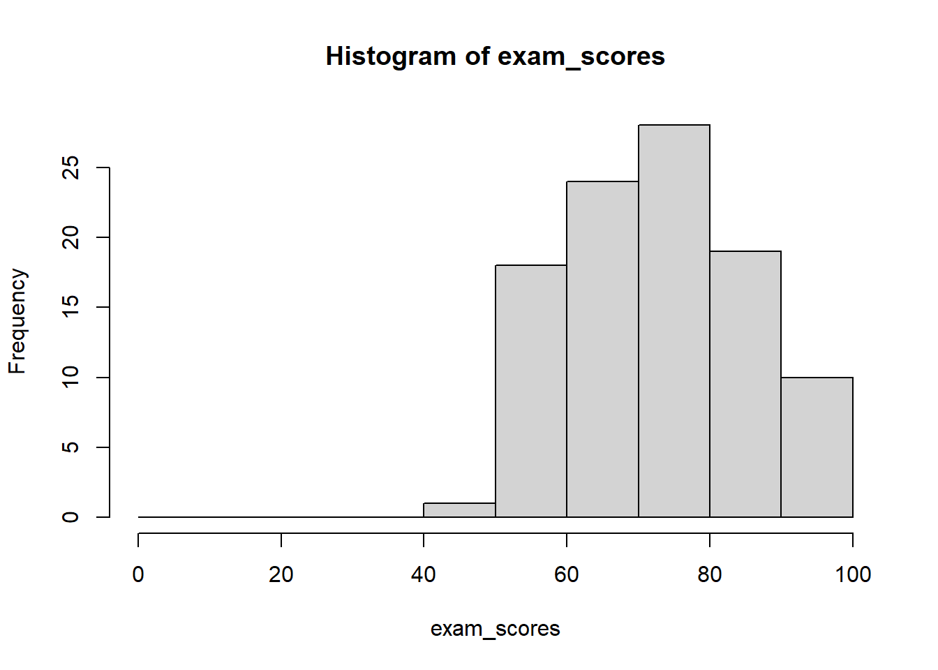
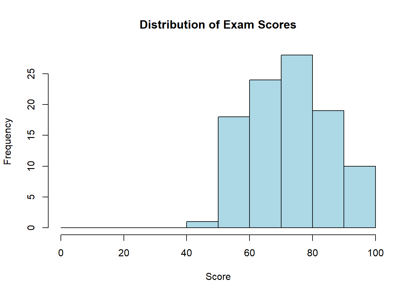
Visualizing Distributions: Histograms
A histogram is a graphical representation of a frequency distribution. It displays data using bars where:
The x-axis shows the values or intervals (bins)
The y-axis can show frequency, relative frequency, or density
The height of each bar represents the count, proportion, or density for that interval
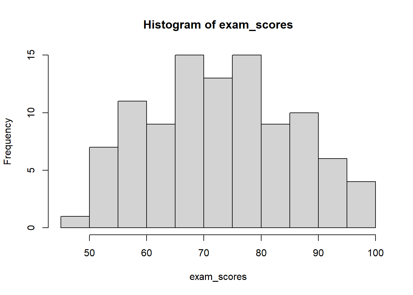
Bars touch each other (no gaps) for continuous variables
Choosing bin widths: The number and width of bins significantly affects how your histogram looks. Too few bins hide important patterns, while too many bins create “noise” and make patterns hard to see.
In statistics, noise is unwanted random variation that obscures the pattern we’re trying to find. Think of it like static on a radio—it makes the music (the “signal”) harder to hear. In data, noise comes from measurement errors, random fluctuations, or the inherent variability in what we’re studying. Noise is random variation in data that hides the real patterns we want to see, similar to how background noise makes conversation difficult to hear.
Several approaches help determine appropriate bin widths (*):
Sturges’ rule: Use k = 1 + \log_2(n) bins, where n is the sample size. This works well for roughly symmetric distributions.
Square root rule: Use k = \sqrt{n} bins. A simple, reasonable default for many situations.
In R, you can specify bins in several ways:
# Generate exam scores dataset.seed(123) # For reproducibilityexam_scores <-c(rnorm(80, mean =75, sd =12), # Most students cluster around 75runif(15, 50, 65), # Some lower performersrunif(5, 85, 95) # A few high achievers)# Keep scores within valid range (0-100)exam_scores <-pmin(pmax(exam_scores, 0), 100)# Round to whole numbersexam_scores <-round(exam_scores)# Specify number of binshist(exam_scores, breaks =10)
# Specify exact break pointshist(exam_scores, breaks =seq(0, 100, by =10))
# Let R choose automatically (uses Sturges' rule by default)hist(exam_scores)
The best approach is often to experiment with different bin widths to find what best reveals your data’s pattern. Start with a default, then try fewer and more bins to see how the story changes.
Defining bin boundaries: When creating bins for a frequency table, you must decide how to handle values that fall exactly on the boundaries. For example, if you have bins 0-10 and 10-20, which bin does the value 10 belong to?
The solution is to use interval notation to specify whether each boundary is included or excluded:
Closed interval[a, b] includes both endpoints: a \leq x \leq b
Open interval(a, b) excludes both endpoints: a < x < b
Half-open interval[a, b) includes the left endpoint but excludes the right: a \leq x < b
Half-open interval(a, b] excludes the left endpoint but includes the right: a < x \leq b
Standard convention: Most statistical software, including R, uses left-closed, right-open intervals[a, b) for all bins except the last one, which is fully closed [a, b]. This means:
The value at the lower boundary is included in the bin
The value at the upper boundary belongs to the next bin
The very last bin includes both boundaries to capture the maximum value
For example, with bins 0-20, 20-40, 40-60, 60-80, 80-100:
Score Range
Interval Notation
Values Included
0-20
[0, 20)
0 ≤ score < 20
20-40
[20, 40)
20 ≤ score < 40
40-60
[40, 60)
40 ≤ score < 60
60-80
[60, 80)
60 ≤ score < 80
80-100
[80, 100]
80 ≤ score ≤ 100
This convention ensures that:
Every value is counted exactly once (no double-counting)
No values fall through the cracks
The bins partition the entire range completely
When presenting frequency tables in reports, you can simply write “0-20, 20-40, …” and note that bins are left-closed, right-open, or explicitly show the interval notation if precision is important.
Frequency histogram shows the raw counts:
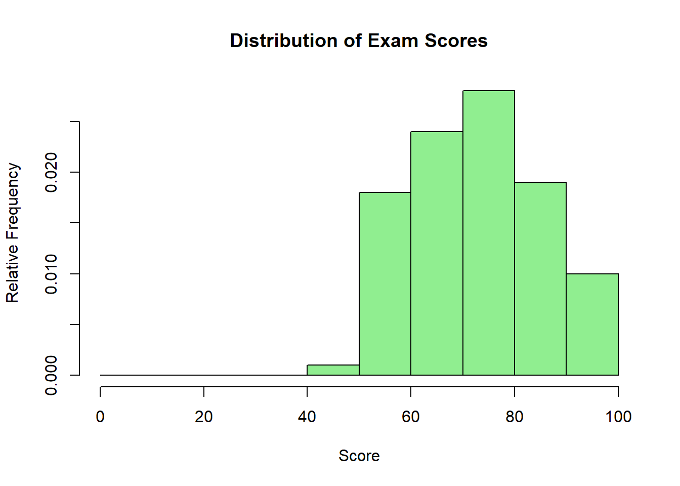
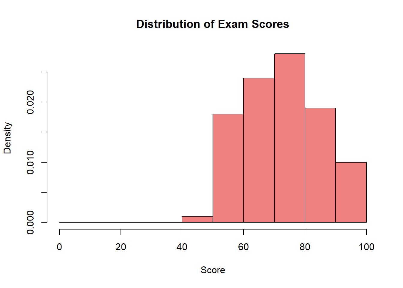
# R code examplehist(exam_scores, breaks =seq(0, 100, by =10),main ="Distribution of Exam Scores",xlab ="Score",ylab ="Frequency",col ="lightblue")
Relative frequency histogram shows proportions (useful when comparing groups of different sizes):
hist(exam_scores, breaks =seq(0, 100, by =10),freq =FALSE, # This creates relative frequency/densitymain ="Distribution of Exam Scores",xlab ="Score",ylab ="Relative Frequency",col ="lightgreen")
Density histogram adjusts for interval width and is used with density curves:
hist(exam_scores, breaks =seq(0, 100, by =10),freq =FALSE, # Creates density scalemain ="Distribution of Exam Scores",xlab ="Score",ylab ="Density",col ="lightcoral")
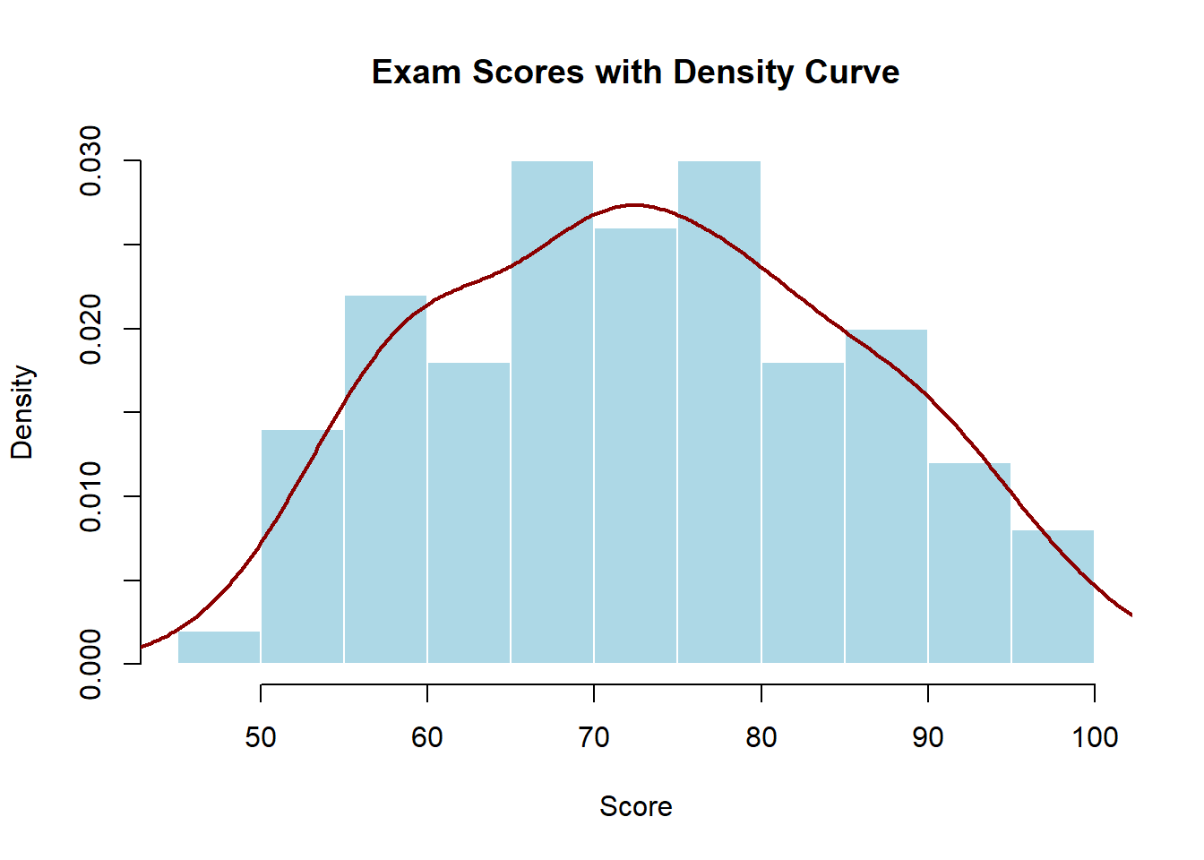
Density Curves
A density curve is a smooth line that approximates/models the shape of a distribution. Unlike histograms that show actual data in discrete bins, density curves show the overall pattern as a continuous function. The area under the entire curve always equals 1, and the area under any portion of the curve represents the proportion of observations in that range.
# Adding a density curve to a histogramhist(exam_scores, freq =FALSE,main ="Exam Scores with Density Curve",xlab ="Score",ylab ="Density",col ="lightblue",border ="white")lines(density(exam_scores), col ="darkred", lwd =2)
Density curves are particularly useful for:
Identifying the shape of the distribution (symmetric, skewed, bimodal)
Comparing multiple distributions on the same plot
Understanding the theoretical (true) distribution underlying your data
Tip
In statistics, a percentile indicates the relative position of a data point within a dataset by showing the percentage of observations that fall at or below that value. For example, if a student scores at the 90th percentile on a test, their score is equal to or higher than 90% of all other scores.
Quartiles are special percentiles that divide data into four equal parts: the first quartile (Q1, 25th percentile), second quartile (Q2, 50th percentile, also the median), and third quartile (Q3, 75th percentile). If Q1 = 65 points, then 25% of students scored 65 or below.
More generally, quantiles are values that divide data into equal-sized groups—percentiles divide into 100 parts, quartiles into 4 parts, deciles into 10 parts, and so on.
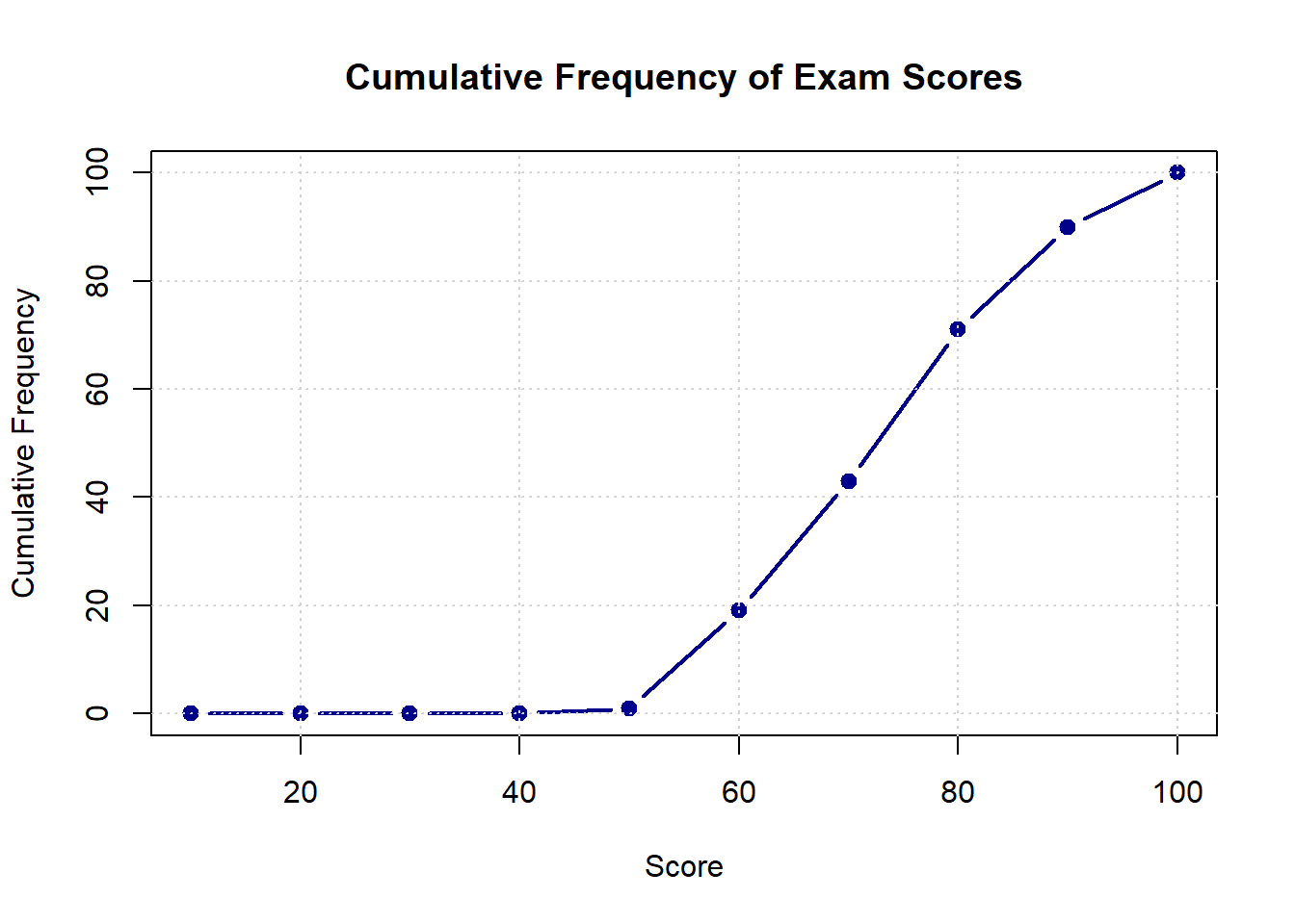
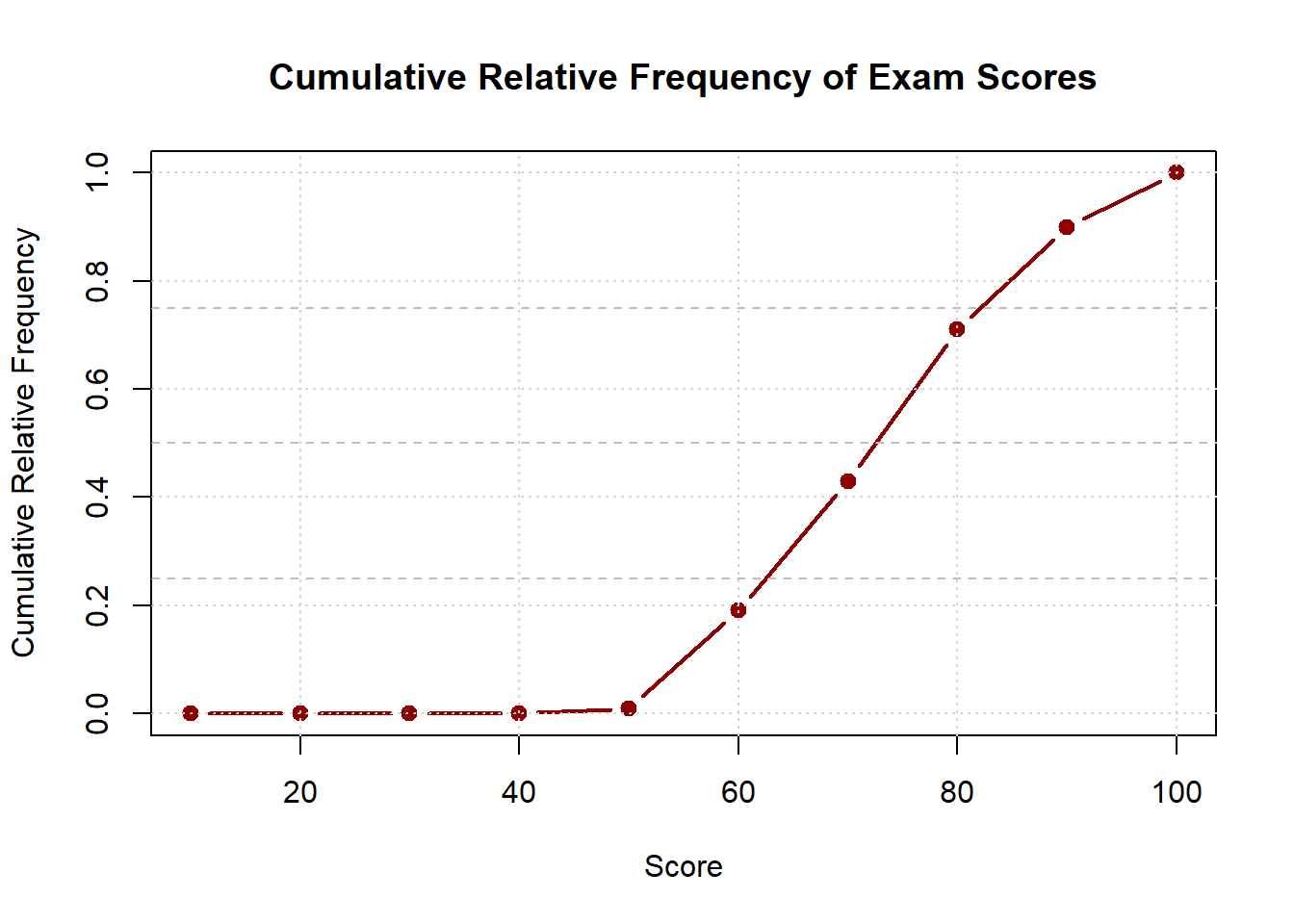
Visualizing Cumulative Frequency (*)
Cumulative frequency plots, also called ogives (pronounced “oh-jive”), display how frequencies accumulate across values. These plots use lines rather than bars and always increase from left to right, eventually reaching the total number of observations (for cumulative frequency) or 1.0 (for cumulative relative frequency).
Cumulative frequency plots are excellent for:
Finding percentiles and quartiles visually
Determining what proportion of data falls below or above a certain value
Comparing distributions of different groups
# Creating cumulative frequency datascore_breaks <-seq(0, 100, by =10)freq_counts <-hist(exam_scores, breaks = score_breaks, plot =FALSE)$countscumulative_freq <-cumsum(freq_counts)# Plotting cumulative frequencyplot(score_breaks[-1], cumulative_freq,type ="b", # both points and linesmain ="Cumulative Frequency of Exam Scores",xlab ="Score",ylab ="Cumulative Frequency",col ="darkblue",lwd =2,pch =19)grid()
For cumulative relative frequency (which is more commonly used):
The cumulative relative frequency curve makes it easy to read percentiles. For example, if you draw a horizontal line at 0.75 and see where it intersects the curve, the corresponding x-value is the 75th percentile—the score below which 75% of students fall.
Discrete vs. Continuous Distributions
The type of variable you’re analyzing determines how you visualize its distribution:
Discrete distributions apply to variables that can only take specific, countable values. Examples include number of children in a family (0, 1, 2, 3…), number of customer complaints per day, or responses on a 5-point Likert scale.
For discrete data, we typically use:
Bar charts (with gaps between bars) rather than histograms
Frequency or relative frequency on the y-axis
Each distinct value gets its own bar
# Example: Number of children per familychildren <-c(0, 1, 2, 2, 1, 3, 0, 2, 1, 4, 2, 1, 0, 2, 3)barplot(table(children),main ="Distribution of Number of Children",xlab ="Number of Children",ylab ="Frequency",col ="skyblue")
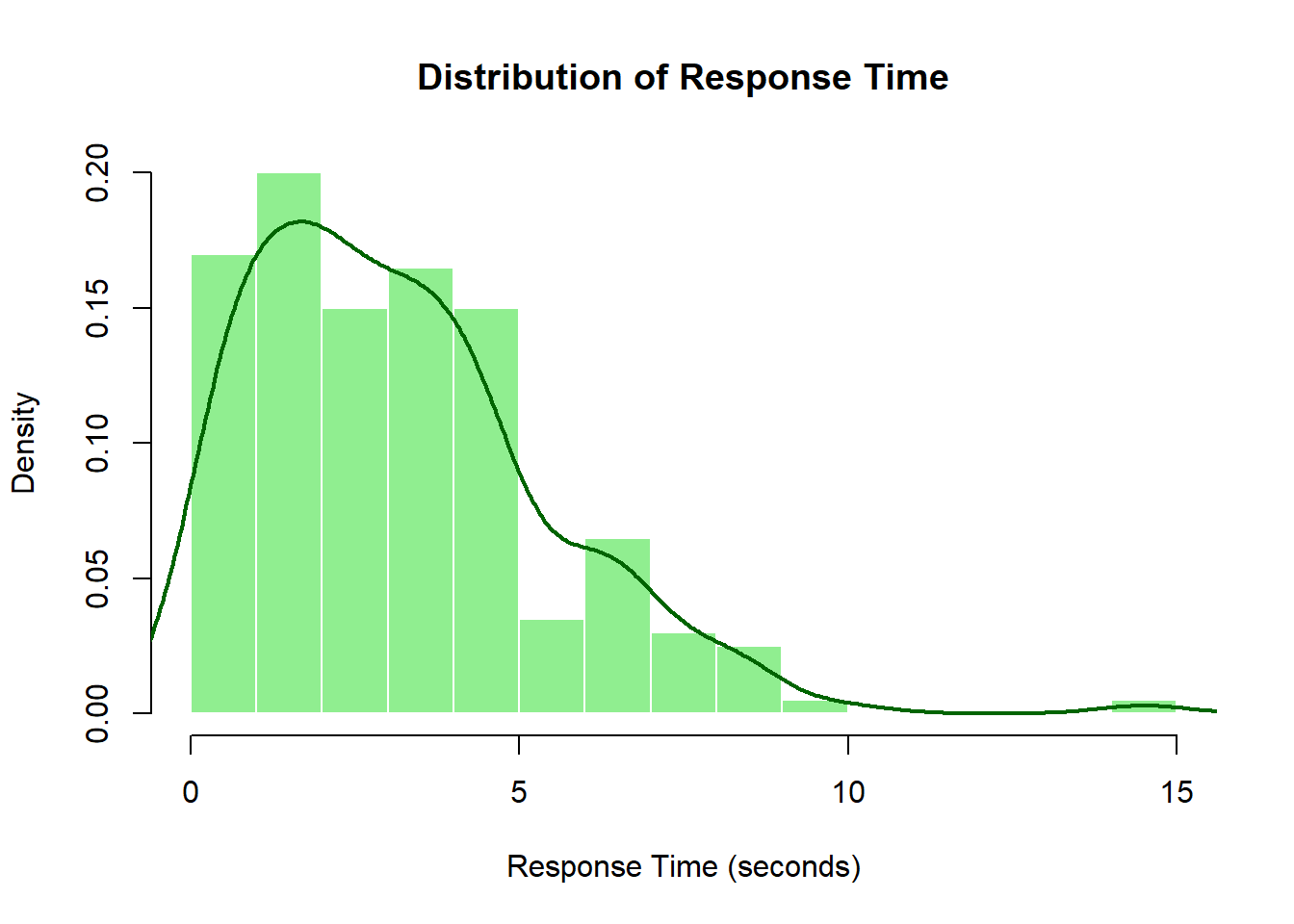
Continuous distributions apply to variables that can take any value within a range. Examples include temperature, response time, height, or turnout percentage.
For continuous data, we use:
Histograms (with touching bars) that group data into intervals
Density curves to show the smooth pattern
Density on the y-axis when using density curves
# Generate response time data (in seconds)set.seed(456) # For reproducibilityresponse_time <-rgamma(200, shape =2, scale =1.5)# Example: Response time distributionhist(response_time, breaks =15,freq =FALSE,main ="Distribution of Response Time",xlab ="Response Time (seconds)",ylab ="Density",col ="lightgreen",border ="white")lines(density(response_time), col ="darkgreen", lwd =2)
The key difference is that discrete distributions show probability at specific points, while continuous distributions show probability density across ranges. For continuous variables, the probability of any exact value is essentially zero—instead, we talk about the probability of falling within an interval.
Understanding whether your variable is discrete or continuous guides your choice of visualization and statistical methods, ensuring your analysis accurately represents the nature of your data.
Describing Distributions
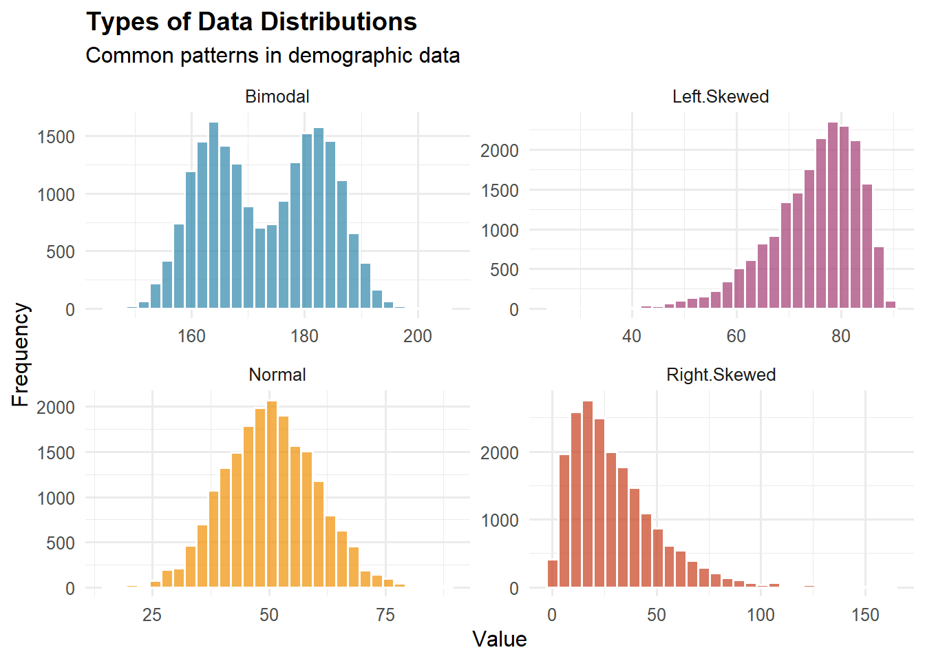
Shape Characteristics:
Symmetry vs. Skewness:
Symmetric: Mirror image around center (example: heights in homogeneous population)
Right-skewed (positive skew): Long tail to right (example: income, wealth)
Left-skewed (negative skew): Long tail to left (example: age at death in developed countries)
Example of Skewness Impact:
Income distribution in the U.S.:
Median household income: ~$70,000
Mean household income: ~$100,000
Mean > Median indicates right skew
A few very high incomes pull the mean up
Modality:
Unimodal: One peak (example: test scores)
Bimodal: Two peaks (example: height when mixing males and females)
Multimodal: Multiple peaks (example: age distribution in a college town—peaks at college age and middle age)
Important Probability Distributions:
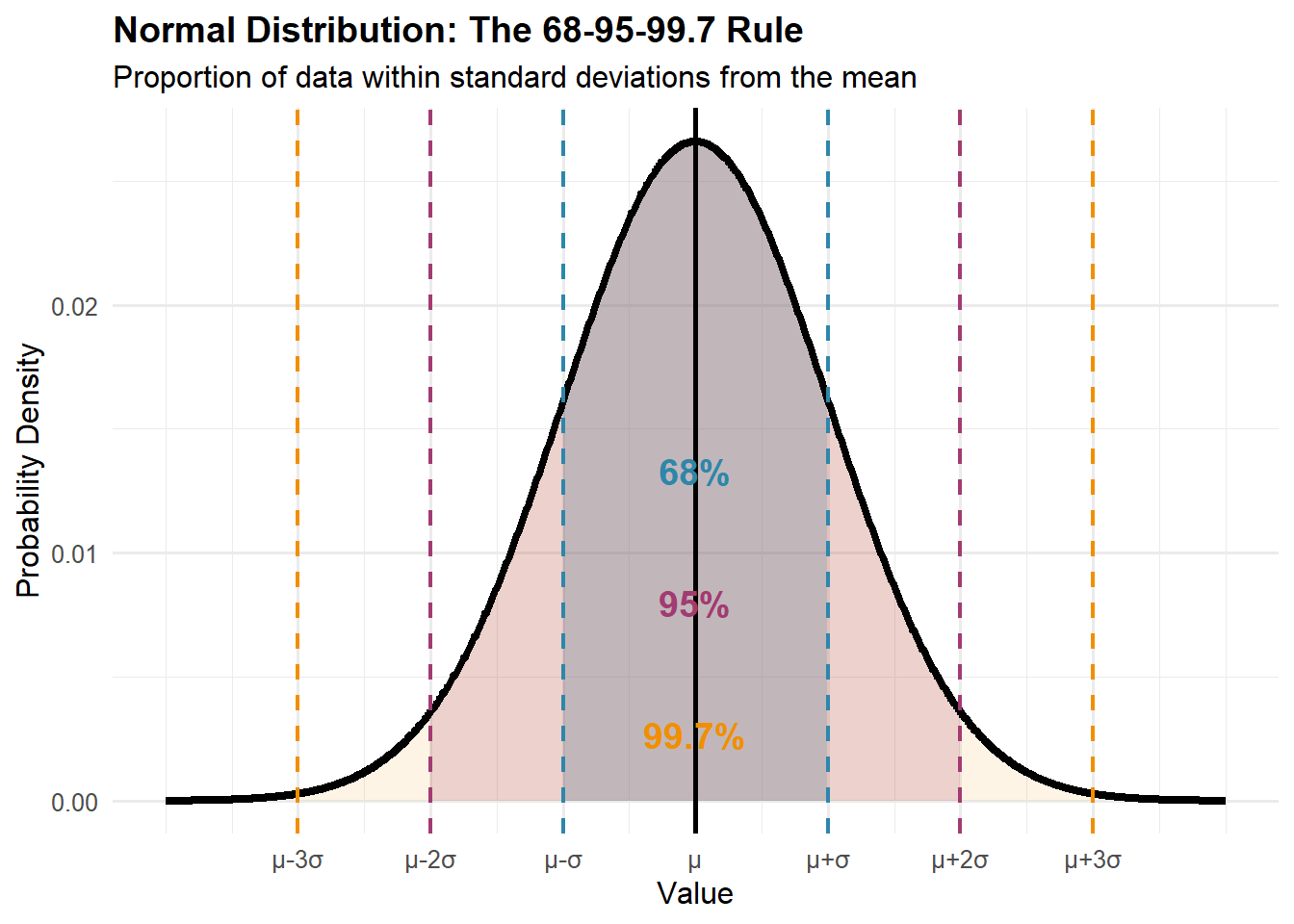
Normal (Gaussian) Distribution:
Bell-shaped, symmetric
Characterized by mean (\mu) and standard deviation (\sigma)
About 68% of values within \mu \pm \sigma
About 95% within \mu \pm 2\sigma
About 99.7% within \mu \pm 3\sigma
Demographic Applications:
Heights within homogeneous populations
Measurement errors
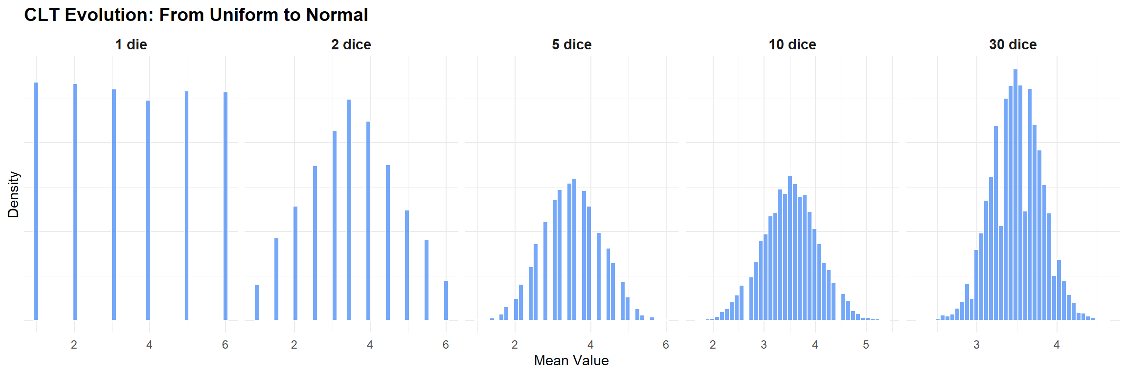
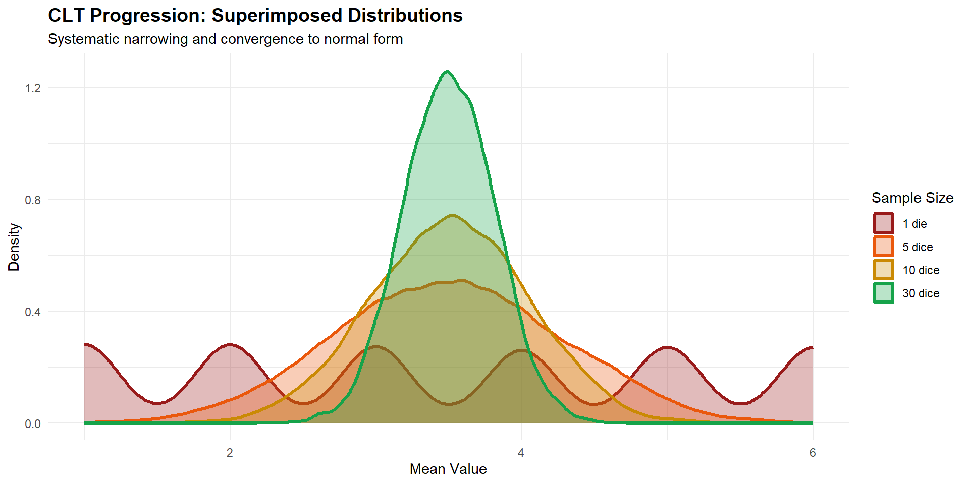
Sampling distributions of means (Central Limit Theorem)
Binomial Distribution:
Number of successes in n independent trials
Each trial has probability p of success
Mean = np, Variance = np(1-p)
Example: Number of male births out of 100 births (p \approx 0.512)
Poisson Distribution:
Count of events in fixed time/space
Mean = Variance = \lambda
Good for rare events
Demographic Applications:
Number of deaths per day in small town
Number of births per hour in hospital
Number of accidents at intersection per month
Visualizing Frequency Distributions (*)
Histogram: For continuous data, shows frequency with bar heights.
X-axis: Value ranges (bins)
Y-axis: Frequency or density
No gaps between bars (continuous data)
Bin width affects appearance
Bar Chart: For categorical data, shows frequency with separated bars.
X-axis: Categories
Y-axis: Frequency
Gaps between bars (discrete categories)
Order may or may not matter
Cumulative Distribution Function (CDF): Shows proportion of values ≤ each point of data.
Always increases (or stays flat)
Starts at 0, ends at 1
Steep slopes indicate common values
Flat areas indicate rare values
Box Plot (Box-and-Whisker Plot): A visual summary that displays the distribution’s key statistics using five key values.
The Five-Number Summary:
Minimum: Leftmost whisker end (excluding outliers)
Q1 (First Quartile): Left edge of the box (25th percentile)
Median (Q2): Line inside the box (50th percentile)
Q3 (Third Quartile): Right edge of the box (75th percentile)
Maximum: Rightmost whisker end (excluding outliers)
What It Reveals:
Skewness: If median line is off-center in the box, or whiskers are unequal
Spread: Wider boxes and longer whiskers indicate more variability
Outliers: Immediately visible as separate points
Symmetry: Equal whisker lengths and centered median suggest normal distribution
Quick Interpretation:
Narrow box = consistent data
Long whiskers = wide range of values
Many outliers = potential data quality issues or interesting extreme cases
Median closer to Q1 = right-skewed data (tail extends right)
Median closer to Q3 = left-skewed data (tail extends left)
Box plots are especially useful for comparing multiple groups side-by-side!
1.8 Variables and Measurement Scales
A variable is any characteristic that can take different values across units of observation.
Measurement: Transforming Concepts into Numbers
The Political World is Full of Data
Political science has evolved from a primarily theoretical discipline to one that increasingly relies on empirical evidence. Whether we’re studying:
Election outcomes: Why do people vote the way they do?
Public opinion: What shapes attitudes toward immigration or climate policy?
International relations: What factors predict conflict between nations?
Policy effectiveness: Did a new education policy actually improve outcomes?
We need systematic ways to analyze data and draw conclusions that go beyond anecdotes and personal impressions.
Consider this question: “Does democracy lead to economic growth?”
Your intuition might suggest yes—democratic countries tend to be wealthier. But is this causation or correlation? Are there exceptions? How confident can we be in our conclusions?
Statistics provides the tools to move from hunches to evidence-based answers, helping us distinguish between what seems true and what actually is true.
The Challenge of Measurement in Social Sciences
In social sciences, we often struggle with the fact that key concepts do not translate directly into numbers:
Quantitative Variables represent amounts or quantities and can be:
Continuous Variables: Can take any value within a range, limited only by measurement precision.
Age (22.5 years, 22.51 years, 22.514 years…)
Income ($45,234.67)
Height (175.3 cm)
Population density (432.7 people per square kilometer)
Discrete Variables: Can only take specific values, usually counts.
Number of children in a family (0, 1, 2, 3…)
Number of marriages (0, 1, 2…)
Number of rooms in a dwelling (1, 2, 3…)
Number of migrants entering a country per year
Qualitative Variables represent categories or qualities and can be:
Nominal Variables: Categories with no inherent order.
Country of birth (USA, Mexico, Canada…)
Religion (Christian, Muslim, Hindu, Buddhist…)
Blood type (A, B, AB, O)
Cause of death (heart disease, cancer, accident…)
Ordinal Variables: Categories with a meaningful order but unequal intervals.
Education level (no schooling, primary, secondary, tertiary)
Satisfaction with healthcare (very dissatisfied, dissatisfied, neutral, satisfied, very satisfied)
Socioeconomic status (low, middle, high)
Self-rated health (poor, fair, good, excellent)
Measurement Scales
Understanding measurement scales is crucial because they determine which statistical methods are appropriate:
Nominal Scale: Categories only—we can count frequencies but cannot order or perform arithmetic. Example: We can say 45% of residents were born locally, but we cannot calculate an “average birthplace.”
Ordinal Scale: Order matters but differences between values are not necessarily equal. Example: The difference between “poor” and “fair” health may not equal the difference between “good” and “excellent” health.
Interval Scale: Equal intervals between values but no true zero point. Example: Temperature in Celsius—the difference between 20°C and 30°C equals the difference between 30°C and 40°C, but 0°C doesn’t mean “no temperature.”
Ratio Scale: Equal intervals with a true zero point, allowing all mathematical operations. Example: Income—$40,000 is twice as much as $20,000, and $0 means no income.
1.9 Parameters, Statistics, Estimands, Estimators, and Estimates
Statistical inference is the process of learning unknown features of a population from finite samples. This section introduces five core ideas.
Quick comparison (summary table)
Term
What is it?
Random?
Typical notation
Example
Estimand
Precisely defined target quantity
No
words (specification)
“Median household income in CA on 2024-01-01.”
Parameter
The true population value of that quantity
No*
\theta,\ \mu,\ p,\ \beta
True mean age at first birth in France (2023)
Estimator
A rule/formula mapping data to an estimate
—
\hat\theta = g(X_1,\dots,X_n)
\bar X, \hat p = X/n, OLS \hat\beta
Statistic
Any function of the sample (includes estimators)
Yes
\bar X,\ s^2,\ r
Sample mean from n=500 births
Estimate
The numerical value obtained from the estimator
No
a number
\hat p = 0.433
*Fixed for the population/time frame you define; it can differ across places/times.
Parameter
A parameter is a numerical characteristic of a population—fixed but unknown.
Common parameters:\mu (mean), \sigma^2 (variance), p (proportion), \beta (regression effect), \lambda (rate).
Example. The true mean age at first birth for all women in France, 2023, is a parameter \mu. We do not know it without full population data.
Note
Notation. A common convention is Greek letters for population parameters and Roman letters for sample statistics. Consistency matters more than the specific symbols chosen.
Statistic
A statistic is any function of sample data. Statistics vary from sample to sample.
Examples:\bar x (sample mean), s^2 (sample variance), \hat p (sample proportion), r (sample correlation), b (sample regression slope).
Example. From a random sample of 500 births, \bar x = 30.9 years; a different sample might give 31.4.
Estimand
The estimand is the target quantity—specified clearly enough that two researchers would compute the same number from the same full population.
Well-specified estimands
“Median household income in California on 2024-01-01.”
“Male–female difference in life expectancy for births in Sweden, 2023.”
“Proportion of 25–34 year-olds in urban areas with tertiary education.”
Warning
Why precise definitions matter. “Unemployment rate” is ambiguous unless you specify (i) who counts as unemployed, (ii) age range, (iii) geography, (iv) time window. Different definitions lead to different parameters (e.g., U-1 … U-6 in the U.S.).
Estimator
An estimator is the rule that turns data into an estimate.
Bias — is the estimator centered on the truth? If the same study were repeated many times, an unbiased estimator would average to the true value. A biased estimator would systematically miss it (too high or too low).
Variance — how much do estimates differ across samples? Even without bias, repeated samples will not give exactly the same number. Lower variance means more stable results from sample to sample.
Mean Squared Error (MSE) — overall accuracy in one measure. MSE combines both components:
\mathrm{MSE}(\hat\theta)=\mathrm{Var}(\hat\theta)+\big(\mathrm{Bias}(\hat\theta)\big)^2.
Lower MSE is better. An estimator with a small bias but much lower variance can have a lower MSE than an unbiased but highly variable one.
Efficiency — comparative precision among estimators. Among unbiased estimators that target the same parameter with the same data, the more efficient estimator has the smaller variance. When small bias is allowed, compare using MSE instead.
Sources of precision (common cases)
Sample mean (simple random sample):
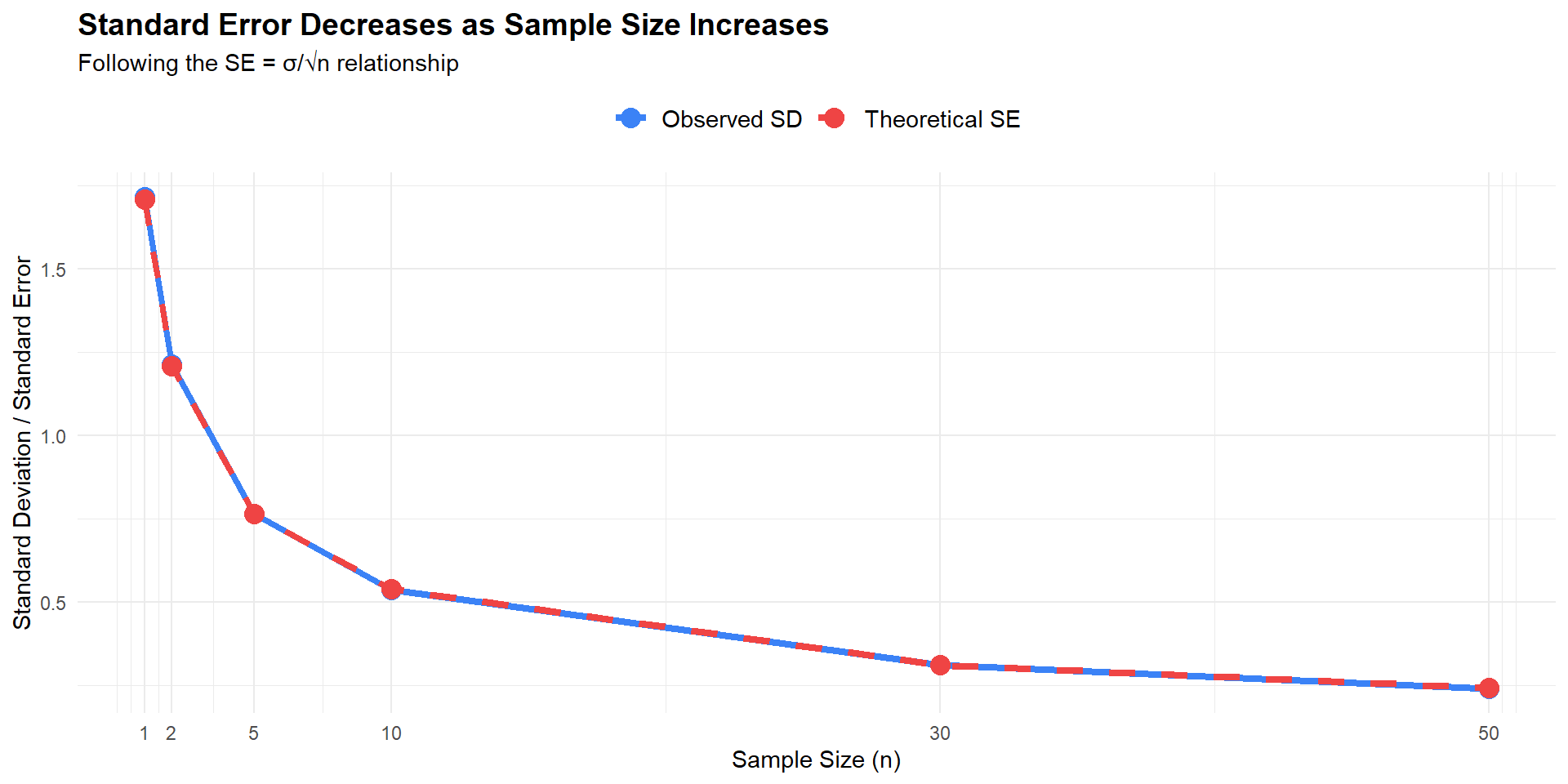
\operatorname{Var}(\bar X)=\frac{\sigma^2}{n},\qquad
\mathrm{SE}(\bar X)=\frac{\sigma}{\sqrt{n}}.
Larger n reduces SE at the rate 1/\sqrt{n}.
Design effects: clustering, stratification, and weights can change variance. Match your SE method to the sampling design.
Tip
Practical guidance
Define the estimand precisely (population, time, unit, and definition).
Select an estimator that directly targets that estimand.
Among unbiased options, prefer lower variance (greater efficiency).
When bias–variance trade-offs are relevant, compare MSE.
Report the estimate and its uncertainty (SE or CI), and state key assumptions.
Estimate
An estimate is the numerical value obtained after applying the estimator to the data.
Worked example
Estimand: Approval share among all U.S. adults today.
Parameter: p (unknown true approval).
Estimator: \hat p = X/n.
Sample: n=1{,}500, approvals X=650.
Estimate: \hat p = 650/1500 = 0.433 (43.3%).
Common confusions and clarifications
Parameter vs statistic: Population quantity vs sample-derived quantity.
Estimator vs estimate: Procedure vs numerical result.
Time index: Parameters can change over time (e.g., Q2 vs Q3).
Definition first: Specify the estimand before choosing the estimator.
Understanding Different Types of Unpredictability
Not all uncertainty is the same. Understanding different sources of unpredictability helps us choose appropriate statistical methods and interpret results correctly.
Concept
What is it?
Source of unpredictability
Example
Randomness
Individual outcomes are uncertain, but the probability distribution is known or modeled.
Fluctuations across realizations; lack of information about a specific outcome.
Dice roll, coin toss, polling sample
Chaos
Deterministic dynamics highly sensitive to initial conditions (butterfly effect).
Tiny initial differences grow rapidly → large trajectory divergences.
Weather forecasting, double pendulum, population dynamics
Entropy
A measure of uncertainty/dispersion (information-theoretic or thermodynamic).
Larger when outcomes are more evenly distributed (less predictive information).
Shannon entropy in data compression
“Haphazardness” (colloquial)
A felt lack of order without an explicit model; a mixture of mechanisms.
No structured description or stable rules; overlapping processes.
Traffic patterns, social media trends
Quantum randomness
A single outcome is not determined; only the distribution is specified (Born rule).
Fundamental (ontological) indeterminacy of individual measurements.
Electron spin measurement, photon polarization
Key Distinctions for Statistical Practice
Deterministic chaos ≠ statistical randomness: A chaotic system is fully deterministic yet practically unpredictable due to extreme sensitivity to initial conditions. Statistical randomness, by contrast, models uncertainty via probability distributions where individual outcomes are genuinely uncertain.
Why this matters: In statistics, we typically model phenomena as random processes, assuming we can specify probability distributions even when individual outcomes are unpredictable. This assumption underlies most statistical inference.
Quantum Mechanics and Fundamental Randomness
In the Copenhagen interpretation, randomness is fundamental (ontological): a single outcome cannot be predicted, but the probability distribution is given by the Born rule.
This represents true randomness at the most basic level of nature.
1.10 Statistical Error and Uncertainty
Introduction: Why Uncertainty Matters
No measurement or estimate is perfect. Understanding different types of error is crucial for interpreting results and improving study design.
The Central Challenge
Every time we use a sample to learn about a population, we introduce uncertainty. The key is to:
Quantify this uncertainty honestly
Distinguish between different sources of error
Communicate results transparently
Types of Error
Random Error
Random error represents unpredictable fluctuations that vary from observation to observation without a consistent pattern. These errors arise from various sources of natural variability in the data collection and measurement process.
Key Characteristics
Unpredictable Direction: Sometimes too high, sometimes too low
No Consistent Pattern: Varies randomly across observations
Averages to Zero: Over many measurements, positive and negative errors cancel out
Quantifiable: Can be estimated and reduced through appropriate methods
Random error encompasses several subtypes:
Sampling Error
Sampling error is the most common type of random error—it arises because we observe a sample rather than the entire population. Different random samples from the same population will yield different estimates purely by chance.
Key properties:
Decreases with sample size: \propto 1/\sqrt{n}
Quantifiable using probability theory
Inevitable when working with samples
Example: Internet Access Survey
Imagine surveying 100 random households about internet access:
The variation around the true value (red line) represents sampling error. With larger samples, estimates would cluster more tightly.
Measurement Error
Measurement error is random variation in the measurement process itself—even when measuring the same thing repeatedly.
Examples:
Slight variations when reading a thermometer due to parallax
Random fluctuations in electronic instruments
Inconsistencies in human judgment when coding qualitative data
Unlike sampling error (which comes from who/what we observe), measurement error comes from how we observe.
Other Sources of Random Error
Processing error: Random mistakes in data entry, coding, or computation
Model specification error: When the true relationship is more complex than assumed
Temporal variation: Natural day-to-day fluctuations in the phenomenon being measured
Systematic Error (Bias)
Systematic error represents consistent deviation in a particular direction. Unlike random error, it doesn’t average out with repeated sampling or measurement—it persists and pushes results consistently away from the truth.
Example: Scales that always read 2 pounds heavy; survey questions that lead respondents toward particular answers.
Respondents systematically misreport.
Example: People underreport alcohol consumption, overreport voting, or give socially desirable answers.
Non-responders differ systematically from responders.
Example: Very sick and very healthy people less likely to respond to health surveys, leaving only those with moderate health.
Only observing “survivors” of some process.
Example: During WWII, the military analyzed returning bombers to determine where to add armor. Planes showed the most damage on wings and tail sections. Abraham Wald realized the flaw: they should armor where there weren’t bullet holes—the engine and cockpit. Planes hit in those areas never made it back to be analyzed. They were only studying the survivors.
Observers or interviewers systematically influence results.
Example: Interviewers unconsciously prompting certain responses or recording observations that confirm their expectations.
The Bias-Variance Decomposition
Mathematically, total error (Mean Squared Error) decomposes into:
Confidence intervals quantify sampling uncertainty but assume no systematic error. A perfectly precise estimate (narrow CI) can still be biased if the study design is flawed.
Practical Application: Opinion Polling
Case Study: Political Polls
When a poll reports “Candidate A: 52%, Candidate B: 48%”, this is incomplete without uncertainty quantification.
The Golden Rule of Polling
With ~1,000 randomly selected respondents:
Margin of error: ±3 percentage points (95% confidence)
Interpretation: A reported 52% means true support likely between 49% and 55%
What this covers: Only random sampling error—assumes no systematic bias
Critical Distinction
The ±3% margin of error quantifies sampling uncertainty only. It does not account for:
Coverage bias (who’s excluded from the sampling frame)
Non-response bias (who refuses to participate)
Response bias (people misreporting their true views)
Timing effects (opinions changing between poll and election)
Sample Size and Precision
Sample Size
Margin of Error (95%)
Use Case
n = 100
± 10 pp
Broad direction only
n = 400
± 5 pp
General trends
n = 1,000
± 3 pp
Standard polls
n = 2,500
± 2 pp
High precision
n = 10,000
± 1 pp
Very high precision
Law of Diminishing Returns
To halve the margin of error, you need four times the sample size because \text{MOE} \propto 1/\sqrt{n}
This applies only to sampling error. Doubling your sample size from 1,000 to 2,000 won’t fix systematic problems like biased question wording or unrepresentative sampling methods.
What Quality Polls Should Report
A transparent poll discloses:
Field dates: When was data collected?
Population and sampling method: Who was surveyed and how were they selected?
Sample size: How many people responded?
Response rate: What proportion of contacted people participated?
Weighting procedures: How was the sample adjusted to match population characteristics?
Margin of sampling error: Quantification of sampling uncertainty
Question wording: Exact text of questions asked
The Reporting Gap
Most news reports mention only the topline numbers and occasionally the margin of error. They rarely discuss potential systematic biases, which can be much larger than sampling error.
Visualization: Sampling Variability
The following simulation demonstrates how confidence intervals behave across repeated sampling:
Most intervals capture the true value, but some “miss” purely due to sampling randomness. This is expected and quantifiable—it’s the nature of random sampling error.
Important: This simulation assumes no systematic bias. In real polling, systematic errors (non-response bias, coverage problems, question wording effects) can shift all estimates in the same direction, making them consistently wrong even with large samples.
Common Misconceptions
Misconception #1: Margin of Error Covers All Uncertainty
❌ Myth: “The true value is definitely within the margin of error”
✅ Reality:
With 95% confidence, there’s still a 5% chance the true value falls outside the interval due to sampling randomness alone
More importantly, margin of error only covers sampling error, not systematic biases
Real polls often have larger errors from non-response bias, question wording, or coverage problems than from sampling error
Misconception #2: Larger Samples Fix Everything
❌ Myth: “If we just survey more people, we’ll eliminate all error”
✅ Reality:
Larger samples reduce random error (particularly sampling error): more precise estimates
Larger samples do NOT reduce systematic error: bias remains unchanged
A poll of 10,000 people with 70% response rate and biased sampling frame will give a precisely wrong answer
Better to have 1,000 well-selected respondents than 10,000 poorly selected ones
Misconception #3: Random = Careless
❌ Myth: “Random error means someone made mistakes”
✅ Reality:
Random error is inherent in sampling and measurement—it’s not a mistake
Even with perfect methodology, different random samples yield different results
Random errors are predictable in aggregate even though unpredictable individually
The term “random” refers to the pattern (no systematic direction), not to carelessness
Misconception #4: Confidence Intervals are Guarantees
❌ Myth: “95% confidence means there’s a 95% chance the true value is in this specific interval”
✅ Reality:
The true value is fixed (but unknown)—it either is or isn’t in the interval
“95% confidence” means: if we repeated this process many times, about 95% of the intervals we construct would contain the true value
Each specific interval either captures the truth or doesn’t—we just don’t know which
Misconception #5: Bias Can Be Calculated Like Random Error
❌ Myth: “We can calculate the bias just like we calculate standard error”
✅ Reality:
Random error is quantifiable using probability theory because we know the sampling process
Systematic error is usually unknown and unknowable without external validation
You can’t use the sample itself to detect bias—you need independent information about the population
This is why comparing polls to election results is valuable: it reveals biases that weren’t quantifiable beforehand
Real-World Example: Polling Failures
Case Study: When Polls Mislead
Consider a scenario where 20 polls all show Candidate A leading by 3-5 points, with margins of error around ±3%. The polls seem consistent, but Candidate B wins.
What happened?
Not sampling error: All polls agreed—unlikely if only random variation
Likely systematic error:
Non-response bias: Certain voters consistently refused to participate
Social desirability bias: Some voters misreported their true preference
Turnout modeling error: Wrong assumptions about who would actually vote
Coverage bias: Sampling frame (e.g., phone lists) systematically excluded certain groups
The lesson: Consistency among polls doesn’t guarantee accuracy. All polls can share the same systematic biases, giving false confidence in wrong estimates.
Key Takeaways
Essential Points
Understanding Error Types:
Random error is unpredictable variation that averages to zero
Sampling error: From observing a sample, not the whole population
Measurement error: From imperfect measurement instruments or processes
Reduced by: larger samples, better instruments, more measurements
Systematic error (bias) is consistent deviation in one direction
Selection bias, measurement bias, response bias, non-response bias, etc.
Reduced by: better study design, not larger samples
Quantifying Uncertainty:
Standard error measures typical sampling variability (one type of random error)
Margin of error ≈ 2 × SE gives a range for 95% confidence about sampling uncertainty
Sample size and sampling error precision follow: \text{SE} \propto 1/\sqrt{n}
Quadrupling sample size halves sampling error
Diminishing returns as n increases
Confidence intervals provide plausible ranges but assume no systematic bias
Critical Insights:
A precisely wrong answer (large biased sample) is often worse than an imprecisely right answer (small unbiased sample)
Always consider both sampling error AND potential systematic biases—published margins of error typically ignore the latter
Transparency matters: Report methodology, response rates, and potential biases, not just point estimates and margins of error
Validation is essential: Compare estimates to known values whenever possible to detect systematic errors
The Practitioner’s Priority
When designing studies:
First: Minimize systematic error through careful design
Representative sampling methods
High response rates
Unbiased measurement tools
Proper question wording
Then: Optimize sample size to achieve acceptable precision
Larger samples help only after bias is addressed
Balance cost vs. precision improvement
Remember diminishing returns
Finally: Report uncertainty honestly
State assumptions clearly
Acknowledge potential biases
Don’t let precise estimates create false confidence
1.11 Sampling and Sampling Methods (*)
Sampling is the process of selecting a subset of individuals from a population to estimate characteristics of the whole population. The way we sample profoundly affects what we can conclude from our data.
The Sampling Frame
Before discussing methods, we must understand the sampling frame—the list or device from which we draw our sample. The frame should ideally include every population member exactly once.
Common Sampling Frames:
Electoral rolls (for adult citizens)
Telephone directories (increasingly problematic due to mobile phones and unlisted numbers)
Address lists from postal services
Birth registrations (for newborns)
School enrollment lists (for children)
Tax records (for income earners)
Satellite imagery (for dwellings in remote areas)
Frame Problems:
Undercoverage: Frame missing population members (homeless individuals not on address lists)
Overcoverage: Frame includes non-population members (deceased people still on voter rolls)
Duplication: Same unit appears multiple times (people with multiple phone numbers)
Clustering: Multiple population members per frame unit (multiple families at one address)
Probability Sampling Methods
Probability sampling gives every population member a known, non-zero probability of selection. This allows us to make statistical inferences about the population.
Simple Random Sampling (SRS)
Every possible sample of size n has equal probability of selection. It’s the gold standard for statistical theory but often impractical for large populations.
How It Works:
Number every unit in the population from 1 to N
Use random numbers to select n units
Each unit has probability n/N of selection
Example: To sample 50 students from a school of 1,000:
Assign each student a number from 1 to 1,000
Generate 50 random numbers between 1 and 1,000
Select students with those numbers
Advantages:
Statistically optimal
Easy to analyze
No need for additional information about population
Disadvantages:
Requires complete sampling frame
Can be expensive (selected units might be far apart)
May not represent important subgroups well by chance
Systematic Sampling
Select every kth element from an ordered sampling frame, where k = N/n (the sampling interval).
How It Works:
Calculate sampling interval k = N/n
Randomly select starting point between 1 and k
Select every kth unit thereafter
Example: To sample 100 houses from 5,000 on a street listing:
k = 5,000/100 = 50
Random start: 23
Sample houses: 23, 73, 123, 173, 223…
Advantages:
Simple to implement in field
Spreads sample throughout population
Disadvantages:
Can introduce bias if there’s periodicity in the frame
Hidden Periodicity Example: Sampling every 10th apartment in buildings where corner apartments (numbers ending in 0) are all larger. This would bias our estimate of average apartment size.
Stratified Sampling
Divide population into homogeneous subgroups (strata) before sampling. Sample independently within each stratum.
How It Works:
Divide population into non-overlapping strata
Sample independently from each stratum
Combine results with appropriate weights
Example: Studying income in a city with distinct neighborhoods:
Stratum 1: High-income neighborhood (10% of population) - sample 100
Stratum 2: Middle-income neighborhood (60% of population) - sample 600
Stratum 3: Low-income neighborhood (30% of population) - sample 300
Types of Allocation:
Proportional: Sample size in each stratum proportional to stratum size
If stratum has 20% of population, it gets 20% of sample
Optimal (Neyman): Larger samples from more variable strata
If income varies more in high-income areas, sample more there
Equal: Same sample size per stratum regardless of population size
Useful when comparing strata is primary goal
Advantages:
Ensures representation of all subgroups
Can increase precision substantially
Allows different sampling methods per stratum
Provides estimates for each stratum
Disadvantages:
Requires information to create strata
Can be complex to analyze
Cluster Sampling
Select groups (clusters) rather than individuals. Often used when population is naturally grouped or when creating a complete frame is difficult.
Single-Stage Cluster Sampling:
Divide population into clusters
Randomly select some clusters
Include all units from selected clusters
Two-Stage Cluster Sampling:
Randomly select clusters (Primary Sampling Units)
Within selected clusters, randomly select individuals (Secondary Sampling Units)
Example: Surveying rural households in a large country:
Stage 1: Randomly select 50 villages from 1,000 villages
Stage 2: Within each selected village, randomly select 20 households
Total sample: 50 × 20 = 1,000 households
Multi-Stage Example: National health survey:
Stage 1: Select states
Stage 2: Select counties within selected states
Stage 3: Select census blocks within selected counties
Stage 4: Select households within selected blocks
Stage 5: Select one adult within selected households
If DEFF = 2, you need twice the sample size to achieve the same precision as SRS.
Non-Probability Sampling Methods
Non-probability sampling doesn’t guarantee known selection probabilities. While limiting statistical inference, these methods may be necessary or useful in certain situations.
Convenience Sampling
Selection based purely on ease of access. No attempt at representation.
Examples:
Surveying students in your class about study habits
Interviewing people at a shopping mall about consumer preferences
Online polls where anyone can participate
Medical studies using volunteers who respond to advertisements
When It Might Be Acceptable:
Pilot studies to test survey instruments
Exploratory research to identify issues
When studying processes believed to be universal
Major Problems:
No basis for inference to population
Severe selection bias likely
Results may be completely misleading
Real Example: Literary Digest’s 1936 U.S. presidential poll surveyed 2.4 million people (huge sample!) but used telephone directories and club memberships as frames during the Depression, dramatically overrepresenting wealthy voters and incorrectly predicting Landon would defeat Roosevelt.
Purposive (Judgmental) Sampling
Deliberate selection of specific cases based on researcher judgment about what’s “typical” or “interesting.”
Examples:
Selecting “typical” villages to represent rural areas
Choosing specific age groups for a developmental study
Selecting extreme cases to understand range of variation
Picking information-rich cases for in-depth study
Types of Purposive Sampling:
Typical Case: Choose average or normal examples
Studying “typical” American suburbs
Extreme/Deviant Case: Choose unusual examples
Studying villages with unusually low infant mortality to understand success factors
Maximum Variation: Deliberately pick diverse cases
Selecting diverse schools (urban/rural, rich/poor, large/small) for education research
Critical Case: Choose cases that will be definitive
“If it doesn’t work here, it won’t work anywhere”
When It’s Useful:
Qualitative research focusing on depth over breadth
When studying rare populations
Resource constraints limit sample size severely
Exploratory phases of research
Problems:
Entirely dependent on researcher judgment
No statistical inference possible
Different researchers might select different “typical” cases
Quota Sampling
Selection to match population proportions on key characteristics. Like stratified sampling but without random selection within groups.
Determine population proportions for these characteristics
Set quotas for each combination
Interviewers fill quotas using convenience methods
Detailed Example: Political poll with quotas:
Population proportions:
Male 18-34: 15%
Male 35-54: 20%
Male 55+: 15%
Female 18-34: 16%
Female 35-54: 19%
Female 55+: 15%
For a sample of 1,000:
Interview 150 males aged 18-34
Interview 200 males aged 35-54
And so on…
Interviewers might stand on street corners approaching people who appear to fit needed categories until quotas are filled.
Why It’s Popular in Market Research:
Faster than probability sampling
Cheaper (no callbacks for specific individuals)
Ensures demographic representation
No sampling frame needed
Why It’s Problematic for Statistical Inference:
Hidden Selection Bias: Interviewers approach people who look approachable, speak the language well, aren’t in a hurry—systematically excluding certain types within each quota cell.
Example of Bias: An interviewer filling a quota for “women 18-34” might approach women at a shopping mall on Tuesday afternoon, systematically missing:
Women who work during weekdays
Women who can’t afford to shop at malls
Women with young children who avoid malls
Women who shop online
Even though the final sample has the “right” proportion of young women, they’re not representative of all young women.
No Measure of Sampling Error: Without selection probabilities, we can’t calculate standard errors or confidence intervals.
Historical Cautionary Tale: Quota sampling was standard in polling until the 1948 U.S. presidential election, when polls using quota sampling incorrectly predicted Dewey would defeat Truman. The failure led to adoption of probability sampling in polling.
Snowball Sampling
Participants recruit additional subjects from their acquaintances. The sample grows like a rolling snowball.
How It Works:
Identify initial participants (seeds)
Ask them to refer others with required characteristics
Ask new participants for further referrals
Continue until sample size reached or referrals exhausted
Example: Studying undocumented immigrants:
Start with 5 immigrants you can identify
Each refers 3 others they know
Those 15 each refer 2-3 others
Continue until you have 100+ participants
When It’s Valuable:
Hidden Populations: Groups without sampling frames
Drug users
Homeless individuals
People with rare diseases
Members of underground movements
Socially Connected Populations: When relationships matter
Studying social network effects
Researching community transmission of diseases
Understanding information diffusion
Trust-Dependent Research: When referrals increase participation
As sample size increases, sample statistics converge to population parameters.
Demonstration: Estimating sex ratio at birth:
10 births: 7 males (70% - very unstable)
100 births: 53 males (53% - getting closer to ~51.2%)
1,000 births: 515 males (51.5% - quite close)
10,000 births: 5,118 males (51.18% - very close)
Visualizing the Law of Large Numbers: Coin Flips
Let’s see this in action with coin flips. A fair coin has a 50% chance of landing heads, but individual flips are unpredictable.
# Simulate coin flips and show convergenceset.seed(42)n_flips <-1000flips <-rbinom(n_flips, 1, 0.5) # 1 = heads, 0 = tails# Calculate cumulative proportion of headscumulative_prop <-cumsum(flips) /seq_along(flips)# Create data frame for plottinglln_data <-data.frame(flip_number =1:n_flips,cumulative_proportion = cumulative_prop)# Plot the convergenceggplot(lln_data, aes(x = flip_number, y = cumulative_proportion)) +geom_line(color ="steelblue", alpha =0.7) +geom_hline(yintercept =0.5, color ="red", linetype ="dashed", size =1) +geom_hline(yintercept =c(0.45, 0.55), color ="red", linetype ="dotted", alpha =0.7) +labs(title ="Law of Large Numbers: Coin Flip Proportions Converge to 0.5",x ="Number of coin flips",y ="Cumulative proportion of heads",caption ="Red dashed line = true probability (0.5)\nDotted lines = ±5% range" ) +scale_y_continuous(limits =c(0.3, 0.7), breaks =seq(0.3, 0.7, 0.1)) +theme_minimal()
What this shows:
Early flips show wild variation (first 10 flips might be 70% or 30% heads)
As we add more flips, the proportion stabilizes around 50%
The “noise” of individual outcomes averages out over time
The Mathematical Statement
Let A denote an event of interest (e.g., “heads on a coin flip”, “vote for party X”, “sum of dice equals 7”). If P(A) = p and we observe nindependent trials with the same distribution (i.i.d.), then the sample frequency ofA:
\hat{p}_n = \frac{\text{number of occurrences of } A}{n}
converges top as n increases.
Examples in Different Contexts
Dice example: The event “sum = 7” with two dice has probability 6/36 ≈ 16.7\%, while “sum = 4” has 3/36 ≈ 8.3\%. Over many throws, a sum of 7 appears about twice as often as a sum of 4.
Election polling: If population support for a party equals p, then under random sampling of size n, the observed frequency \hat{p}_n will approach p as n grows (assuming random sampling and independence).
Quality control: If 2% of products are defective, then in large batches, approximately 2% will be found defective (assuming independent production).
Why This Matters for Statistics
Bottom line: Randomness underpins statistical inference by turning uncertainty in individual outcomes into predictable distributions for estimates. The Law of Large Numbers guarantees that the “noise” of individual outcomes averages out, allowing us to:
Predict long-run frequencies
Quantify uncertainty (margins of error)
Draw reliable inferences from samples
Make probabilistic statements about populations
This principle works in surveys, experiments, and even quantum phenomena (in the frequentist interpretation).
Central Limit Theorem (CLT)
The Central Limit Theorem states that the distribution of sample means approaches a normal distribution as sample size increases, regardless of the shape of the original population distribution. This holds true even for highly skewed or non-normal populations.
Key Insights
Sample Size Threshold: Sample sizes of n ≥ 30 are typically sufficient for the CLT to apply
Standard Error: The standard deviation of sample means equals σ/√n, where σ is the population standard deviation
Statistical Foundation: We can make inferences about population parameters using normal distribution properties, even when the underlying data is non-normal
Why This Matters in Practice
Consider income data, which is typically right-skewed with a long tail of high earners. While individual incomes don’t follow a normal distribution, something remarkable happens when we repeatedly take samples and calculate their means:
What “normally distributed sample means” actually means:
If you take many different groups of 30+ people and calculate each group’s average income
These group averages will form a bell-shaped pattern when plotted
Most group averages will cluster near the true population mean
The probability of getting a group average far from the population mean becomes predictable
This predictable pattern (normal distribution) allows us to:
Calculate confidence intervals using normal distribution properties
Perform statistical hypothesis tests
Make predictions about sample means with known probability
Concrete Example: Imagine a city where individual incomes range from $20,000 to $10,000,000, heavily skewed right. If you:
Randomly select 100 people and calculate their mean income: maybe $75,000
Repeat this 1000 times (1000 different groups of 100 people)
Plot these 1000 group means: they’ll form a bell curve centered around the true population mean
About 95% of these group means will fall within a predictable range
This happens even though individual incomes are extremely skewed!
Mathematical Foundation
For a population with mean μ and finite variance σ²:
Sampling distribution of the mean: \bar{X} \sim N(\mu, \frac{\sigma^2}{n}) as n \to \infty
Standard error of the mean: SE_{\bar{X}} = \frac{\sigma}{\sqrt{n}}
Standardized sample mean: Z = \frac{\bar{X} - \mu}{\sigma/\sqrt{n}} \sim N(0,1) for large n
Key Takeaways
Universal Application: The CLT applies to any distribution with finite variance
Convergence to Normality: The approximation to normal distribution improves as sample size increases
Foundation for Inference: Most parametric statistical tests rely on the CLT
Sample Size Considerations: While n ≥ 30 is a common guideline, highly skewed distributions may require larger samples for accurate approximation
1.13 Statistical Significance: A Quick Start Guide
Imagine you flip a coin 10 times and get 8 heads. Is the coin biased, or did you just get lucky? This is the core question statistical significance (statistical inference) helps us answer.
Statistical significance tells us whether patterns in our data likely reflect something real or could have happened by pure chance.
Statistical significance is a measure (p-value) of how confident we can be that patterns observed in our sample are not due to chance alone. When a result is statistically significant (typically p-value < 0.05), it means the probability of obtaining such data in the absence of a real effect is very low.
The Courtroom Analogy
Statistical hypothesis testing works like a criminal trial:
Null Hypothesis (H_0): The defendant is innocent (no effect exists)
Alternative Hypothesis (H_1): The defendant is guilty (an effect exists)
The Evidence: Your data and test results
The Verdict: “Guilty” (reject H_0) or “Not Guilty” (fail to reject H_0)
Crucial distinction: “Not guilty” ≠ “Innocent”
A “not guilty” verdict means insufficient evidence to convict
Similarly, “not statistically significant” means insufficient evidence for an effect, NOT proof of no effect
Start with Skepticism (Presumption of Innocence)
In statistics, we always start by assuming nothing special is happening:
Null Hypothesis (H_0): “There’s no effect”
The coin is fair
The new drug doesn’t work
Study time doesn’t affect grades
Alternative Hypothesis (H_1): “There IS an effect”
The coin is biased
The drug works
More study time improves grades
Key principle: We maintain the null hypothesis (innocence) unless our data provides strong evidence against it—“beyond a reasonable doubt” in legal terms, or “p < 0.05” in statistical terms.
1.14 The p-value: Your “Surprise Meter”
The p-value answers one specific question:
“If nothing special were happening (null hypothesis is true), how surprising would our results be?”
A p-value is the probability of observing the study’s results, or more extreme results, if the null hypothesis (a statement of no effect or no difference) is true.
Three Ways to Think About p-values
1. The Surprise Scale
p < 0.01: Very surprising! (Strong evidence against H_0)
p < 0.05: Pretty surprising (Moderate evidence against H_0)
p > 0.05: Not that surprising (Insufficient evidence against H_0)
2. Concrete Example: The Suspicious Coin
You flip a coin 10 times and get 8 heads. What’s the p-value?
The calculation: If the coin were fair, the probability of getting 8 or more heads is: p = P(≥8 \text{ heads in 10 flips}) \approx 0.055 \approx 5.5\%
Interpretation: There’s a 5.5% chance of getting results this extreme with a fair coin. That’s somewhat unusual but not shocking.
3. The Formal Definition
A p-value is the probability of getting results at least as extreme as what you observed, assuming the null hypothesis is true.
Warning
Common Mistake: The p-value is NOT the probability that the null hypothesis is true! It assumes the null is true and tells you how unusual your data would be in that world.
1.15 The Prosecutor Fallacy: A Warning
I can see why the example might be challenging for beginners! Here’s a revised version that builds up the intuition more gradually without requiring knowledge of Bayes theorem or significance levels:
1.16 The Prosecutor Fallacy: A Warning
The Fallacy Explained
Imagine this courtroom scenario:
Prosecutor: “If the defendant were innocent, there’s only a 1% chance we’d find his DNA at the crime scene. We found his DNA. Therefore, there’s a 99% chance he’s guilty!”
This is WRONG! The prosecutor confused:
P(Evidence | Innocent) = 0.01 ← What we know
P(Innocent | Evidence) = ? ← What we want to know (but can’t get from the p-value alone!)
When we get p = 0.01, it’s tempting to think:
❌ WRONG: “There’s only a 1% chance the null hypothesis is true”
❌ WRONG: “There’s a 99% chance our treatment works”
✅ CORRECT: “If the null hypothesis were true, there’s only a 1% chance we’d see data this extreme”
Why This Matters: A Simple Medical Testing Example
Imagine a rare disease test that’s 99% accurate:
If you have the disease, the test is positive 99% of the time
If you don’t have the disease, the test is negative 99% of the time (so 1% false positive rate)
Here’s the key: Suppose only 1 in 1000 people actually have this disease.
Now let’s test 10,000 people:
10 people have the disease → 10 test positive (rounded)
9,990 people don’t have the disease → about 100 test positive by mistake (1% of 9,990)
Total positive tests: 110
If you test positive, what’s the chance you actually have the disease?
Only 10 out of 110 positive tests are real
That’s about 9%, not 99%!
The Research Analogy
The same thing happens in research:
When we test many hypotheses (like testing many potential drugs)
Most don’t work (like most people don’t have the rare disease)
Even with “significant” results (like a positive test), most findings might be false positives
Important
A p-value tells you how surprising your data would be IF the null hypothesis were true. It doesn’t tell you the probability that the null hypothesis IS true.
Think of it like this: The probability of the ground being wet IF it rained is very different from the probability it rained IF the ground is wet—the ground could be wet from a sprinkler!
Remember: A p-value tells you P(Data | Null is true), not P(Null is true | Data). These are as different as P(Wet ground | Rain) and P(Rain | Wet ground)—the ground could be wet from a sprinkler!
1.17 Introduction to Regression Analysis: Modeling Relationships Between Variables
Before we begin our discussion of regression analysis, we need to understand what we mean by a model in scientific inquiry. A model is a simplified, abstract representation of a real-world phenomenon or system. Models deliberately omit details to focus on the essential relationships we are trying to understand. They are not meant to capture every aspect of reality—which would be impossibly complex—but rather to serve as tools that help us identify patterns, make predictions, test hypotheses, and communicate our ideas clearly. The statistician George Box captured this idea perfectly when he noted that “all models are wrong, but some are useful.” In other words, while we know our models don’t perfectly represent reality, they can still provide valuable insights into the phenomena we study.
Regression analysis is a fundamental statistical method for modeling the relationship between variables. Specifically, it helps us understand how one or more independent variables (also called predictors or explanatory variables) are related to a dependent variable (the outcome or response variable we want to explain or predict). The goal of regression analysis is to quantify these relationships and, when appropriate, to predict values of the dependent variable based on the independent variables.
In its simplest form, called simple linear regression, we model the relationship between a single independent variable X and a dependent variable Y using the equation:
Y = \beta_0 + \beta_1 X + \varepsilon
where \beta_0 represents the intercept, \beta_1 represents the slope (showing how much Y changes for each unit change in X), and \varepsilon represents the error term—the part of Y that our model cannot explain.
One of the most powerful tools in statistical analysis is regression analysis—a method for understanding and quantifying relationships between variables.
The core idea is simple: How does one thing relate to another, and can we use that relationship to make predictions?
The One-Sentence Summary: Regression helps us understand how things relate to each other in a messy, complicated world where everything affects everything else.
What is Regression Analysis?
Imagine you’re curious about the relationship between education and income. You notice that people with more education tend to earn more money, but you want to understand this relationship more precisely:
How much does each additional year of education increase income, on average?
How strong is this relationship?
Are there other factors we should consider?
Can we predict someone’s likely income if we know their education level?
Regression analysis provides systematic answers to these questions. It’s like finding the “best-fitting story” that describes how variables relate to each other.
Variables and Variation
A variable is any characteristic that can take different values across units of observation. In political science:
Units of analysis: Countries, individuals, elections, policies, years
💡 In Plain English: A variable is anything that changes. If everyone voted the same way, “voting preference” wouldn’t be a variable—it would be a constant. We study variables because we want to understand why things differ.
Note
Consider a typical pre-election news headline: “Candidate Smith’s approval rating reaches 68%.” Your immediate inference likely suggests favorable electoral prospects for Smith—not guaranteed victory, but a strong position. You naturally understand that higher approval ratings tend to predict better electoral performance, even though the relationship is not perfect.
This intuitive assessment exemplifies the core logic of regression analysis. You used one piece of information (approval rating) to make a prediction about another outcome (electoral success). Moreover, you recognized both the relationship between these variables and the uncertainty inherent in your prediction.
While such informal reasoning serves us well in daily life, it has important limitations. How much better are Smith’s chances at 68% approval compared to 58%? What happens when we need to consider multiple factors simultaneously—approval ratings, economic conditions, and incumbency status? How confident should we be in our predictions?
Regression analysis provides a systematic framework for addressing these questions. It transforms our intuitive understanding of relationships into precise mathematical models that can be tested and refined. Through regression analysis, researchers can:
Generate precise predictions: Move beyond general assessments to specific numerical estimates—for instance, predicting not just that Smith will “probably win,” but estimating the expected vote share and range of likely outcomes.
Identify which factors matter most: Determine the relative importance of different variables—perhaps discovering that economic conditions influence elections more strongly than approval ratings.
Quantify uncertainty in predictions: Explicitly measure how confident we should be in our predictions, distinguishing between near-certain outcomes and educated guesses.
Test theoretical propositions with empirical data: Evaluate whether our beliefs about cause-and-effect relationships hold up when examined systematically across many observations.
In essence, regression analysis systematizes the pattern recognition we perform intuitively, providing tools to make our predictions more accurate, our comparisons more meaningful, and our conclusions more reliable.
The Fundamental Model
A model represents an object, person, or system in an informative way. Models divide into physical representations (such as architectural models) and abstract representations (such as mathematical equations describing atmospheric dynamics).
The core of statistical thinking can be expressed as:
Y = f(X) + \text{error}
This equation states that our outcome (Y) equals some function of our predictors (X), plus unpredictable variation.
Components:
Y = Dependent variable (the phenomenon we seek to explain)
X = Independent variable(s) (explanatory factors)
f() = The functional relationship (often assumed linear)
error (\epsilon) = Unexplained variation
💡 What This Really Means: Think of it like a recipe. Your grade in a class (Y) depends on study hours (X), but not perfectly. Two students studying 10 hours might get different grades because of test anxiety, prior knowledge, or just luck (the error term). Regression finds the average relationship.
This model provides the foundation for all statistical analysis—from simple correlations to complex machine learning algorithms.
Regression helps answer fundamental questions such as:
How much does education increase political participation?
What factors predict electoral success?
Do democratic institutions promote economic growth?
The Basic Idea: Drawing the Best Line Through Points
Simple Linear Regression
Let’s start with the simplest case: the relationship between two variables. Suppose we plot education (years of schooling) on the x-axis and annual income on the y-axis for 100 people. We’d see a cloud of points, and regression finds the straight line that best represents the pattern in these points.
What makes a line “best”? The regression line minimizes the total squared vertical distances from all points to the line. Think of it as finding the line that makes the smallest total prediction error.
The equation of this line is: Y = a + bX + \text{error}
Or in our example: \text{Income} = a + b \times \text{Education} + \text{error}
Where:
a (intercept) = predicted income with zero education
b (slope) = change in income per additional year of education
error (e) = difference between actual and predicted income
Someone with 0 years of education is predicted to earn $15,000
Each additional year of education is associated with $4,000 more income
Someone with 12 years of education is predicted to earn: $15,000 + (4,000 ) = $63,000
Someone with 16 years (bachelor’s degree) is predicted to earn: $15,000 + (4,000 ) = $79,000
Understanding Relationships vs. Proving Causation
A crucial distinction: regression shows association, not necessarily causation. Our education-income regression shows they’re related, but doesn’t prove education causes higher income. Other explanations are possible:
Reverse causation: Maybe wealthier families can afford more education for their children
Common cause: Perhaps intelligence or motivation affects both education and income
Coincidence: In small samples, patterns can appear by chance
Example of Spurious Correlation: A regression might show that ice cream sales strongly predict drowning deaths. Does ice cream cause drowning? No! Both increase in summer (the common cause, confounding variable).
Multiple Regression: Controlling for Other Factors
Real life is complicated—many factors influence outcomes simultaneously. Multiple regression lets us examine one relationship while “controlling for” or “holding constant” other variables.
The Power of Statistical Control
Returning to education and income, we might wonder: Is the education effect just because educated people tend to be from wealthier families, or live in cities? Multiple regression can separate these effects:
Now b_1 represents the education effect after accounting for age, location, and family background. If b_1 = 3,000, it means: “Comparing people of the same age, location, and family background, each additional year of education is associated with $3,000 more income.”
Demographic Example: Fertility and Women’s Education
This suggests each year of women’s education is associated with 0.3 fewer children. But is education the cause, or are educated women different in other ways? Adding controls:
Now we see education’s association is weaker (-0.15 instead of -0.3) after accounting for urban residence and contraceptive access. This suggests part of education’s apparent effect operates through these other pathways.
Types of Variables in Regression
Outcome (Dependent) Variable
This is what we’re trying to understand or predict:
Income in our first example
Number of children in our fertility example
Life expectancy in health studies
Migration probability in population studies
Predictor (Independent) Variables
These are factors we think might influence the outcome:
Quantitative: Age, years of education, income, distance
Qualitative (categorical): Gender, race, marital status, region
Handling Categorical Variables: We can’t directly put “religion” into an equation. Instead, we create binary variables:
Christian = 1 if Christian, 0 otherwise
Muslim = 1 if Muslim, 0 otherwise
Hindu = 1 if Hindu, 0 otherwise
(One category becomes the reference group)
Different Types of Regression for Different Outcomes
The basic regression idea adapts to many situations:
Linear Regression
For continuous outcomes (income, height, blood pressure): Y = a + b_1X_1 + b_2X_2 + … + \text{error}
Logistic Regression
For binary outcomes (died/survived, migrated/stayed, married/unmarried):
Instead of predicting the outcome directly, we predict the probability: \log\left(\frac{p}{1-p}\right) = a + b_1X_1 + b_2X_2 + …
Where p is the probability of the event occurring.
Example: Predicting migration probability based on age, education, and marital status. The model might find young, educated, unmarried people have 40% probability of migrating, while older, less educated, married people have only 5% probability.
Poisson Regression
For count outcomes (number of children, number of doctor visits): \log(\text{expected count}) = a + b_1X_1 + b_2X_2 + …
Example: Modeling number of children based on women’s characteristics. Useful because it ensures predictions are never negative (can’t have -0.5 children!).
Survival (Cox model)/Hazard Regression
What it’s for: Predicting when something will happen, not just if it will happen.
The challenge: Imagine you’re studying how long marriages last. You follow 1,000 couples for 10 years, but by the end of your study:
400 couples divorced (you know exactly when)
600 couples are still married (you don’t know if/when they’ll divorce)
Regular regression can’t handle this “incomplete story” problem—those 600 ongoing marriages contain valuable information, but we don’t know their endpoints yet.
How Cox models help: Instead of trying to predict the exact timing, they focus on relative risk—who’s more likely to experience the event sooner. Think of it like asking “At any given moment, who’s at higher risk?” rather than “Exactly when will this happen?”
Real-world applications:
Medical research: Who responds to treatment faster?
Business: Which customers cancel subscriptions sooner?
Social science: What factors make life events happen earlier/later?
Interpreting Regression Results
Coefficients
The coefficient tells us the expected change in outcome for a one-unit increase in the predictor, holding other variables constant.
Examples of Interpretation:
Linear regression for income:
“Each additional year of education is associated with $3,500 higher annual income, controlling for age and experience”
Logistic regression for infant mortality:
“Each additional prenatal visit is associated with 15% lower odds of infant death, controlling for mother’s age and education”
Multiple regression for life expectancy:
“Each $1,000 increase in per-capita GDP is associated with 0.4 years longer life expectancy, after controlling for education and healthcare access”
Statistical Significance
The regression also tests whether relationships could be due to chance:
p-value < 0.05: Relationship unlikely due to chance (statistically significant)
p-value > 0.05: Relationship could plausibly be random variation
But remember: Statistical significance ≠ practical importance. With large samples, tiny effects become “significant.”
Confidence Intervals for Coefficients
Just as we have confidence intervals for means or proportions, we have them for regression coefficients:
“The effect of education on income is $3,500 per year, 95% CI: [$2,800, $4,200]”
This means we’re 95% confident the true effect is between $2,800 and $4,200.
R-squared: How Well Does the Model Fit?
R^2 (R-squared) measures the proportion of variation in the outcome explained by the predictors:
R^2 = 0: Predictors explain nothing
R^2 = 1: Predictors explain everything
R^2 = 0.3: Predictors explain 30% of variation
Example: A model of income with only education might have R^2 = 0.15 (education explains 15% of income variation). Adding age, experience, and location might increase R^2 to 0.35 (together they explain 35%).
Assumptions and Limitations
Regression makes assumptions that may not hold:
Exogeneity (No Hidden Relationships)
The most fundamental assumption: predictors must not be correlated with errors. In simple terms, there shouldn’t be hidden factors that affect both your predictors and outcome.
Example: If studying education’s effect on income but omitting “ability,” your results are biased - ability affects both education level and income. This assumption is written as: E[\varepsilon | X] = 0
Why it matters: Without it, all your coefficients are wrong, even with millions of observations!
Linearity
Assumes straight-line relationships. But what if education’s effect on income is stronger at higher levels? We can add polynomial terms: \text{Income} = a + b_1 \times \text{Education} + b_2 \times \text{Education}^2
Independence
Assumes observations are independent. But family members might be similar, repeated measures on the same person are related, and neighbors might influence each other. Special methods handle these dependencies.
Homoscedasticity
Assumes error variance is constant. But prediction errors might be larger for high-income people than low-income people. Diagnostic plots help detect this.
Normality
Assumes errors follow normal distribution. Important for small samples and hypothesis tests, less critical for large samples.
Note: The first assumption (exogeneity) is about getting the right answer. The others are mostly about precision and statistical inference. Violating exogeneity means your model is fundamentally wrong; violating the others means your confidence intervals and p-values might be off.
Common Statistical Pitfalls
Endogeneity (omitted variable bias): Forgetting about hidden factors that affect both X and Y, violating the fundamental exogeneity assumption. Example: Studying education→income without accounting for ability.
Simultaneity/Reverse causality: When X and Y determine each other at the same time. Simple regression assumes one-way causation, but reality is often bidirectional. Example: Price affects demand AND demand affects price simultaneously.
Confounding: Failing to account for variables that affect both predictor and outcome, leading to spurious relationships. Example: Ice cream sales correlate with drownings (both caused by summer).
Selection bias: Non-random samples that systematically exclude certain groups, making results ungeneralizable. Example: Surveying only smartphone users about internet usage.
Ecological fallacy: Assuming group-level patterns apply to individuals. Example: Rich countries have lower birth rates ≠ rich people have fewer children.
P-hacking (data dredging): Testing multiple hypotheses until finding significance, or tweaking analysis until p < 0.05. With 20 tests, you expect 1 false positive by chance alone!
Overfitting: Building a model too complex for your data - perfect on training data, useless for prediction. Remember: With enough parameters, you can fit an elephant.
Survivorship bias: Analyzing only “survivors” while ignoring failures. Example: Studying successful companies while ignoring those that went bankrupt.
Overgeneralization: Extending findings beyond the studied population, time period, or context. Example: Results from US college students ≠ universal human behavior.
Remember: The first three are forms of endogeneity - they violate E[\varepsilon|X]=0 and make your coefficients fundamentally wrong. The others make results misleading or non-representative.
Helps identify policy levers for countries concerned about high or low fertility.
Policy levers are the tools and methods that governments and organizations use to influence events and achieve specific goals by affecting behavior and outcomes.
Mortality Modeling
Predicting life expectancy or mortality risk: \text{Mortality Risk} = f(\text{Age, Sex, Smoking, Education, Healthcare Access, …})
Used by insurance companies, public health officials, and researchers.
Migration Prediction
Understanding who migrates and why: P(\text{Migration}) = f(\text{Age, Education, Employment, Family Ties, Distance, …})
Helps predict population flows and plan for demographic change.
Marriage and Divorce
Analyzing union formation and dissolution: P(\text{Divorce}) = f(\text{Age at Marriage, Education Match, Income, Children, Duration, …})
Informs social policy and support services.
Common Pitfalls and How to Avoid Them
Overfitting
Including too many predictors can make the model fit perfectly in your sample but fail with new data. Like memorizing exam answers instead of understanding concepts.
Solution: Use simpler models, cross-validation, or reserve some data for testing.
Multicollinearity
When predictors are highly correlated (e.g., years of education and degree level), the model can’t separate their effects.
Solution: Choose one variable or combine them into an index.
Omitted Variable Bias
Leaving out important variables can make other effects appear stronger or weaker than they really are.
Example: The relationship between ice cream sales and crime rates disappears when you control for temperature.
Extrapolation
Using the model outside the range of observed data.
Example: If your data includes education from 0-20 years, don’t predict income for someone with 30 years of education.
Making Regression Intuitive
Think of regression as a sophisticated averaging technique:
Simple average: “The average income is $50,000”
Conditional average: “The average income for college graduates is $70,000”
Regression: “The average income for 35-year-old college graduates in urban areas is $78,000”
Each added variable makes our prediction more specific and (hopefully) more accurate.
Regression in Practice: A Complete Example
Research Question: What factors influence age at first birth?
Data: Survey of 1,000 women who have had at least one child
Variables:
Outcome: Age at first birth (years)
Predictors: Education (years), Urban (0/1), Income (thousands), Religious (0/1)
Simple Regression Result: \text{Age at First Birth} = 18 + 0.8 \times \text{Education}
Interpretation: Each year of education associated with 0.8 years later first birth.
Education effect reduced but still positive (0.5 years per education year)
Urban women have first births 2 years later
Each $1,000 income associated with 0.03 years (11 days) later
Religious women have first births 1.5 years earlier
R^2 = 0.42 (model explains 42% of variation)
This richer model helps us understand that education’s effect partly operates through urban residence and income.
Warning
Regression is a gateway to advanced statistical modeling. Once you understand the basic concept—using variables to predict outcomes and quantifying relationships—you can explore:
Interaction effects: When one variable’s effect depends on another
Non-linear relationships: Curves, thresholds, and complex patterns
Multilevel models: Accounting for grouped data (students in schools, people in neighborhoods)
Time series regression: Analyzing change over time
Machine learning extensions: Random forests, neural networks, and more
The key insight remains: We’re trying to understand how things relate to each other in a systematic, quantifiable way.
1.18 Data Quality and Sources
No analysis is better than the data it’s based on. Understanding data quality issues is crucial for demographic and social research.
Dimensions of Data Quality
Accuracy: How close are measurements to true values?
Example: Age reporting often shows “heaping” at round numbers (30, 40, 50) because people round their ages.
Completeness: What proportion of the population is covered?
Example: Census conducted every 10 years becomes increasingly outdated, especially in rapidly changing areas.
Consistency: Are definitions and methods stable over time and space?
Example: Definition of “urban” varies by country, making international comparisons difficult.
Accessibility: Can researchers and policy makers actually use the data?
Common Data Sources in Demography
Census: Complete enumeration of population
Advantages:
Complete coverage (in theory)
Small area data available
Baseline for other estimates
Disadvantages:
Expensive and infrequent
Some populations hard to count
Limited variables collected
Sample Surveys: Detailed data from population subset
Examples:
Demographic and Health Surveys (DHS)
American Community Survey (ACS)
Labour Force Surveys
Advantages:
Can collect detailed information
More frequent than census
Can focus on specific topics
Disadvantages:
Sampling error present
Small areas not represented
Response burden may reduce quality
Administrative Records: Data collected for non-statistical purposes
Examples:
Tax records
School enrollment
Health insurance claims
Mobile phone data
Advantages:
Already collected (no additional burden)
Often complete for covered population
Continuously updated
Disadvantages:
Coverage may be selective
Definitions may not match research needs
Access often restricted
Data Quality Issues Specific to Demography
Age Heaping: Tendency to report ages ending in 0 or 5
Detection: Calculate Whipple’s Index or Myers’ Index
Impact: Affects age-specific rates and projections
Digit Preference: Reporting certain final digits more than others
Example: Birth weights often reported as 3,000g, 3,500g rather than precise values
Recall Bias: Difficulty remembering past events accurately
Example: “How many times did you visit a doctor last year?” Often underreported for frequent visitors, overreported for rare visitors.
Proxy Reporting: Information provided by someone else
Challenge: Household head reporting for all members may not know everyone’s exact age or education
1.19 Ethical Considerations in Statistical Demographics
Statistics isn’t just about numbers—it involves real people and has real consequences.
Informed Consent
Participants should understand:
Purpose of data collection
How data will be used
Risks and benefits
Their right to refuse or withdraw
Challenge in Demographics: Census participation is often mandatory, raising ethical questions about consent.
Confidentiality and Privacy
Statistical Disclosure Control: Protecting individual identity in published data
Methods include:
Suppressing small cells (e.g., “<5” instead of “2”)
Geographic aggregation
Example: In a table of occupation by age by sex for a small town, there might be only one female doctor aged 60-65, making her identifiable.
Representation and Fairness
Who’s Counted?: Decisions about who to include affect representation
Prisoners: Where are they counted—prison location or home address?
Homeless: How to ensure coverage?
Undocumented immigrants: Include or exclude?
Differential Privacy: Mathematical framework for privacy protection while maintaining statistical utility
Trade-off: More privacy protection = less accurate statistics
Misuse of Statistics
Cherry-Picking: Selecting only favorable results
Example: Reporting decline in teen pregnancy from peak year rather than showing full trend
P-Hacking: Manipulating analysis to achieve statistical significance
Ecological Fallacy: Inferring individual relationships from group data
Example: Counties with more immigrants have higher average incomes ≠ immigrants have higher incomes
Responsible Reporting
Uncertainty Communication: Always report confidence intervals or margins of error
Context Provision: Include relevant comparison groups and historical trends
Limitation Acknowledgment: Clearly state what data can and cannot show
1.20 Common Misconceptions in Statistics
Understanding what statistics is NOT is as important as understanding what it is.
Misconception 1: “Statistics Can Prove Anything”
Reality: Statistics can only provide evidence, never absolute proof. And proper statistics, honestly applied, constrains conclusions significantly.
Example: A study finds correlation between ice cream sales and drowning deaths. Statistics doesn’t “prove” ice cream causes drowning—both are related to summer weather.
Misconception 2: “Larger Samples Are Always Better”
Reality: Beyond a certain point, larger samples add little precision but may add bias.
Example: Online survey with 1 million responses may be less accurate than probability sample of 1,000 due to self-selection bias.
Diminishing Returns:
n = 100: Margin of error \approx 10 pp.
n = 1,000: Margin of error \approx 3.2 pp.
n = 10,000: Margin of error \approx 1 pp.
n = 100,000: Margin of error \approx 0.32 pp.
The jump from 10,000 to 100,000 barely improves precision but costs 10\times more.
\text{Age-Specific Fertility Rate} = \frac{\text{Births to women aged } x}{\text{Women aged } x} \times 1,000
Standardization: Compare populations with different structures
Direct Standardization: Apply population’s rates to standard age structure Indirect Standardization: Apply standard rates to population’s age structure
Life Table Analysis
Life tables summarize mortality experience of a population.
Key Columns:
q_x: Probability of dying between age x and x+1
l_x: Number surviving to age x (from 100,000 births)
d_x: Deaths between age x and x+1
L_x: Person-years lived between age x and x+1
e_x: Life expectancy at age x
Example Interpretation: If q_{65} = 0.015, then 1.5% of 65-year-olds die before reaching 66. If e_{65} = 18.5, then 65-year-olds average 18.5 more years of life.
Fertility Analysis
Total Fertility Rate (TFR): Average children per woman given current age-specific rates
Example: If each 5-year age group from 15-49 has ASFR = 20 per 1,000: \text{TFR} = 7 \text{ age groups} \times \frac{20}{1,000} \times 5 \text{ years} = 0.7 \text{ children per woman}
This very low TFR indicates below-replacement fertility.
Migration Analysis
Net Migration Rate: \text{NMR} = \frac{\text{Immigrants} - \text{Emigrants}}{\text{Population}} \times 1,000
Python: General programming language with statistical libraries
Libraries: pandas, numpy, scipy, statsmodels
Advantages: Integration with other applications
1.23 Conclusion
Key Terms Summary
Statistics: The science of collecting, organizing, analyzing, interpreting, and presenting data to understand phenomena and support decision-making
Descriptive Statistics: Methods for summarizing and presenting data in meaningful ways without extending conclusions beyond the observed data
Inferential Statistics: Techniques for drawing conclusions about populations from samples, including estimation and hypothesis testing
Population: The complete set of individuals, objects, or measurements about which conclusions are to be drawn
Sample: A subset of the population that is actually observed or measured to make inferences about the population
Superpopulation: A theoretical infinite population from which observed finite populations are considered to be samples
Parameter: A numerical characteristic of a population (usually unknown and denoted by Greek letters)
Statistic: A numerical characteristic calculated from sample data (known and denoted by Roman letters)
Estimator: A rule or formula for calculating estimates of population parameters from sample data
Estimand: The specific population parameter targeted for estimation
Estimate: The numerical value produced by applying an estimator to observed data
Random Error (Sampling Error): Unpredictable variation arising from the sampling process that decreases with larger samples
Systematic Error (Bias): Consistent deviation from true values that cannot be reduced by increasing sample size
Sampling: The process of selecting a subset of units from a population for measurement
Sampling Frame: The list or device from which a sample is drawn, ideally containing all population members
Probability Sampling: Sampling methods where every population member has a known, non-zero probability of selection
Simple Random Sampling: Every possible sample of size n has equal probability of selection
Systematic Sampling: Selection of every kth element from an ordered sampling frame
Stratified Sampling: Division of population into homogeneous subgroups before sampling within each
Cluster Sampling: Selection of groups (clusters) rather than individuals
Non-probability Sampling: Sampling methods without guaranteed known selection probabilities
Convenience Sampling: Selection based purely on ease of access
Purposive Sampling: Deliberate selection based on researcher judgment
Quota Sampling: Selection to match population proportions on key characteristics without random selection
Snowball Sampling: Participants recruit additional subjects from their acquaintances
Standard Error: The standard deviation of the sampling distribution of a statistic
Margin of Error: Maximum expected difference between estimate and parameter at specified confidence
Confidence Interval: Range of plausible values for a parameter at specified confidence level
Confidence Level: Probability that the confidence interval method produces intervals containing the parameter
Data: Collected observations or measurements
Quantitative Data: Numerical measurements (continuous or discrete)
Qualitative Data: Categorical information (nominal or ordinal)
Data Distribution: Description of how values spread across possible outcomes
Frequency Distribution: Summary showing how often each value occurs in data
Absolute Frequency: Count of observations for each value
Relative Frequency: Proportion of observations in each category
Cumulative Frequency: Running total of frequencies up to each value
1.24 Appendix A: Visualizations for Statistics & Demography
## ============================================## Visualizations for Statistics & Demography## Chapter 1: Foundations## ============================================# Load required librarieslibrary(ggplot2)library(dplyr)library(tidyr)library(gridExtra)library(scales)library(patchwork) # for combining plots# Set theme for all plotstheme_set(theme_minimal(base_size =12))# Color palette for consistencycolors <-c("#2E86AB", "#A23B72", "#F18F01", "#C73E1D", "#6A994E")# ==================================================# 1. POPULATION vs SAMPLE VISUALIZATION# ==================================================# Create a population and sample visualizationset.seed(123)# Generate population data (e.g., ages of 10,000 people)population <-data.frame(id =1:10000,age =round(rnorm(10000, mean =40, sd =15)))population$age[population$age <0] <-0population$age[population$age >100] <-100# Take a random samplesample_size <-500sample_data <- population[sample(nrow(population), sample_size), ]# Create visualizationp1 <-ggplot(population, aes(x = age)) +geom_histogram(binwidth =5, fill = colors[1], alpha =0.7, color ="white") +geom_vline(xintercept =mean(population$age), color = colors[2], linetype ="dashed", size =1.2) +labs(title ="Population Distribution (N = 10,000)",subtitle =paste("Population mean (μ) =", round(mean(population$age), 2), "years"),x ="Age (years)", y ="Frequency") +theme(plot.title =element_text(face ="bold"))p2 <-ggplot(sample_data, aes(x = age)) +geom_histogram(binwidth =5, fill = colors[3], alpha =0.7, color ="white") +geom_vline(xintercept =mean(sample_data$age), color = colors[4], linetype ="dashed", size =1.2) +labs(title =paste("Sample Distribution (n =", sample_size, ")"),subtitle =paste("Sample mean (x̄) =", round(mean(sample_data$age), 2), "years"),x ="Age (years)", y ="Frequency") +theme(plot.title =element_text(face ="bold"))# Combine plotspopulation_sample_plot <- p1 / p2print(population_sample_plot)
# ==================================================# 2. TYPES OF DATA DISTRIBUTIONS# ==================================================# Generate different distribution typesset.seed(456)n <-5000# Normal distributionnormal_data <-rnorm(n, mean =50, sd =10)# Right-skewed distribution (income-like)right_skewed <-rgamma(n, shape =2, scale =15)# Left-skewed distribution (age at death in developed country)left_skewed <-90-rgamma(n, shape =3, scale =5)left_skewed[left_skewed <0] <-0# Bimodal distribution (e.g., height of mixed male/female population)n2 <-20000nf <- n2 %/%2; nm <- n2 - nfbimodal <-c(rnorm(nf, mean =164, sd =5),rnorm(nm, mean =182, sd =5))# Create data framedistributions_df <-data.frame(Normal = normal_data,`Right Skewed`= right_skewed,`Left Skewed`= left_skewed,Bimodal = bimodal) %>%pivot_longer(everything(), names_to ="Distribution", values_to ="Value")# Plot distributionsdistributions_plot <-ggplot(distributions_df, aes(x = Value, fill = Distribution)) +geom_histogram(bins =30, alpha =0.7, color ="white") +facet_wrap(~Distribution, scales ="free", nrow =2) +scale_fill_manual(values = colors[1:4]) +labs(title ="Types of Data Distributions",subtitle ="Common patterns in demographic data",x ="Value", y ="Frequency") +theme(plot.title =element_text(face ="bold", size =14),legend.position ="none")print(distributions_plot)
# ==================================================# 3. NORMAL DISTRIBUTION WITH 68-95-99.7 RULE# ==================================================# Generate normal distribution dataset.seed(789)mean_val <-100sd_val <-15x <-seq(mean_val -4*sd_val, mean_val +4*sd_val, length.out =1000)y <-dnorm(x, mean = mean_val, sd = sd_val)df_norm <-data.frame(x = x, y = y)# Create the plotnormal_plot <-ggplot(df_norm, aes(x = x, y = y)) +# Fill areas under the curvegeom_area(data =subset(df_norm, x >= mean_val - sd_val & x <= mean_val + sd_val),aes(x = x, y = y), fill = colors[1], alpha =0.3) +geom_area(data =subset(df_norm, x >= mean_val -2*sd_val & x <= mean_val +2*sd_val),aes(x = x, y = y), fill = colors[2], alpha =0.2) +geom_area(data =subset(df_norm, x >= mean_val -3*sd_val & x <= mean_val +3*sd_val),aes(x = x, y = y), fill = colors[3], alpha =0.1) +# Add the curvegeom_line(size =1.5, color ="black") +# Add vertical lines for standard deviationsgeom_vline(xintercept = mean_val, linetype ="solid", size =1, color ="black") +geom_vline(xintercept =c(mean_val - sd_val, mean_val + sd_val), linetype ="dashed", size =0.8, color = colors[1]) +geom_vline(xintercept =c(mean_val -2*sd_val, mean_val +2*sd_val), linetype ="dashed", size =0.8, color = colors[2]) +geom_vline(xintercept =c(mean_val -3*sd_val, mean_val +3*sd_val), linetype ="dashed", size =0.8, color = colors[3]) +# Add labelsannotate("text", x = mean_val, y =max(y) *0.5, label ="68%", size =5, fontface ="bold", color = colors[1]) +annotate("text", x = mean_val, y =max(y) *0.3, label ="95%", size =5, fontface ="bold", color = colors[2]) +annotate("text", x = mean_val, y =max(y) *0.1, label ="99.7%", size =5, fontface ="bold", color = colors[3]) +# Labelsscale_x_continuous(breaks =c(mean_val -3*sd_val, mean_val -2*sd_val, mean_val - sd_val, mean_val, mean_val + sd_val, mean_val +2*sd_val, mean_val +3*sd_val),labels =c("μ-3σ", "μ-2σ", "μ-σ", "μ", "μ+σ", "μ+2σ", "μ+3σ")) +labs(title ="Normal Distribution: The 68-95-99.7 Rule",subtitle ="Proportion of data within standard deviations from the mean",x ="Value", y ="Probability Density") +theme(plot.title =element_text(face ="bold", size =14))print(normal_plot)
# ==================================================# 4. SIMPLE LINEAR REGRESSION# ==================================================# Load required librarieslibrary(ggplot2)library(scales)# Define color palette (this was missing in original code)colors <-c("#2E86AB", "#A23B72", "#F18F01", "#C73E1D", "#592E83")# Generate data for regression example (Education vs Income)set.seed(2024)n_reg <-200education <-round(rnorm(n_reg, mean =14, sd =3))education[education <8] <-8education[education >22] <-22# Create income with linear relationship plus noiseincome <-15000+4000* education +rnorm(n_reg, mean =0, sd =8000)income[income <10000] <-10000reg_data <-data.frame(education = education, income = income)# Fit linear modellm_model <-lm(income ~ education, data = reg_data)# Create subset of data for residual linessubset_indices <-sample(nrow(reg_data), 20)subset_data <- reg_data[subset_indices, ]subset_data$predicted <-predict(lm_model, newdata = subset_data)# Create regression plotregression_plot <-ggplot(reg_data, aes(x = education, y = income)) +# Add pointsgeom_point(alpha =0.6, size =2, color = colors[1]) +# Add regression line with confidence intervalgeom_smooth(method ="lm", se =TRUE, color = colors[2], fill = colors[2], alpha =0.2) +# Add residual lines for a subset of points to show the conceptgeom_segment(data = subset_data,aes(x = education, xend = education, y = income, yend = predicted),color = colors[4], alpha =0.5, linetype ="dotted") +# Add equation to plot (adjusted position based on data range)annotate("text", x =min(reg_data$education) +1, y =max(reg_data$income) *0.9, label =paste("Income = $", format(round(coef(lm_model)[1]), big.mark =","), " + $", format(round(coef(lm_model)[2]), big.mark =","), " × Education","\nR² = ", round(summary(lm_model)$r.squared, 3), sep =""),hjust =0, size =4, fontface ="italic") +# Labels and formattingscale_y_continuous(labels =dollar_format()) +labs(title ="Simple Linear Regression: Education and Income",subtitle ="Each year of education associated with higher income",x ="Years of Education", y ="Annual Income") +theme_minimal() +theme(plot.title =element_text(face ="bold", size =14))print(regression_plot)
# ==================================================# 5. SAMPLING ERROR AND SAMPLE SIZE# ==================================================# Show how standard error decreases with sample sizeset.seed(111)sample_sizes <-c(10, 25, 50, 100, 250, 500, 1000, 2500, 5000)n_simulations <-1000# True population parameterstrue_mean <-50true_sd <-10# Run simulations for each sample sizese_results <-data.frame()for (n in sample_sizes) { sample_means <-replicate(n_simulations, mean(rnorm(n, true_mean, true_sd))) se_results <-rbind(se_results, data.frame(n = n, se_empirical =sd(sample_means),se_theoretical = true_sd /sqrt(n)))}# Create the plotse_plot <-ggplot(se_results, aes(x = n)) +geom_line(aes(y = se_empirical, color ="Empirical SE"), size =1.5) +geom_point(aes(y = se_empirical, color ="Empirical SE"), size =3) +geom_line(aes(y = se_theoretical, color ="Theoretical SE"), size =1.5, linetype ="dashed") +scale_x_log10(breaks = sample_sizes) +scale_color_manual(values =c("Empirical SE"= colors[1], "Theoretical SE"= colors[2])) +labs(title ="Standard Error Decreases with Sample Size",subtitle ="The precision of estimates improves with larger samples",x ="Sample Size (log scale)", y ="Standard Error",color ="") +theme(plot.title =element_text(face ="bold", size =14),legend.position ="top")print(se_plot)
# ==================================================# 6. CONFIDENCE INTERVALS VISUALIZATION# ==================================================# Simulate multiple samples and their confidence intervalsset.seed(999)n_samples <-20sample_size_ci <-100true_mean_ci <-50true_sd_ci <-10# Generate samples and calculate CIsci_data <-data.frame()for (i in1:n_samples) { sample_i <-rnorm(sample_size_ci, true_mean_ci, true_sd_ci) mean_i <-mean(sample_i) se_i <-sd(sample_i) /sqrt(sample_size_ci) ci_lower <- mean_i -1.96* se_i ci_upper <- mean_i +1.96* se_i contains_true <- (true_mean_ci >= ci_lower) & (true_mean_ci <= ci_upper) ci_data <-rbind(ci_data,data.frame(sample = i, mean = mean_i, lower = ci_lower, upper = ci_upper,contains = contains_true))}# Create CI plotci_plot <-ggplot(ci_data, aes(x = sample, y = mean)) +geom_hline(yintercept = true_mean_ci, color ="red", linetype ="dashed", size =1) +geom_errorbar(aes(ymin = lower, ymax = upper, color = contains), width =0.3, size =0.8) +geom_point(aes(color = contains), size =2) +scale_color_manual(values =c("TRUE"= colors[1], "FALSE"= colors[4]),labels =c("Misses true value", "Contains true value")) +coord_flip() +labs(title ="95% Confidence Intervals from 20 Different Samples",subtitle =paste("True population mean = ", true_mean_ci, " (red dashed line)", sep =""),x ="Sample Number", y ="Sample Mean with 95% CI",color ="") +theme(plot.title =element_text(face ="bold", size =14),legend.position ="bottom")print(ci_plot)
# ==================================================# 7. SAMPLING DISTRIBUTIONS (CENTRAL LIMIT THEOREM)# ==================================================# ---- Setup ----library(tidyverse)library(ggplot2)theme_set(theme_minimal(base_size =13))set.seed(2025)# Skewed population (Gamma); change if you want another DGPNpop <-100000population <-rgamma(Npop, shape =2, scale =10) # skewed rightmu <-mean(population)sigma <-sd(population)# ---- CLT: sampling distribution of the mean ----sample_sizes <-c(1, 5, 10, 30, 100)B <-2000# resamples per nclt_df <- purrr::map_dfr(sample_sizes, \(n) {tibble(n = n,mean =replicate(B, mean(sample(population, n, replace =TRUE))))})# Normal overlays: N(mu, sigma/sqrt(n))clt_range <- clt_df |>group_by(n) |>summarise(min_x =min(mean), max_x =max(mean), .groups ="drop")normal_df <- clt_range |>rowwise() |>mutate(x =list(seq(min_x, max_x, length.out =200))) |>unnest(x) |>mutate(density =dnorm(x, mean = mu, sd = sigma /sqrt(n)))clt_plot <-ggplot(clt_df, aes(mean)) +geom_histogram(aes(y =after_stat(density), fill =factor(n)),bins =30, alpha =0.6, color ="white") +geom_line(data = normal_df, aes(x, density), linewidth =0.8) +geom_vline(xintercept = mu, linetype ="dashed") +facet_wrap(~ n, scales ="free", ncol =3) +labs(title ="CLT: Sampling distribution of the mean → Normal(μ, σ/√n)",subtitle =sprintf("Skewed population: Gamma(shape=2, scale=10). μ≈%.2f, σ≈%.2f; B=%d resamples each.", mu, sigma, B),x ="Sample mean", y ="Density" ) +guides(fill ="none")clt_plot
# ==================================================# 8. TYPES OF SAMPLING ERROR# ==================================================# Create data to show random vs systematic errorset.seed(321)n_measurements <-100true_value <-50# Random error onlyrandom_error <-rnorm(n_measurements, mean = true_value, sd =5)# Systematic error (bias) onlysystematic_error <-rep(true_value +10, n_measurements) +rnorm(n_measurements, 0, 0.5)# Both errorsboth_errors <-rnorm(n_measurements, mean = true_value +10, sd =5)error_data <-data.frame(measurement =1:n_measurements,`Random Error Only`= random_error,`Systematic Error Only`= systematic_error,`Both Errors`= both_errors) %>%pivot_longer(-measurement, names_to ="Error_Type", values_to ="Value")# Create error visualizationerror_plot <-ggplot(error_data, aes(x = measurement, y = Value, color = Error_Type)) +geom_hline(yintercept = true_value, linetype ="dashed", size =1, color ="black") +geom_point(alpha =0.6, size =1) +geom_smooth(method ="lm", se =FALSE, size =1.2) +facet_wrap(~Error_Type, nrow =1) +scale_color_manual(values = colors[1:3]) +labs(title ="Random Error vs Systematic Error (Bias)",subtitle =paste("True value = ", true_value, " (black dashed line)", sep =""),x ="Measurement Number", y ="Measured Value") +theme(plot.title =element_text(face ="bold", size =14),legend.position ="none")print(error_plot)
# ==================================================# 9. DEMOGRAPHIC PYRAMID# ==================================================# Create age pyramid dataset.seed(777)age_groups <-c("0-4", "5-9", "10-14", "15-19", "20-24", "25-29", "30-34", "35-39", "40-44", "45-49", "50-54", "55-59", "60-64", "65-69", "70-74", "75-79", "80+")# Create data for a developing country patternmale_pop <-c(12, 11.5, 11, 10.5, 10, 9.5, 9, 8.5, 8, 7.5, 7, 6, 5, 4, 3, 2, 1.5)female_pop <-c(11.8, 11.3, 10.8, 10.3, 9.8, 9.3, 8.8, 8.3, 7.8, 7.3, 6.8, 5.8, 4.8, 3.8, 2.8, 2.2, 2)pyramid_data <-data.frame(Age =factor(rep(age_groups, 2), levels =rev(age_groups)),Population =c(-male_pop, female_pop), # Negative for malesSex =c(rep("Male", length(male_pop)), rep("Female", length(female_pop))))# Create population pyramidpyramid_plot <-ggplot(pyramid_data, aes(x = Age, y = Population, fill = Sex)) +geom_bar(stat ="identity", width =1) +scale_y_continuous(labels =function(x) paste0(abs(x), "%")) +scale_fill_manual(values =c("Male"= colors[1], "Female"= colors[3])) +coord_flip() +labs(title ="Population Pyramid",subtitle ="Age and sex distribution (typical developing country pattern)",x ="Age Group", y ="Percentage of Population") +theme(plot.title =element_text(face ="bold", size =14),legend.position ="top")print(pyramid_plot)
# ==================================================# 10. REGRESSION RESIDUALS AND DIAGNOSTICS# ==================================================# Use the previous regression model for diagnosticsreg_diagnostics <-data.frame(fitted =fitted(lm_model),residuals =residuals(lm_model),standardized_residuals =rstandard(lm_model),education = reg_data$education,income = reg_data$income)# Create diagnostic plots# 1. Residuals vs Fittedp_resid_fitted <-ggplot(reg_diagnostics, aes(x = fitted, y = residuals)) +geom_point(alpha =0.5, color = colors[1]) +geom_hline(yintercept =0, linetype ="dashed", color ="red") +geom_smooth(method ="loess", se =TRUE, color = colors[2], size =0.8) +labs(title ="Residuals vs Fitted Values",subtitle ="Check for homoscedasticity",x ="Fitted Values", y ="Residuals")# 2. Q-Q plotp_qq <-ggplot(reg_diagnostics, aes(sample = standardized_residuals)) +stat_qq(color = colors[1]) +stat_qq_line(color ="red", linetype ="dashed") +labs(title ="Normal Q-Q Plot",subtitle ="Check for normality of residuals",x ="Theoretical Quantiles", y ="Standardized Residuals")# 3. Histogram of residualsp_hist_resid <-ggplot(reg_diagnostics, aes(x = residuals)) +geom_histogram(bins =30, fill = colors[3], alpha =0.7, color ="white") +geom_vline(xintercept =0, color ="red", linetype ="dashed") +labs(title ="Distribution of Residuals",subtitle ="Should be approximately normal",x ="Residuals", y ="Frequency")# 4. Residuals vs Predictorp_resid_x <-ggplot(reg_diagnostics, aes(x = education, y = residuals)) +geom_point(alpha =0.5, color = colors[4]) +geom_hline(yintercept =0, linetype ="dashed", color ="red") +geom_smooth(method ="loess", se =TRUE, color = colors[2], size =0.8) +labs(title ="Residuals vs Predictor",subtitle ="Check for patterns",x ="Education (years)", y ="Residuals")# Combine diagnostic plotsdiagnostic_plots <- (p_resid_fitted + p_qq) / (p_hist_resid + p_resid_x)print(diagnostic_plots)
The Central Limit Theorem states that the distribution of sample means approaches a normal distribution as sample size increases, regardless of the shape of the original population distribution.
Key Insights
Sample Size Threshold: Sample sizes of n ≥ 30 are typically sufficient for the CLT to apply
Standard Error: The standard deviation of sample means equals σ/√n, where σ is the population standard deviation
Statistical Foundation: We can make inferences about population parameters using normal distribution properties
The most effective approach to understanding CLT is to observe the systematic transformation of the distribution as the number of dice increases. Beginning with 1 die (uniform distribution), we can observe how increasing the sample size gradually transforms the distribution into a normal distribution.
library(ggplot2)library(dplyr)set.seed(123)
The Progressive Transformation
# Sample sizes to demonstratesample_sizes <-c(1, 2, 5, 10, 30, 50)num_simulations <-10000# Simulate for each sample sizeall_data <-data.frame()for (n in sample_sizes) { means <-replicate(num_simulations, { dice <-sample(1:6, n, replace =TRUE)mean(dice) }) temp_df <-data.frame(mean = means,n = n,label =paste(n, ifelse(n ==1, "die", "dice")) ) all_data <-rbind(all_data, temp_df)}# Create ordered factorall_data$label <-factor(all_data$label, levels =paste(sample_sizes, ifelse(sample_sizes ==1, "die", "dice")))# Plot the progressionggplot(all_data, aes(x = mean)) +geom_histogram(aes(y =after_stat(density)), bins =40, fill ="#3b82f6", color ="white", alpha =0.7) +facet_wrap(~label, scales ="free", ncol =3) +labs(title ="Central Limit Theorem: Step-by-Step Progression",subtitle =sprintf("Each panel shows %s simulations demonstrating the convergence to normality", format(num_simulations, big.mark =",")),x ="Mean Value",y ="Density" ) +theme_minimal() +theme(plot.title =element_text(size =16, face ="bold"),plot.subtitle =element_text(size =11, color ="gray40"),strip.text =element_text(face ="bold", size =12),strip.background =element_rect(fill ="#f0f0f0", color =NA) )
Analysis of Progressive Stages:
1 die: Uniform (discrete) distribution - all values 1 to 6 equally probable
2 dice: Triangular tendency - central values more frequent
5 dice: Emergent bell-shaped pattern - observable clustering around 3.5
10 dice: Distinctly normal - narrow Gaussian curve forming
30 dice: Normal distribution - practical demonstration of CLT
50 dice: Near-ideal normal distribution - strong concentration around mean
The distribution exhibits decreasing variability and increasingly pronounced bell-shaped characteristics as n increases.
Observed vs Theoretical Values Across Sample Sizes
n
Observed_Mean
Observed_SD
Theoretical_Mean
Theoretical_SE
Range
1
3.470
1.716
3.5
1.708
[1, 6]
2
3.503
1.213
3.5
1.208
[1, 6]
5
3.494
0.764
3.5
0.764
[1, 6]
10
3.507
0.537
3.5
0.540
[1.7, 5.4]
30
3.500
0.311
3.5
0.312
[2.27, 4.63]
50
3.498
0.239
3.5
0.242
[2.68, 4.3]
Observations:
The population mean remains constant at 3.5 (independent of sample size)
The standard error exhibits systematic decline as n increases (SE ∝ 1/√n)
The range narrows considerably with increasing sample size
1.27 Mathematical Foundation
For a population with mean μ and finite variance σ²:
\bar{X} \sim N\left(\mu, \frac{\sigma^2}{n}\right) \text{ as } n \to \infty
Standard error of the mean:
SE_{\bar{X}} = \frac{\sigma}{\sqrt{n}}
For a fair die: μ = 3.5, σ² = 35/12 ≈ 2.917
1.28 Key Takeaways
Initial Condition: A single die exhibits a uniform (discrete) distribution
Progressive Transformation: As the number of observations increases, the distribution shape systematically evolves
Convergence to Normality: At n=30, a distinct normal distribution is observable
Variance Reduction: The distribution demonstrates increasing concentration around the expected value
Universality: The theorem applies to any population distribution with finite variance
1.29 Practical Significance
This distributional transformation enables:
Application of normal distribution tables and properties for statistical inference
Construction of confidence intervals with specified confidence levels
Execution of hypothesis tests (t-tests, z-tests)
Formulation of predictions about sample means with known probability
Essential Property of CLT: Although individual die rolls follow a uniform distribution, the distribution of means from multiple dice converges asymptotically to a normal distribution in a predictable manner consistent with mathematical theory, providing the foundation for classical statistical inference.
1.30 Appendix C: Standard Errors and Margins of Error: Means, Proportions, Variance, and Covariance
Key Insight: A Proportion IS a Mean
A proportion is simply the mean of a binary (0/1) variable. If you code “success” as 1 and “failure” as 0, then:
\hat{p} = \bar{x} = \frac{\sum x_i}{n}
For example, if 6 out of 10 people support a policy (coded as 1=support, 0=don’t support):
They’re identical! The special formulas for proportions are just the general formulas applied to binary data.
The Universal Formula for Means
Both proportions and continuous means use the same fundamental formula for standard error:
SE = \frac{SD}{\sqrt{n}}
The Margin of Error (for 95% confidence) is then:
MoE = 1.96 \times SE = 1.96 \times \frac{SD}{\sqrt{n}}
Calculating SE and MoE for Proportions
For a sample proportion \hat{p}, the standard deviation is derived from the binomial distribution:
SD = \sqrt{p(1-p)}
Therefore:
SE_p = \sqrt{\frac{p(1-p)}{n}}
MoE_p = 1.96\sqrt{\frac{p(1-p)}{n}}
Example: Political Poll
If 60% of voters support a candidate (p = 0.6) with n = 400:
SD = \sqrt{0.6 \times 0.4} = \sqrt{0.24} = 0.490
SE = \frac{0.490}{\sqrt{400}} = \frac{0.490}{20} = 0.0245 (or 2.45%)
MoE = 1.96 \times 0.0245 = 0.048 (or ±4.8%)
Calculating SE and MoE for Typical Means
For a continuous variable like height, weight, or test scores:
SE_{\bar{x}} = \frac{SD}{\sqrt{n}}
MoE_{\bar{x}} = 1.96 \times \frac{SD}{\sqrt{n}}
Example: Mean Height
If measuring height with SD = 10 cm and n = 100:
SE = \frac{10}{\sqrt{100}} = \frac{10}{10} = 1.0 cm
MoE = 1.96 \times 1.0 = ±1.96 cm
Why Proportions Often Require Larger Samples
The perception that proportions need larger samples arises from several factors:
1. Maximum Variance at p = 0.5
The variance p(1-p) is maximized when p = 0.5, giving:
SD_{max} = \sqrt{0.5 \times 0.5} = 0.5
This means on a 0-1 scale, the standard deviation can be quite large relative to the range. For “maximum uncertainty” scenarios (p = 0.5):
n = \left(\frac{1.96 \times 0.5}{MoE}\right)^2 = \frac{0.9604}{MoE^2}
Sample size requirements for different margins of error (at p = 0.5):
Desired MoE
Required n
±1% (0.01)
9,604
±2% (0.02)
2,401
±3% (0.03)
1,068
±5% (0.05)
385
2. Context of Precision
The desired precision differs by context:
Proportions: Political polls typically want ±3-4 percentage points
Height: ±0.5 cm might suffice (only 5% of a 10 cm SD)
Test scores: ±2 points might be acceptable (depends on scale)
These represent different levels of relative precision.
3. Scale Matters
For a proportion measured as ±0.02 (2 percentage points):
This is 2% of the full 0-1 scale
Relatively speaking, this is very precise
For height measured as ±2 cm with SD = 10 cm:
This is only 20% of one standard deviation
Less stringent requirement
4. Rare Events
When estimating rare proportions (e.g., p = 0.01), you need enough sample to actually observe the events:
For p = 0.01 with n = 100, you expect only 1 success
Need n \approx 1,500 for ±0.5% precision
Margin of Error and Sample Size for Variance
Variance estimation is more complex because sample variance does not follow a normal distribution - it follows a scaled chi-squared distribution (for normally distributed data).
Standard Error of Variance
For a normally distributed variable, the standard error of the sample variance s^2 is:
SE(s^2) = s^2\sqrt{\frac{2}{n-1}}
Example: Height Variance
If height has s^2 = 100 cm² (so s = 10 cm) with n = 101: